Atmosphere Mini Lesson/Activity Teacher Key


- Air Temperatures Around the World
-
Link to Air Temperatures around the World Mini Lesson
- Check with your instructor on how to submit your answers.
- What does surface air temperature anomaly mean? (Surface air temperature anomaly refers to how much warmer or cooler the air temperature near the surface of Earth is compared to the long term average of surface air temperatures.)
- What is the range of values shown on the scale bar? (The values in the scale bars display a range of -4.1 to 5.2.) Explain what those values mean? (These numbers show how much cooler (negative values) or warmer (positive values) the surface air temperature measurements were in January 2000-2020 vs. surface air temperature measurements taken over a longer period of time in the past (the 30-year period from 1951 to 1980).
- Identify the locations on the map where you would find the highest and lowest values (the extremes) of the data. (The highest values seen in the data are mostly in the high latitudes (Arctic and Antarctic zones) and located over areas of land. The lowest values seen in the data are typically found in ocean areas.)
- Explain why your selected locations experience these extremes while other parts of the world do not. (Answers will vary.)
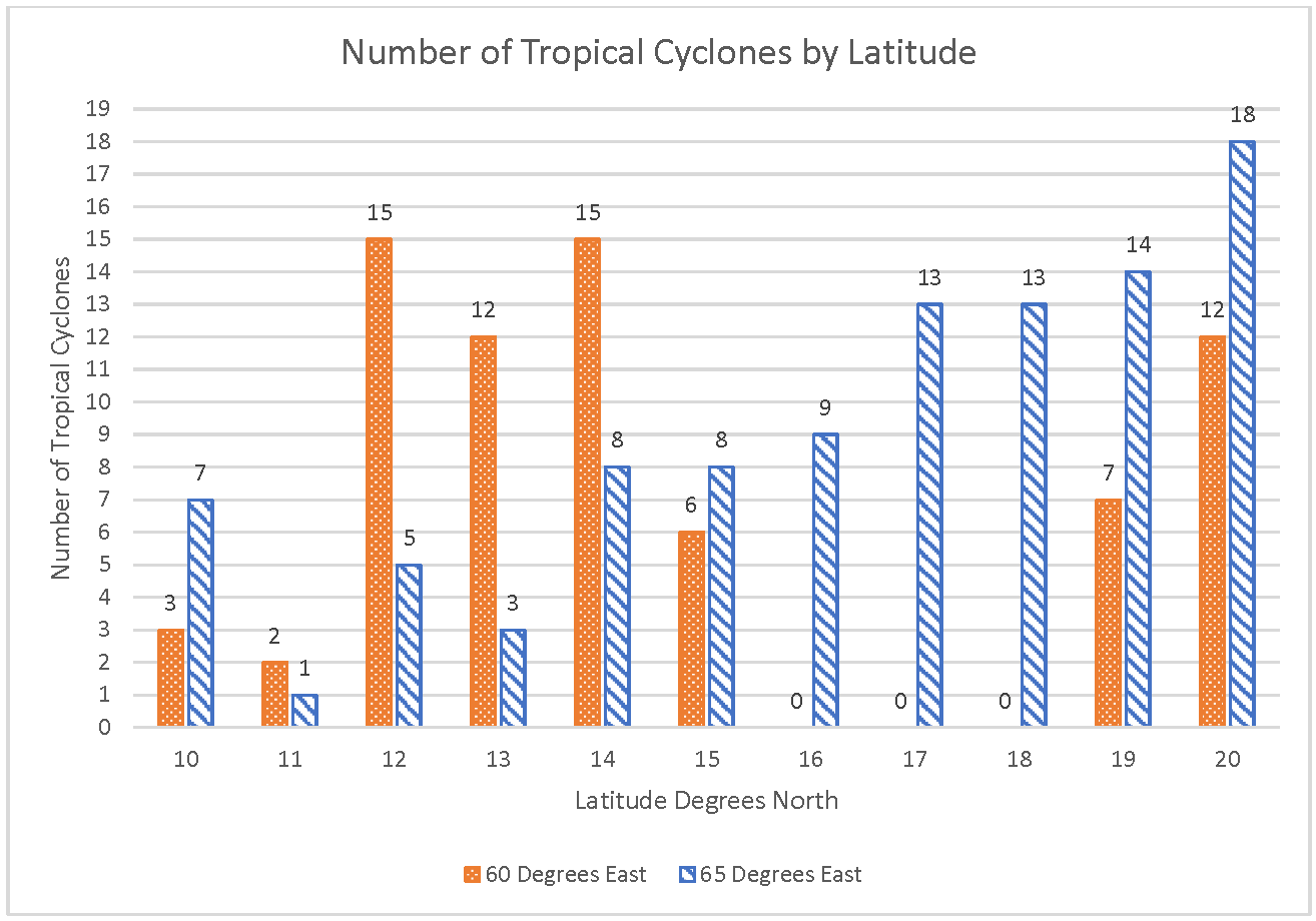
- Analyze Graph of Tropical Cyclone Counts
-
Link to Analyze Graph of Tropical Cyclone Counts Lesson

Number of Tropical Cyclones by Latitude
https://mynasadata.larc.nasa.gov/sites/default/files/2022-01/Bar_column%20chart%20cropped.png
Steps
- Analyze the Tropical Cyclone Counts double bar graph and answer the questions.
- Check with your instructor on how to submit your answers.
- At 14° north, how many more tropical cyclones were at 60° east than at 65° east? 7 more
- At 60 degrees east, how many more tropical cyclones were at 14° north than at 15° north? 9 more
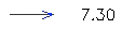
- What was the total number of tropical cyclones at each latitude between 60° and 65° east?
- 10° N – 10 tropical cyclones
- 11° N – 3 tropical cyclones
- 12° N – 20 tropical cyclones
- 13° N – 15 tropical cyclones
- 14° N – 23 tropical cyclones
- 15° N – 14 tropical cyclones
- 16° N – 9 tropical cyclones
- 17° N – 13 tropical cyclones
- 18° N – 13 tropical cyclones
- 19° N – 21 tropical cyclones
- 20° N – 30 tropical cyclones
- In table form:
- Which latitude had the highest total number of tropical cyclones at these longitudes? 20 degrees north
- How many fewer total tropical cyclones were at 15° north than at 14° north at these longitudes? 9 fewer
- Look at the locations on the map. Do you think the land around these locations have enough risk of hurricanes that they should develop emergency plans? Answers will vary. It would be a good idea to have plans in place for how to handle hurricanes.
- Analyzing a Volcanic Ash Model
-
Link to Analyzing a Volcanic Ash Model
Watch the videos and answer the questions. Check with your instructor on how to submit your answers. Frist, watch the What's Ash Anyway? video to find out about volcanic ash and answer the questions below.
- How is volcanic ash different from fireplace ash? (Accept reasonable responses. Ash in the fireplace is the residue of burning wood and is organic. Volcanic ash is a mix of ground up rock and glass and is not organic.)
- Why is volcanic ash dangerous? (It can be a hazard to people on the ground and for aircraft. It can get into aircraft engines and damage them making flights unsafe.)
Watch the video Tracking Volcanic Ash with Satellites. It describes tracking volcanic ash with satellites and shows the Calbuco volcano eruption. Then answer the questions below.
- What do you notice about how the ash from the Calbuco volcano traveled? (Accept reasonable responses including the following: It traveled far. It looked like it was traveling around the world. It was at different heights in the atmosphere.)
- Why does NASA study volcanic ash? (The information is used to help make forecasts to keep aircraft from being damaged by the volcanic ash and improving air traffic management.)
- Analyzing Surface Air Temperatures by Latitude
-
Link to Analyzing Surface Air Temperatures by Latitude Mini Lesson
- Answer the questions below. Check with your instructor on how to submit your answers.
- At what latitudes and within which zone(s) do you see the most significant surface air temperature positive anomalies? What do these positive anomalies indicate? The most dramatic land surface temperature positive anomalies can be seen from 65°S to 85°S in the Antarctic Zone and from 65°N to 80°N in the Arctic Zone; these positive anomalies mean that the mean land surface temperatures across those latitudes were much higher than usual during the year of 2018 when compared to the mean land surface temperatures of the years 1951 through 1980.
- At what latitudes and within which zone(s) do you see the most significant surface air temperature negative anomalies? What does these negative anomalies indicate? The most dramatic land surface temperature negative anomalies can be seen from 85°N to 90°N; these negative anomalies indicate that the mean land surface temperatures across those latitudes were much lower than usual during the year of 2018 when compared to the mean land surface temperatures of the years 1951 through 1980.
- What trends in surface air temperature do you observe with respect to latitude? (Do you see places in the graph where a pattern can be recognized?) Both of the higher latitudes show a trend where mean land surface temperatures increase sharply above the baseline at about 65°S to 80°S and 65°N to 80°N; however, mean land surface temperatures then decrease sharply at both 60°S and 60°N. There is also much greater variability in the mean land surfaces temperature data from the areas of 60°S to 90°S and from 60°N to 90°N. A pattern of increase is seen once more at around 25°S to 50°S and 25°N to 50°N. While, the Tropics (from 23.5°N and 23.5°S) show the most stability of the data and areas on Earth where mean land surface temperatures were consistently much closer to the baseline temperatures.
- What inference(s) or conclusion(s) can you make about these data? Can you provide any scientific explanation(s) for these? Aside from the region from 85°N to 90°N, the higher latitudes were warming more than any other area of the globe during April of 2018. This could be linked to melting ice and decreases in albedo, which could, in turn, cause an increase in the absorption of shortwave energy and further warming (Accept other reasonable responses.).
- Analyzing Surface Temperature Differences
-
Link to Analyzing Surface Temperature Differences Mini Lesson
- Observe the image above and answer the following questions. Check with your instructor on how to submit answers.
- What time of year do you predict this to be? Explain your evidence. Autumn or Winter due to the lack of leaves on trees and the browning leaves of the one remaining tree with leaves. The grass is also browner than one would expect in the spring or summer.
- What is the temperature of the air? 54° Fahrenheit
- How do the temperatures of the grass measured in sunlight differ from grass measured in the shade? The temperatures collected from the grass in the shade are 9°C cooler than the grass in the sunlight.
- What is the temperature difference between sunlit concrete and shaded concrete? What does this difference in temperature tell you about how surfaces are heated? The temperatures collected from the sidewalk in the shade are 7°C cooler than the sidewalk in the sunlight. Surfaces heat up and cool down differently, as evidenced by the temperature differences between grass and concrete.
- Based on what you have seen in this image, which type of area do you think is warmer, urban areas (cities and towns) or rural areas (country sides)? Why. (Surfaces like concrete and asphalt heat up to higher temperatures than ones with grass and plants so cities and towns will likely be hotter than rural areas that have more agricultural and forested areas.)
- Atmospheric Methane
-
Steps:
- Check with your instructor on how to submit your answers.
- Identify the range of methane emissions displayed on the model. The model in the video shows a range of methane concentrations from 1800 ppb (parts per billion) to 2100 ppb.
- Identify and describe two anthropogenic sources of methane emissions. Answers Vary - the following are identified in the video: Rice cultivation and livestock, use of fossil fuels.
- Identify and describe two natural sources of methane emissions. Answers Vary - the following are identified in the video: Seasonal flooding of wetlands, thawing permafrost.
- Develop a scientific question that could lead to an investigation about a particular source of methane emissions. (QUESTION DEVELOPMENT GUIDELINES: The questions SHOULD NOT be rhetorical in nature, the questions SHOULD NOT be able to answered with Yes/No, the questions SHOULD be able to lead to a specific hypothesis, generally cause and effect questions are harder to answer (but not necessarily inappropriate for this exercise), guide your students to develop questions that help with identifying correlations.) Answers Vary - the following are examples: How will changes in precipitation in the Arctic region impact methane emissions? How will construction of a fossil fuel pipeline affect methane emissions? What type of agricultural activities result in the highest methane emissions? How can methane emissions from rice cultivation be reduced?
- Identify the range of methane emissions displayed on the model. How does this compare to the movie model? The model in the video shows a range of methane concentrations from 1.74 ppm (parts per million) to 1.98 ppm. Note that a part per billion is 1000 times smaller than a part per million. Therefore to compare the datasets, it may be useful to change the concentration to 1,740ppb and 1,980 ppb for the Alaskan Region emissions.
- Use specific data to describe a seasonal trend observed in methane emissions in the Alaska region. Answers Vary - but descriptions should always be supported to include specific data as evidence as opposed to simply noting general directional trends. The following is an example: Methane concentrations over in the north interior of Alaska (~58oN, 156oW) show a consistent seasonal increase from winter to late summer/early fall. Winter methane concentrations display a lower value around 1.90ppm while late summer/early fall show values at the highest range of 1.98ppm.
-
Explain how seasonal trends affect carbon cycling, including methane emissions in the Arctic region.
Answers Vary - the following are examples. The Arctic range is snow and ice covered in the winter months. These conditions limit the amount of carbon exchanged between the geosphere and the atmosphere. As seasonal temperatures rise, rates of decomposition increase and previously frozen soils that are saturated and have limited oxygen will emit methane.
Permafrost is extensive in the Arctic range. This is ground that remains completely frozen for at least two years. If the seasonal thaw period is extended, the greater the depths to which the soils will thaw. This increases the amount of thawing permafrost soils which result in a release of trapped carbon in the geosphere to the the atmosphere. When freezing occurs this condition in reversed and plant/organic material that has taken up atmospheric carbon becomes trapped in the frozen soils.
- Refer to the Earth’s energy budget diagram below to discuss how methane emissions in the Arctic are part of a positive feedback loop that is associated with an increasing rate of warming Arctic temperatures. Since methane is a potent greenhouse gas, when it is emitted from the geosphere into the atmosphere it will affect the how energy is transferred in the atmosphere since it traps longwave radiation (terrestrial radiation). The more longwave radiation is trapped in the atmosphere, the greater the amount of longwave radiation stays in the atmosphere and is not allowed to escape the Earth’s system. This causes and increase in Earth’s surface temperatures as more energy is now available to warm the Earth’s surface. As Earth’s surface warms, more methane is potentially emitted from the thawing of frozen Arctic soils (permafrost) which then leads to higher concentrations of greenhouse gases in the atmosphere.
- Carbon Dioxide Production and Sequestration
-
Link to Carbon Dioxide Production and Sequestration
- Use the image of forested and deforested land to answer the questions. Check with your instructor on how to submit answers.
- The picture shows a plot of landscape measuring 1 kilometer on a side.
- Each box on the image covers 2.5 acres.
- The land and soil with green trees sequester carbon dioxide at a rate of 1 ton per acre per year. So, a box that is all trees will sequester 2.5 tons of carbon dioxide per year.
- The deforested land and soil have smaller amounts of vegetation and only sequesters carbon dioxide at a rate of 0.2 tons per acre per year. So, a box that is all deforested, or bare, land will sequester 0.5 tons of carbon dioxide per year.
- Estimate the size of the forested (dark green) area of the picture in acres. If one box has more than one type of cover, estimate how much is trees and how much is not. How many forested acres are in this picture?
- Approximately 2/3 of the picture is covered in green. 2.5 * 100 * .66 = 165 acres
- Accept reasonable estimates.
- Estimate the size of the deforested, bare area of the picture. How many deforested acres are in this picture?
- Approximately 1/3 of the picture is covered in green. 2.5 * 100 * .33 = 82.5 acres
- Accept reasonable estimates.
- How much carbon dioxide is sequestered by trees?
- (Number of boxes covered by trees X 2.5 tons of carbon dioxide per year)
- Approximately 66 * 2.5 tons/year = 165 tons/year
- Accept reasonable estimates
- How much carbon dioxide is sequestered by bare land?
- (Number of boxes covered by bare land x 0.5 tons of carbon dioxide per year)
- Approximately 33 * .5 tons/year = 16.5 tons/year
- What is the total rate of carbon dioxide sequestration in this particular area in terms of tons per year?
- Approximately 165 tons/year + 16.5 tons/year = 181.5 tons/year
- A typical American home produces about 10 tons of carbon dioxide per year. The image shows one house. What is the is the overall (or net) sequestration of carbon dioxide in the image including the house?
- 181.5 tons/year - 10 tons/year = 171.5 tons/year
- Assume someone built 50 more homes on the land in the image. What would the overall (or net) carbon dioxide sequestration be?
- There are 51 houses total.
- 181.5 tons/year - 51(10 tons/year) = 181.5 tons/year - 510 tons/year = -328.5 tons/year.
- This means that there is a production of 328.5 tons/year that is NOT sequestered.
- Use the image of forested and deforested land to answer the questions. Check with your instructor on how to submit answers.
- Clouds and Climate Impacts
-
Link to Clouds and Climate Impacts
After watching the NOVA Video: The Climate Wild Card, reflect on the questions below that NASA scientists are working hard to answer. Answer the questions on another sheet of paper.
- How will clouds respond as the planet warms? Scientists are not sure if there will be an increase in low cooling clouds or higher absorbing clouds.
- Could we see an increase in reflecting clouds, which would help to slow the global warming trend? It is possible. This is why scientists are studying clouds and climate.
- Or will there be an increase in absorbing clouds, which could dramatically speed up the warming? It is possible. This is why scientists are studying clouds and climate.
- How would this warming affect the polar regions and in turn affect coastal areas? If there were an increase in absorbing clouds, the polar regions could warm by over 20 degrees Fahrenheit. This would lead to ice melting which could cause a rise in sea level of up to six feet.
As a class, brainstorm how the polar regions and coastal areas might be affected if there is an increase in absorbing clouds. Fill in the chain of events below that might occur if the percentage of absorbing clouds increases. Accept reasonable responses including those in question 4.
- Clouds & Earth's Climate with Dr. Patrick Taylor Video
-
Link to Clouds & Earth's Climate with Dr. Patrick Taylor Video
Steps:
- Check with your instructor on how to submit your answers.
- How much has Earth’s mean surface temperature warmed over the last 130 years? More than 1֯ Celsius or more than 1.8֯ Fahrenheit.
- How does the CERES (Clouds and the Earth’s Radiant Energy System) project produce global climate data records of Earth’s energy budget and clouds over many decades? Over decades, from space, with six different instruments on four different satellites. The instruments are the CERES and MODIS instruments.
- Why is Earth’s energy budget important for climate? The difference between the amount of sunlight absorbed by Earth and the amount of infrared energy emitted to space controls Earth’s temperature.
- If less sunlight is absorbed than infrared energy is emitted to space, what will the effect be on Earth’s temperature? It will cool Earth’s temperature.
- If more sunlight is absorbed than infrared energy is emitted to space, what will the effect be on Earth’s temperature? It will warm Earth’s temperature.
- According to the animation of CERES data showing where Earth cools by losing infrared energy to space, which regions lose the most energy to space? In the warmest places, especially desert regions of Earth.
- Where is the least infrared energy lost to space? Cold regions such as the Arctic and Antarctic and places with a lot of clouds like the Amazon, Central Africa, and the tropical western Pacific regions.
- According to the animation showing CERES observations of reflected sunlight from Earth, where are the areas with the least reflected sunlight? Oceans.
- According to the animation showing CERES observations of reflected sunlight from Earth, where are the areas with the most reflected sunlight? Polar regions covered by ice and snow as well as some places in the Tropics with lots of clouds
- What are two possible effects that clouds have on the energy budget? Cooling and warming. Teacher Note: Some reflect more sunlight for a cooling effect. Others reduce the amount of infrared radiation lost to space resulting in warming. It depends on the height of the clouds and the amount of water vapor they contain. High-level clouds tend to have a warming effect. Low-level clouds tend to have a cooling effect. The effects are also different across Earth with more cooling over the oceans and warming over the land and the poles. The total overall effect is a cooling effect.
- Why does NASA study clouds and their role in Earth’s energy budget? How clouds change and the impact on the Earth’s energy budget will influence how climate changes including how hot and dry summers will be, the frequency of extreme weather events, where it rains, when it rains, and how hard it rains.
- Cloud Sort Activity
-
The Cloud Sort Activity Key is available in a slide deck.
- Comparing Winds & Surface Ocean Currents
-
Link to Comparing Winds & Surface Ocean Currents Mini Lesson
Reading the Images
-
Orient yourself to the ocean basins, the vectors, the vector legend, and the date/time information. Vector Legend:
-
Observe primarily the data displayed for the Equator and the North Atlantic Ocean.
- Run the animation My NASA Data: Global Wind Vectors 2017 2018. (May need to replay when needed.)
-
Answer the following questions. Check with your instructor on how to submit your answers.
- Observe the winds blowing across Earth’s surface. Which direction do the winds primarily blow around the Equator? West to East
- Focus your attention on the North Atlantic Ocean. What direction are the winds primarily blowing to? East in the North Atlantic (called the Prevailing Westerlies)
- Describe the months where the intensity of the Westerlies are the strongest? (Recall, the wind speed is displayed by the length of the arrow or the vector.) Winter months
- Describe the directions of winds off of the Eastern part of North America. There appear to be two circular patterns: 1.) Subpolar Gyre off of Greenland and 2.) Subtropical Gyre separating North America and Africa with Europe
- Winds blow from high to low pressure, and blow clockwise around areas of high pressure and counterclockwise around areas of low pressure in the Northern Hemisphere. (These directions the wind blows around high and low pressure is opposite in the Southern Hemisphere (clockwise around lows and counterclockwise around highs).)
- Observe the gyre in N. Atlantic - is it a high pressure or low-pressure area? The N. Atlantic Gyre consistently flows in a clockwise path around the North Atlantic Ocean. This would be a low pressure area.
Connecting the Data
- Observe the map of ocean surface currents.
- What similarities do you notice? Students should recognize the gyres.
- What role do winds play in the creation of surface currents? Large global wind systems are created by the uneven heating of the Earth’s surface. These global wind systems, in turn, drive the oceans’ surface currents.
-
- Computing Carbon Dioxide Amounts: Student Activity
- Correlating Shortwave Radiation to Cloud Coverage
-
Link to Correlating Shortwave Radiation to Cloud Coverage
- Check with your instructor on how to submit your answers.
- Describe one thing about the datasets that catches your attention? Answers may vary but can include: Monthly Flow of Energy into Surface by Shortwave Radiation - Much of the southern hemisphere (mainly Antarctica) is a darker shade of orange during June 2021, however, during December 2021, the darker shade switches to the northern hemisphere in the Arctic. Monthly Total Cloud Coverage, there is more cloud coverage in the northern hemisphere during the month of December 2021 than there is in June.
- Looking at the datasets entitled Monthly Flow of Energy into Surface by Shortwave Radiation, identify the areas on the datasets that have absorbed the least amount of the Sun’s shortwave radiation.
- June 2021: Least amount of energy is depicted in the southern hemisphere from about 40ºS to 90ºS.
- December 2021: Least amount of energy is depicted in the northern hemisphere in areas of the Arctic from around 40ºN to 90ºN.
- Keeping with the same datasets, identify the areas on the datasets that have absorbed the most shortwave radiation.
- June 2021: Higher energy is depicted in the northern hemisphere between 20ºS and 90ºN
- December 2021: Higher energy is depicted in the southern hemisphere between 20ºN and 90ºS
- Switching over to the datasets Monthly Cloud Coverage, identify the areas on the datasets that have the highest percentages of cloud coverage.
- June 2021: Alaska, Greenland, Canada, Russia, India,
- December 2021: United States, South America, South Africa, Greenland
- Identify the areas on the Monthly Cloud Coverage datasets that have the lowest percentages of cloud coverage.
- June 2021: United States, Northern Africa, Saudi Arabia, Australia
- December 2021: Northern Africa, Australia, China, India
- List the evidence that you found to explain the relationship between shortwave radiation and clouds. Areas that show a high percentage of cloud coverage tend to show lower shortwave radiation.
- Can you pinpoint any other factor(s) that affect the amount of shortwave radiation reaching Earth’s surface besides clouds? Explain. As a result of the tilt of the Earth, incoming shortwave radiation varies by latitude to reflect the seasonal change of angle of incidence. In the northern hemisphere, energy flow increases in June while it decreases in December. The opposite monthly trends are observed in the southern hemisphere.
- Creating and Interpreting Images as Models
-
Link to Creating and Interpreting Images
Array tables to be created:
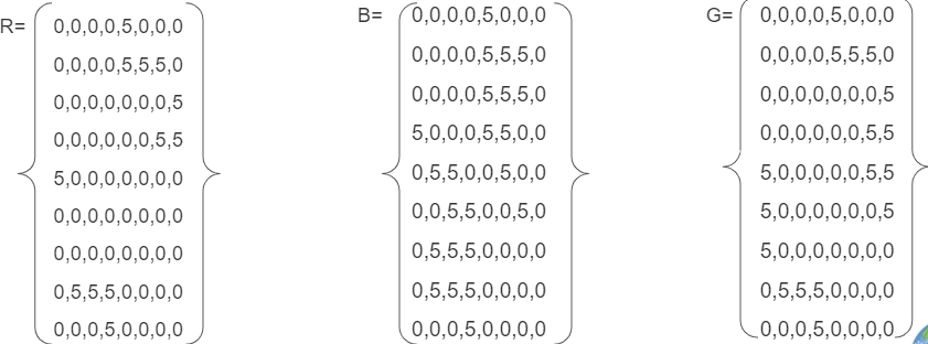
Combined Array Table:
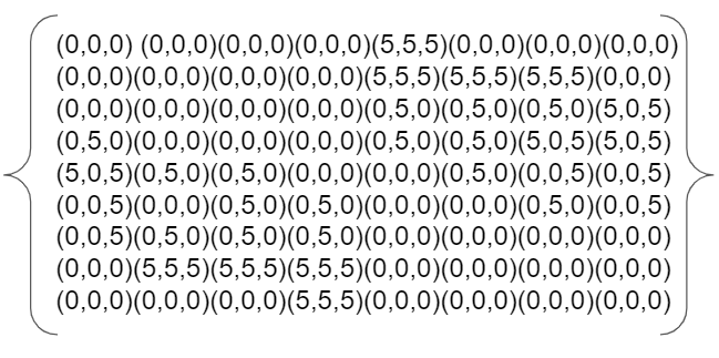
Pixel Grid:
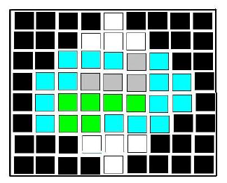
6. Where is the ice represented in the image? In the center of top and bottom. This could be representative of poles on a planet.
- Creating Images from Numbers
-
Link to Creating Images from Numbers
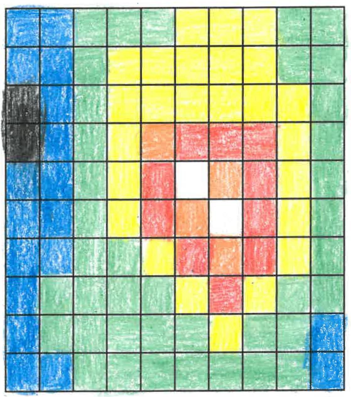
Creating Images from Numbers sample answer using assigned colors. The answers will vary if students select other colors.
https://mynasadata.larc.nasa.gov/sites/default/files/inline-images/creating%20images%20from%20numbers.jpg- Answer the following questions if the data are wind speed in km per hour.
- What color is the fastest? white Slowest? black
- Where is the wind between 21-25 km per hour? red squares or the color chosen
- Answer the following questions if the numbers are elevation in meters above sea level.
- What color is the lowest? black Highest? white
- Where is the elevation between 31 and 35 meters above sea level? white squares
- Do you notice any pattern in the image? Accept reasonable responses. The highest values are in the center. Numbers decrease the farther they are from the center. Learners are likely not to think the red color would be the highest, which is not the case.
- How does the size of the grids in the grid paper affect the image that you created? Accept reasonable responses. Smaller grids can have different values which can provide more detail. Larger grids will provide less detail.
- Which do you think would be more realistic, larger grid sizes or smaller? Why? Accept reasonable responses. Smaller grids will provide more detail, which can be more realistic.
- Answer the following questions if the data are wind speed in km per hour.
- Do Fireworks Create Air Pollution?
-
Link to Do Fireworks Create Air Pollution?
- Check with your instructor on how to submit your answers.
- Identify the highest value reached for PM 2.5? About 108.
- Approximately what time was the highest value reached? About 10 PM.
- Indicate the general direction the wind moving from Pendleton, Oregon on July 4th (look at the light blue, pink and yellow lines on the map)? Northeast.
- Identify which state(s) were in line to encounter PM 2.5 from Pendleton fireworks? Washington and maybe Idaho.
- Identify the highest value reached for PM 2.5? About 540.
- Approximately what time was the highest value reached? About 10 PM.
- Indicate the general direction the wind moving from Boise, Idaho on July 4th (Look at the green, light blue and pink lines on the map)? Northeast/East.
- Identify which state(s) were most likely in line to encounter PM 2.5 from Boise fireworks? Montana and Wyoming.
- Earth System Energy Travels
-
Link to Earth System Energy Travels Mini Lesson
- What can happen to the energy as it travels through the Earth system? It can be reflected or absorbed.
- Where does the largest percentage of energy go in the Earth system? It is absorbed by land and oceans.
- What kinds of ways is the energy used once it enters the Earth system (i.e., Hydrosphere, Atmosphere, Biosphere, etc.)? Accept reasonable responses. Energy that is absorbed can heat the surface and land (geosphere), atmosphere, and oceans (hydrosphere). Energy can also be used by plants for photosynthesis (biosphere).
- What is the role of the atmosphere (including clouds) as it relates to Earth’s energy? The energy can be both reflected and absorbed by the atmosphere and by clouds.
- Earth's Heating Imbalance
-
Link to Earth's Heating Imbalance
Steps:
- Check with your instructor on how to submit your answers.
- Analyze the graph.
- Describe the energy received at the Equator. At the equator (gray line), the peak energy changes very little throughout the year and it is where the energy is concentrated the most.
- How does it change over the year? The peak energy at the equator lowers slightly during the summer months of June and July, then raises during the fall and spring seasons.
- What do the blue lines (23.5 degrees N, 45 degrees N, 60 degrees N) represent? Latitudes in the northern Hemisphere.
- What do the green lines (23.5 degrees S, 45 degrees S, 60 degrees S) represent? Latitudes in the Southern Hemisphere
- Describe the relationship among the blue and green lines and the cause of these values/patterns. The northern latitudes that are furthest away from the equator have the highest peak energy during the summer months while the southern latitudes that are furthest away have the lowest, depicting the cooler periods the southern hemisphere experiences during that time of year. This pattern is reversed as the months go from fall to winter.
- Earth's Energy: Shortwave Radiation
-
- What is albedo? Albedo is the ratio of reflected-to incoming energy. A higher albedo means that more incoming energy is reflected.
- What colors represent areas where the most energy is being reflected back out to space? brighter, whiter regions show where more sunlight is reflected Least energy? blue
- What are the units of these measurements? Watts per square meter
- What drives Earth's climate engine? The Sun's radiant energy
- What system of the Earth system is constantly adjusting to maintain a balance between the energy that reaches the Earth from the Sun and the energy that flows from the Earth back out to space? Atmosphere
- What parts of the aforementioned system reflect energy back to space? clouds, aerosols, bright surfaces
- What feedback do you predict if Earth's cloud cover decreases over time? The albedo would decrease. There would be less shortwave radiation reflected back to space. More energy would be absorbed leading to warming.
- Energy and Matter: Dust Transport
-
Link to Energy and Matter: Dust Transport
Steps:
- Check with your instructor on how to submit your answers.
- Where does the dust originate or come from? Explain what is important about the location of where the dust originates. The dust originates from the Sahara Desert in northern Africa. The Sahara is the world's largest desert, and it contains phosphorus, an essential nutrient that acts like a fertilizer.
- What location does the dust travel to? Explain what is important about this location. The dust travels 3000 miles to South America, over to the Amazon Basin. This location is important because the Amazon Rainforest is replenished by the phosphorus-rich dust from the Sahara, which is an important nutrient for plants to flourish. This essentially "feeds" the rainforest.
- How does the dust travel from one place to the other? The dust travels by wind.
- What NASA satellite collects the data? Cloud-Aerosol Lidar and Infrared Pathfinder Satellite Observation (CALIPSO).
- Explain how the biosphere and geosphere are connected in this example. Answers may vary. The geosphere includes rocks, sediments, and surface soils. The sediments from the Sahara which contain the phosphorous can be associated with the Geosphere. The Amazon Rainforest is part of the biosphere. Without the generation of sediments that have been formed through Earth's processes in the Sahara, the Amazon would not flourish, therefore this example of the biosphere is dependent on the geosphere for replenishment.
- Energy and Matter: Longwave Radiation
-
Link to Energy and Matter: Longwave Radiation Mini Lesson
- Watch the visualization and answer the questions.
- Check with your instructor on how to submit your answers
- What time period does this video show longwave radiation on Earth? 01/26/2012 - 01/27/2012
- What colors represent areas where the most energy is being emitted out to space? brightest yellow
- What are the units of these measurements? Watts per square meter
- Where do you expect to find the warmest temperatures? where the atmosphere is transparent Coldest? where you find clouds, aerosols, or bright surfaces
- What drives Earth's climate engine? Sun
- What parts of the Earth system absorb the most energy? Oceans and land. What evidence do you have to support this claim? The oceans consistently show the highest values in the 300-380 range. Some parts of the Earth's geosphere also show these large values, too.
- Energy and Matter: Shortwave Radiation
-
Link to Energy and Matter: Shortwave Radiation Mini Lesson
- What time period does this video show shortwave radiation on Earth? from January 26 and 27, 2012
- What colors represent areas where the most energy is being reflected back out to space? brighter, whiter regions show where more sunlight is reflected Least energy? blue
- What are the units of these measurements? Watts per square meter
- What drives Earth's climate engine? The Sun's radiant energy
- What part of the Earth system is always adjusting to maintain a balance between Earth's incoming and outgoing energy? Atmosphere
- What parts of this system reflect energy back to space? clouds, aerosols, bright surfaces
- Evaluating Natural and Human Activities Effects on Earth's Climate
-
Link to Evaluating Natural and Human Activities Effects on Earth's Climate
- Review the chart above and answer the following questions. Check with your instructor on how to submit answers.
- What is the net total value of radiative forcing (in watts per square meter) of natural activities? Anthropogenic (human) activities? Natural approximately 0.05 - 0.1 watts per square meter. Anthropogenic approximately 2.5 watts per square meter
- Of the anthropogenic activities, which factor has the greatest value? What category does this belong to? Carbon dioxide belongs to long-lived greenhouse gases.
- Which of the factors have both a cooling and warming effect on climate? Halogenated gases, some short-lived gases that create ozone or destroy other green house gases, and aerosols.
- Why is the year 1750 selected as a baseline? It is prior to the industrial revolution.
- What are three questions that you can ask of this chart? Accept reasonable responses.
- Review the chart above and answer the following questions. Check with your instructor on how to submit answers.
- Examining a Simplified Model of Clouds Effects on Earth's Energy Budget
-
Link to Examining a Simplified Model of Clouds Effects on Earth's Energy Budget
Steps:
- Check with your instructor on how to submit your answers.
- Examine the yellow arrows showing incoming shortwave radiation. What is the difference between the amount of incoming shortwave radiation transmitted through high-level clouds and low-level clouds? High-level clouds transmit more shortwave radiation to Earth’s surface than low-level clouds.
- Examine the red arrows showing outgoing longwave radiation. What is the difference between the amount of outgoing longwave radiation transmitted through high-level clouds and low-level clouds? High-level clouds allow less longwave radiation to escape to space.
- Compare the yellow arrow reflected by the high cloud to the red arrow leaving the base of the high cloud and pointing toward the surface. Overall, what effect do high-level clouds have on the flow of energy through the atmosphere and to Earth's surface? Overall, high-level clouds reflect less shortwave radiation than redirect longwave radiation back toward the surface. High clouds have a warming effect. This is shown in the diagram as the yellow arrow directed toward space from the low cloud is smaller than the red arrow directed from the low cloud to the surface.
- Compare the yellow arrow reflected by the low cloud to the red arrow leaving the base of the low cloud and pointing toward the surface. Overall, what effect do low-level clouds have on the flow of energy through the atmosphere and to Earth's surface? Overall, low-level clouds reflect more sunlight and redirects longwave radiation back toward the surface. Low clouds have a cooling effect. This is shown in the diagram as the yellow arrow directed toward space from the high cloud is smaller than the red arrow directed from the high cloud to the surface.
- As global temperatures rise, how do you think this will effect clouds? Accept reasonable responses. Rising temperatures may cause the cloud base to rise, causing a reduction in cloud layer thickness due to the drier air on the surface of the Earth. Higher-level clouds tend to warm the Earth.
- Explore Albedo
-
- Review the NASA Climate Bits: Albedo video and answer the following questions. (Check with your instructor on how to submit your answers.)
- What is albedo? The fraction of the incoming Sun's energy that is reflected.
- What do the colors represent in the weekly maps of reflected solar radiation for the past 10 years? Lighter colors show more reflection, or higher albedo, and darker colors show less reflection, or lower albedo.
- Why is albedo important for Earth's climate? Incoming solar energy must equal outgoing energy. The amount of energy absorbed and reflected can impact this balance.
- What pattern did you notice? More reflected energy where there are persistent clouds, dust, smoke and pollution and snow and ice. Also, albedo increases at the poles during their respective fall and winter seasons and decrease in their respective winter months. Missing data peaks at the poles in their respective summers. Deserts have a higher albedo than areas with a lot of vegetation.
- Why do you think there are missing data at the poles during their winter seasons? There is little to no sunlight arriving at the poles during these times. Therefore, there is no sunlight to reflect.
- How can humans impact albedo? Contrail and ship trails can temporarily raise albedo. Land use change and burning can also change albedo.
- Review the NASA Climate Bits: Albedo video and answer the following questions. (Check with your instructor on how to submit your answers.)
- Extreme July 2022 Temperatures
-
Link to Extreme July 2022 Temperatures
Steps:
- Check with your instructor on how to submit your answers.
- Describe the daily maximum air temperature in the continental United States during the month of July in 2022. During July 2022, most of the United States daily air temperatures above 30oC with some locations in the mid-west and south displaying temperatures higher than 40oC.
- Identify evidence provided in the animation that supports the claim that the July 2022 air temperatures in the United States were extreme and out of normal expected temperature ranges. Temperature ranges in the United States show values similar to Saharan Desert in northern Africa. (Note the temperature scale has an upper limit of >40oC therefore it is unknown how much higher the air temperatures were modeled to be.)
- Describe one impact excessive heat has on your local community. Answers vary. Example answers may include impact on human life, opening cooling centers, limits time outdoors, increase electric costs for air conditioning, etc.
- Describe one action you should take during times of excessive heat other than to simply moving indoors into climate-controlled conditions. Answers vary. Example answers may be found at https://www.heat.gov/pages/planning-and-preparing
- Describe how the daily maximum air temperatures on the West Coast of the continental United States differs from the air temperatures immediately offshore over the Pacific Ocean. Air temperatures on the continental West Coast were generally over 30oC while immediately offshore, the air temperatures were dramatically different ranging between 10oC and 20oC.
- Use your knowledge of heat transfer to explain why the air temperatures over land are different than the air temperatures over nearby large bodies of waters. Heat is transferred to the air both by directly absorbing shortwave solar radiation as well as absorbing longwave radiation that is emitted from Earth’s surface. The dramatic difference in temperature is a result of a large difference in surface temperatures. Since ocean waters in that region are much cooler as a result of the California current, the air immediately above the ocean surface is cooler since the ocean serves as an energy sink in that region.
- Identify a localized area/region in the continental United States where the air temperatures remained relatively cooler in July. Answers vary. Example response may include that a cooler region of air was experienced over the Rocky Mountain range in Colorado.
- Global Air Temperatures Graph
-
Link to Global Air Temperatures Graph Mini Lesson
- Answer the Questions below. Check with your instructor on how to submit your answers.
- What time frame does the graph cover? 1880 - 2020.
- What do the white dots represent? The white dots represent the variability of annual mean temperatures over time.
- What does the black line represent? The black line represents a trendline or Lowess smoothing over time.
- What is an anomaly? An anomaly is a departure from average conditions.
- What do the changes in the anomaly data mean? As time increases, the variability of temperature also increases. This is depicting a warming trend with the past eight years being the warmest.
- Do you notice a trend? If so, what direction does the trend go? Yes, the trend increases from around 1940 - 2020.
(Additional Information) This graph illustrates the change in global surface temperature relative to 1951-1980 average temperatures. Nineteen of the hottest years have occurred since 2000, with the exception of 1998, which was helped by a very strong El Niño. The year 2020 tied with 2016 for the hottest year on record since record-keeping began in 1880 (source: NASA/GISS). This research is broadly consistent with similar constructions prepared by the Climatic Research Unit and the National Oceanic and Atmospheric Administration.
- How is My Air?
-
Accept reasonable responses. - Hurricane Harvey's Effect on Soil Moisture
-
Link to Hurricane Harvey's Effect on Soil Moisture Mini Lesson
- What does the size of the dot represent? The rate of change in the amount of moisture in the soil
- What does the color represent? The volume of water in the soil (units: cm cubed) per volume of soil (units: cm cubed)
- What area was the most impacted by Hurricane Harvey? How do you know? North West of Houston because it has the largest and darkest hexagons.
- Why do you think there was not a change in soil moisture in the city of Houston? The surface of a city is mainly impermeable so the water isn’t able to soak into the soil but rather runs off into its watershed
- What is one question you have when looking at this map? Answers can vary but examples are; why did the East side of Houston not have as drastic soil moisture change compared to the west side of the city; what was the path the storm took; how much water dumped onto the city?
- Identifying Patterns in PM 2.5
- Interactive Weather Observations
-
Link to Interactive Weather Observations
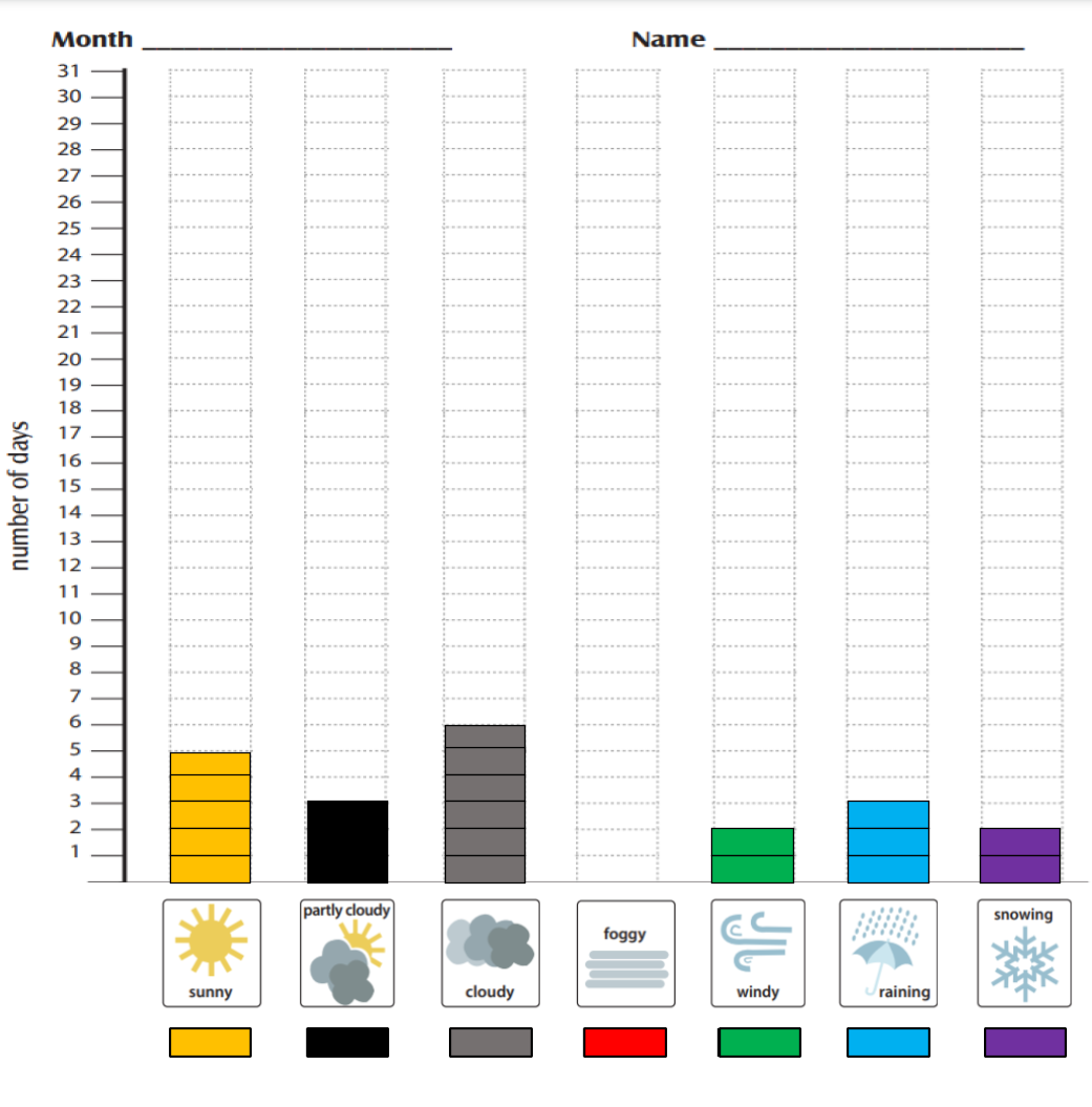
This is a sample of how the bar chart would be filled out. Your chart will look different depending upon the number of days you make observations and the weather you observe.
https://mynasadata.larc.nasa.gov/sites/default/files/inline-images/Weather%20Observation%20Bar%20Chart%20image.png - Interpret Tropical Cyclone Counts Model
-
Link to Interpret Tropical Cyclone Counts Model
Use the Tropical Cyclone Counts Map Image to answer the questions.
- What variable is represented by the colors? The number of tropical cyclones at each location between 1842 and 2018.
- What latitude and longitude ranges have the most cyclones? Approximately five to 10 degrees north of the equator to approximately thirty degrees north. Accept reasonable responses of ranges shown by the darker colors.
- What changes do you see by latitude? There are not many tropical cyclones directly around the equator. As you move north or south of the equator, there are more tropical cyclones. As you more even further away from the equator, the number decreases again.
- What do you think explains the differences by latitude? Tropical cyclones form over large, warm bodies of water.
- Summarize the information you see on the map. Accept reasonable responses. There are clear regions that have experienced larger numbers of tropical cyclones. Areas on land that have been impacted can also be seen.
- What questions do you have about the image? Accept reasonable responses.
- Select a location on land on the map that has a risk of hurricanes. Explain why you think there is a hurricane risk at that location. Accept reasonable responses including land areas that have a darker color showing that there have been multiple tropical cyclones in those locations in the past. This can help predict possible future storms.
- Interpret Tropical Cyclone Counts Scatter Plot
-
Link to Interpret Tropical Cyclone Counts Scatter Plot
-
The Number of Tropical Cyclones at 120 Degrees West Scatter Plot shows the number of tropical cyclones at 120° west for each degree of latitude from the equator (0°) to 40° north; the same as represented along the red line in the mapped image below.
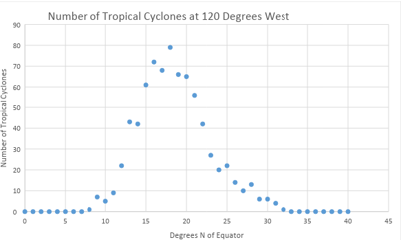
Scatter plot - number of tropical cyclones at 120 degrees west
https://mynasadata.larc.nasa.gov/sites/default/files/inline-images/thumbnail.png - Analyze the scatter plot to answer the questions follow. Check with your instructor on how to submit your answers.
- What does the scatter plot show? What does it NOT show? Accept reasonable responses. It shows how many tropical cyclones, or hurricanes, were at each whole number latitude from 0 to 40 degrees north at the longitude of 120 degrees west. It does NOT show latitudes that are not whole numbers. It does NOT show latitudes outside the 0 to 40 degree north range. It does NOT show any other longitudes in the world.
- Is the plot linear (do the points appear to lie close together along a straight line) or nonlinear (do the points appear to form a curve)? Nonlinear
- Is there a correlation between the two variables? If yes, please describe. There is, but it is not a simple positive or negative correlation.
- What does the shape of the distribution tell you about the location and frequency of tropical cyclones? The number of cyclones increases as you move north of the equator to approximately 20 degrees north and then begins to decrease as you move further north.
-
The map below shows the number of tropical cyclones around the world from 1842 – 2018. There is a thick line at 120 degrees west from the equator to 40 degrees north; the same as represented by the scatter plot. The Tropical Cyclone Counts map was generated in the My NASA Data Earth System Data Explorer. Now compare the scatter plot to the map image and answer the following questions.
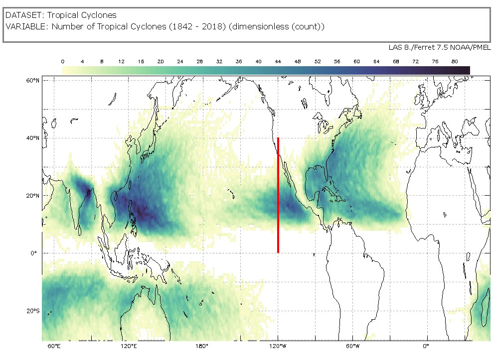
Tropical Cyclone Counts Map showing a line at 120 degrees west from the equator to 40 degrees north
https://mynasadata.larc.nasa.gov/sites/default/files/2022-02/Tropical%20Cyclone%20count%20120%20W.png- Which data visualization, the scatter plot or map, best helps you answer questions about specific number of tropical cyclones at specific locations? The graph could be more precise if it shows the location you want.
- Which data visualization, the scatter plot or map, best helps you answer questions about tropical cyclones around the world? map
- What kind of questions can you ask about tropical cyclones that a scatter plot can help you answer? Accept reasonable responses asking about how the locations and number of cyclones are related.
-
- Interpreting a Graph of Surface Temperature of Urban Areas
-
Link to Interpreting a Graph of Surface Temperature of Urban Areas Mini Lesson
Review the Urban Heat Island Profile graph below showing surface temperatures taken from different types of communities.
- Answer the questions. Check with your instructor on how to submit answers.
- What is the highest temperature in Celsius on the graph? 38 degrees Celsius
- What is the highest temperature in Fahrenheit on the graph? 100 degrees Fahrenheit
- Identify which community (rural, suburban, urban) has the highest surface temperatures and explain why. Urban environments will have the highest surface temperatures because cities are full of these rocky surfaces — asphalt, brick, and concrete — that absorb heat by day and release it at night. These materials are used to make the sidewalks, parking lots, roads, and basketball courts of urban areas.
- Identify which community (rural, suburban, urban) has the lowest surface temperatures and explain why. Rural environments will have the lowest surface temperatures because they have more vegetation. Plants take up water from the ground through their roots. Then, they store the water in their stems and leaves. The water eventually travels to small holes on the underside of leaves. There, the liquid water turns into water vapor and is released into the air. This process is called transpiration. By releasing water, plants cool themselves and the surrounding environment. Like how sweat cools the human body, energy is absorbed and transported away from a warm object by the evaporation of water.
- What kind of community do you live in? Describe the surface temperature of your neighborhood by comparing it with other parts of your community. Answers will vary.
- Answer the questions. Check with your instructor on how to submit answers.
- Introduction to Volcanic Ash
-
Link to Introduction to Volcanic Ash Mini Lesson
- Watch the videos and answer the questions. Check with your instructor on how to submit answers.
- Watch the NASA's Earth Minute: All About Aerosols video.
- Identify different sources of aerosols. Some sources of aerosols are dust, salt, volcanic ash, fire, smoke stacks, and engine emissions.
- What are the effects of aerosols? Aerosols can cool or heat the air, damage the ozone through chemical reactions, and cause health issues.
- How does NASA study aerosols? NASA studies aerosols using equipment on satellites, aircraft, and ground-based devices.
- Watch the NASA video: Fire, Ice, and Safer Skies: NASA Satellites Track Volcanic Clouds which describes hazards of volcanic emissions.
- How does volcanic ash demonstrate an interaction between the geosphere and the atmosphere?
- Why are volcanic emissions a problem? Volcanic emissions are a big problem for aviation, which can cause economic downturn. The volcanic ash can be hard to distinguish from clouds when flying, making it an even bigger challenge. The ash can damage or destroy the exterior and interior of aircraft, including the engine, posing a real danger.
- What is NASA tracking to try to help predict emissions? NASA is tracking SO2 columns via satellite to determine the location of atmospheric sulfur dioxide, characteristic of volcanic emissions.
- Kuril Islands Volcanoes
-
- Examine the images to complete a graphic organizer and answer questions. Check with your instructor on how to submit answers.
- Examine the image snapped from the International Space Station of the Sarychev Volcano in the Kuril Islands which are northeast of Japan. It is a photo of an early stage of eruption on June 12, 2009.
- Describe the impact you think the eruption could have on the Earth spheres: Atmosphere, Biosphere, Cryosphere, Geosphere, and Hydrosphere. Use the graphic organizer provided. NOTE: You will be filling it in for another image as well. Plan to use a different color or font to tell them apart. Answers will vary but may include:
- Atmosphere - clouds are forming among the smoke and ash over the volcano; there is also an area around the central cloud that doesn't have any clouds
- Biosphere - plant and animal life are affected by the eruption
- Cryosphere - any ice located at the top of the mountain melted and evaporated.
- Geosphere - sediment, rock, and ash have been dispersed in the atmosphere and the land surrounding the volcano
- Hydrosphere - sediment, rock, and ash also enter into the watershed where this volcano is located. This combination is a volcanic hazard.
- Now, examine the image (also taken from the International Space Station) of the Raikoke Volcano, also in the Kuril Islands. This eruption occurred on June 22, 2019.
- Describe the impact you think the eruption could have on the Earth spheres: Atmosphere, Biosphere, Cryosphere, Geosphere, and Hydrosphere. Use the same graphic organizer provided. Record your observations for the new volcano in a different font or a different color. Answers will vary and may include the following:
- Atmosphere - the volcanic plume interacts with storm clouds. There are different kinds of clouds formed along the plume and they have different colors.
- Biosphere - plant and animal life are affected by the eruption
- Cryosphere - any ice located at the top of the mountain melted and evaporated.
- Geosphere - sediment, rock, and ash have been dispersed in the atmosphere and the land surrounding the volcano
- Hydrosphere - sediment, rock, and ash also enter into the watershed where this volcano is located. This combination is a volcanic hazard.
- Compare the two images and use your graphic organizer to answer the following questions.
- Compare the two images. What are the similarities and differences in the images?
- Similarities: Sarychev Volcano & Raikoke Volcano: Plumes both reach the atmosphere and impact cloud formation
- Differences:
- Sarychev Volcano - the plume does not seem to spread to other regions.
- Raikoke Volcano ash plume seems to have risen higher in the atmosphere and the ash is mixing with the clouds and spreading out.
- The volcanoes happened approximately 30 km apart. What does this tell you about the area? Answers will vary. Example, this is a very tectonically active region.
- Make a claim about the volcanoes in the area. Use the evidence from the images and give your reasoning. Answers will vary. Example, volcanoes in this region erupt material high into the atmosphere which may be observed in regions beyond the North Pacific Ocean.
- Compare the two images. What are the similarities and differences in the images?
- Mini Urban Heat Island
-
Link to A Mini Urban Heat Island
Steps:
- Using the infrared thermometer, measure the temperature of each material during the day when it is in direct sunlight. Record the temperature for each object in the first row of the data table. Values will vary depending upon student measurements.
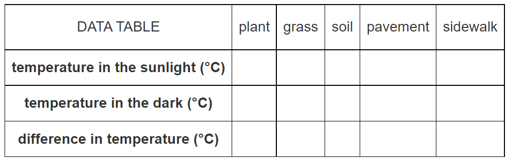
- Wait for the Sun to set.
- Measure the temperature of each surface an hour after sunset. Record the temperature for each object in the second row of the data table.
- Subtract the temperature of each material after dark from the temperature observed during daylight. Record this temperature difference in the bottom row of the data table. Values will vary depending upon student measurements.
- Answer the following questions.
- Which three materials retained the most heat (changed the least)? Answers will vary and should agree with recorded data.
- Which two materials radiated the most heat (were warmest) at night? Answers will vary and should agree with recorded data.
- Which two materials absorbed heat the most readily (warmest daytime temperatures)? Answers will vary and should agree with recorded data.
- Using the infrared thermometer, measure the temperature of each material during the day when it is in direct sunlight. Record the temperature for each object in the first row of the data table. Values will vary depending upon student measurements.
- Modeling Cloud Cover
-
Link to Modeling Cloud Cover
A slide deck with answers in the speaker notes is available.
- Mosquito Habitats
-
a. Which month do you think the Culex pipiens emerged in Memphis, TN in 2020? Answer: March
b. Which month do you think the Culex pipiens emerged in Moline, IL in 2020? Answer: May
c. What might explain the differences? Answer: Moline is at a higher latitude and has lower average temperatures.
d. What do you think will happen if the temperatures increase by two degrees in each location? Answer: The mosquitos will likely emerge days sooner, and the season can last days longer. In both locations, the starting month may not change, but the ending month will likely be one month later.
e. How could the temperature increase impact human health? Since Culex pipiens can transmit disease, this could impact human health due to more possible disease transmission days.
Extensions:
1. Visit the Climate Central site to see the change in mosquito days from the 1980s to the 2010s for Memphis, TN (minus 11 days) and Moline, IL (plus three days). Find the city closest to you and see if it has changed.
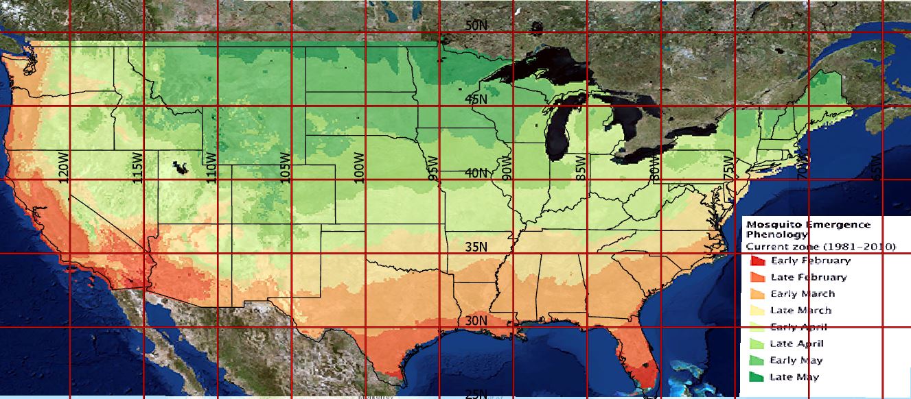
Map of projected first appearance of mosquitoes, based on monthly minimum temperature data. Map data from Anthony Arguez, lmke Durre, Scott Applequist, Mike Squires, Russell Vose, Xungang Yin, and Rocky Bilotta (2010). NOAA’s U.S. Climate Normals (1981-2010). NOAA National Centers for Environmental Information. Courtesy Andrew Clark, IGES. Latitude and longitude grid added by Desiray Wilson, NASA Langley Research Center. 2. Use this image of mosquito emergence from 1981 - 2010 to compare the typical emergence time with the graphs. Note that the Memphis (latitude 35 N, longitude 90 W) climograph temperatures suggest a likely emergence in March of 2020. The emergence map show Memphis in late March. Likewise, the Moline (latitude 40 N, longitude 90 W) climograph temperatures suggest a likely emergence between April and May. The emergence map predicts late April.
3. Alternatively, students can use the Earth System Data Explorer to pull data for their location and create a climograph.
- Mud From the Sky?
-
Try to avoid the misunderstanding that the air originates from the map’s starting point. Share that the map for the exact same time period looks different, as the point of origin for the map is different. The starting point is just the beginning point of data collection, similar to a starting point on a map for driving.
- Check with your instructor on how to submit your answers.
- Trajectory 1 is a backward trajectory, while 2 and 3 are forward trajectories. Explain what this means. Backward means where the air came FROM, ending at a specific location. Forward means where the air is moving TO, beginning at a specific location.
-
Identify the similarities between all three trajectories?
Map 1: The air generally moved from the south to the north, bending eastward.
Map 2: The map shows what states the air moved to or from.
Map 3: The maps show the direction of movement.
-
Explain the difference between all three trajectories?
Map 1: Sometimes the air moved farther.
Map 2: Starting point is different.
Map 3: Paths are somewhat different.
-
Once scientists knew the material came from a dry lake bed, how could these trajectories be used to find the source?
Map 1: The backward trajectory will show where the air was before it dumped the sediment.
Map 2:The maps show the path the air moved.
Map 3: Work backwards, to see where the air passed over a dry lake bed and picked up sediment.
- Multiyear Time Plots for Air Quality Data
-
Link to Multiyear Time Plots for Air Quality Data
Steps:
- Check with your instructor on how to submit your answers.
- Study the tile plot for Oregon and identify:
- The month and year with hazardous air quality. September 2020
- Months that regularly have good air quality. March-June or April-June
- Months that have more potential for poor air quality. October-February (may want to include July or August)
- Make a claim based on the data from Umatilla Country, Oregon.
- What is your evidence?
- What makes this good evidence?
- Fill in the Claims-Evidence-Reasoning table.
- Study the tile plot for Buffalo and make a claim based on the data from Buffalo, New York.
- What is your evidence?
- What makes this good evidence?
- Fill in the Claims-Evidence-Reasoning table.
- Observing Change in Air Temperatures
-
Link to Observing Change in Air Temperatures Mini Lesson
- Answer the questions below. Check with your instructor on how to submit your answers.
- Review the video "Global Surface Air Temperature Anomalies from 1880 to 2017".
- Write a commentary of the events as they happen in the NASA video on global temperatures. A commentary is a descriptive, spoken account about an event or situation. As if you were a NASA broadcaster, you will explain what is happening in this video.
Background:
Earth’s global surface temperatures in 2017 were the second warmest since modern record keeping began in 1880, according to an analysis by NASA. Despite year-to-year changes, average temperatures around the globe remain on a steady, long-term upward trend. In fact, 17 of the 18 warmest years on record have occurred since 2001.Continuing the planet’s long-term warming trend, globally averaged temperatures in 2017 were 1.62 degrees Fahrenheit (0.90 degrees Celsius) warmer than the 1951 to 1980 mean, according to scientists at NASA’s Goddard Institute for Space Studies (GISS) in New York. That is second only to global temperatures in 2016. Last year was the third consecutive year in which temperatures were more than 1.8 degrees Fahrenheit (1 degree Celsius) above late nineteenth-century levels. NASA’s temperature analyses incorporate surface temperature measurements from 6,300 weather stations, ship- and buoy-based observations of sea surface temperatures, and temperature measurements from Antarctic research stations. These raw measurements are analyzed using an algorithm that considers the varied spacing of temperature stations around the globe and urban heating effects that could skew the conclusions. These calculations produce the global average temperature deviations from the baseline period of 1951 to 1980.
See this video for background information.
- Relationship Between Surface Temperature and Vegetation
-
Link to Relationship Between Surface Temperature and Vegetation Mini Lesson
- Answer the questions below. Check with your instructor on how to submit your answers.
- Review the Landsat mapped image showing Vegetation of the Atlanta, Georgia region May 1, 2018. It shows Vegetation Index; it is a measure of how much near-infrared radiation is reflected at the surface and can be used to identify the locations of plants.
- Review the color bar below. On the legend below, areas with a vegetation index closer to 1 contain plant life, while areas less than 0 represent areas that do not contain plant life.
- Select a quadrant to analyze in the image below and answer the questions.
- Where do you find the largest and the smallest values in your quadrant. (Answers will vary. Overall, there is mostly green representing up to 0.6 on the vegetation index. There are concentrations of purple up to -0.4 on the vegetation index mostly in the center of image where the four quadrants meet, as well as near the river.)
- What kinds of environments may exist in an urban environment like Atlanta that would include areas of more/less vegetation? (Parks and suburbs are likely found where the green locations are located; developments where roads, sidewalks, businesses, and homes, etc. are found.)
- Using the vegetation map, make predictions about where you would likely find the hottest and coolest temperatures in the Atlanta metro area. (Answers will vary. The most forested areas will have the coolest temperatures because plants take up water from the ground through their roots and store the water in their stems and leaves. The water eventually travels to small holes on the underside of leaves. There, the liquid water turns into water vapor and is released into the air. This process is called transpiration. By releasing water, plants cool themselves and the surrounding environment.)
- Now observe the surface temperature image from Landsat below and review the color bar. This image shows Surface Temperature, of the Atlanta, Georgia region May 1, 2018; it represents the temperature of the Earth’s surface (expressed in degrees Fahrenheit).
- Now analyze the same quadrant as with the previous map.
- Students answer the the following questions.
- Are your predictions correct? Why or Why not? (Answers will vary.)
- What patterns do you observe? (Generally, the inverse patterns emerges as with the Vegetation map above. The most vegetated are the coolest, while the lease vegetated surfaces are the warmest.)
- What are the tradeoffs to urban development? (The benefit of urban development is that there are more shared communal resources such as transportation. People live within a smaller footprint. The costs are that the developed surfaces create warmer micro climates.)
- Shaconage: Blue Smoke
-
Steps:
- Check with your instructor on how to submit your answers.
- Describe the conditions that contribute to “blue smoke.” High humidity and rainfall, along with volatile organic compounds from plants affect the blue wavelength of light, creating a blue hue to the clouds.
- Explain how the conditions that create the “blue smoke” of this area are different from conditions that cause other aerosol pollutants. Most other pollutants are related to combustion of fossil fuels and manufacturing and do not cause the blue hues in clouds.
- Identify the first people who lived in the area described? Where did they go? The Cherokee Indians lived in this area until they were forced out, and on to reservations in another location.
- Explain the unintended consequences that occurred when European settlers moved in. The settlers brought pigs that mated with wild boars, creating the problem of invasive wild pigs.
- Where would you go to experience “blue smoke” and this location? A trip to the Great Smoky Mountains; Great Smoky Mountains National Park.
- Sky Color and Visibility
-
Link to Sky Color and Visibility
Background
Sky color and visibility are affected by the amount of aerosols, small airborne particles, in the atmosphere. Aerosols can be man-made (anthropogenic) or naturally occurring. Some examples include smoke from fires, volcanic ash, fossil fuels emissions, pollen, and dust. Air molecules and aerosols scatter sunlight, but when more aerosols are present, the color and visibility of the sky can change. See the graphic below from GLOBE showing sky color and visibility scales.
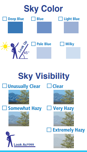
A perfectly clear sky without aerosols will be unusually clear and deep blue. As more aerosols are added to the atmosphere, the sky color will get lighter and the visibility will decrease. In this mini-lesson adapted from GLOBE, students will simulate adding a mystery substance to see the effects of aerosol pollution on sky color and visibility. They will then review information about aerosols as a possible explanation of the mystery substance.
Sky Color Findings
- Describe the difference in color in each circle. The circles got progressively lighter. The shades of blue became lighter as more mystery substance was added.
- What patterns do you observe? As more substance is added the color gets lighter.
- How does the amount of mystery substance affect the color? More substance makes the color lighter.
- Think of the cups as the sky and the color as sky color. How does the amount of mystery substance affect the sky color? It makes the sky color lighter.
- Make a prediction. How do you think the amount of mystery substance will affect visibility? Accept reasonable responses.
Visibility Findings
- How did the amount of mystery substance affect visibility? It reduced the visibility and increased haziness.
- What do you think would happen if we added more of the mystery substance? The sky color would be lighter and the visibility would be even more hazy or less visible.
- What could the mystery substance represent? Accept reasonable responses. Aerosols.
Summarize Findings
- What factors affect sky color and visibility? Aerosols affect sky color and visibility.
- How do they affect sky color and visibility? Aerosols scatter light.
- Surface and Air Temperatures Throughout the Day
-
Link to Surface and Air Temperatures Throughout the Day Mini Lesson
This line graph shows how the surface temperature and air temperature values change over the course of 24 hours. Surface temperatures vary more than air temperatures during the day, but they both are fairly similar at night.
- Review the line graph of surface temperature and air temperature throughout the day and answer the questions below. Check with your instructor on how to submit your answers.
- What do you observe in the line graph of surface temperature and air temperature throughout the day?
- What do you the two different colors represent? Day (orange) vs Night (blue)
- What is the difference between the dashed and the full lines? The dashed lines indicate the Air Temperature, while the solid lines indicate the Surface Temperature.
- How are the variables, surface temperature and air temperature, the same? Different?
- Surface Temperature: This quantity represents the temperature of the first few centimeters at the top of the surface.
- Air Temperature: This quantity refers to the temperature of the air about 2 meters above the surface.
- Describe the X Axis and what it represents.
- The X-axis - The x-axis shows land use areas. Ask students to think about what you will find in the different areas (e.g., When you visit a big city, you won’t see many plants. Instead, you’ll see sidewalks, streets, parking lots and tall buildings. These structures are usually made up of materials such as cement, asphalt, brick, glass, steel and dark roofs). As you head to rural areas, you will probably find that most of the region is covered with plants (grass, trees, and farmland covered with crops).
- Describe the Y Axis and what it represents.
- The Y-axis - The y-axis represents temperature. It should be the same for all four variables. There is no scale because this graphic is a generic representation and doesn't represent any particular geographic region, over a particular time. It shows the general pattern of these changes over a 24-hour cycle over a variety of land-use areas.
- Analyze the line graphs and answer the following questions.
- What do you see? [Answers may vary. Answers may include: Surface temperatures vary more than air temperatures during the day, but they both are fairly similar at night. The temperatures generally increase from the outskirts of the urban areas as you move towards the city center.]
- Describe differences between city and rural areas. The temperatures are generally higher in the cities than the rural areas.
- Explain why these differences might occur. [City-related materials such as black roofs, roads, etc. cause urban areas to absorb and retain heat. Also, the heat produced by automobiles, factories, and homes may also contribute to the higher temperatures.]
- Surveying Earth’s Energy Balance with the Earth System Data Explorer
-
Link to Surveying Earth's Energy Balance with the Earth System Data Explorer
Steps:
- Check with your instructor on how to submit your answers.
- Explain what is being compared between the two data sets. The data sets are comparing the flow of energy into Earth’s surface by shortwave radiation to the amount of energy leaving Earth’s surface by shortwave radiation.
- Describe the term shortwave radiation. Shortwave radiation is visible light coming from the Sun.
- Identify the two factors that can affect the flow of energy to Earth’s surface by shortwave radiation. Clouds and the seasons can affect the flow of shortwave radiation.
- Which factor determines the amount of flow of reflected shortwave radiation? Albedo determines the amount of flow of reflected shortwave radiation.
- The unit used to measure shortwave radiation is called Watts per square meter. What exactly is it measuring? Watts per square meter measures the flow of energy spread out over an area.
- By examining the two data sets, is the amount of shortwave radiation flowing into Earth’s surface equal to the amount of shortwave radiation leaving Earth’s surface? Explain how you know. No. The amount of energy flowing into Earth’s surface is greater than the amount of energy leaving Earth’s surface.
- How does this affect Earth’s Energy Budget? The difference between the amount of energy entering and leaving Earth’s surface causes Earth’s Energy Budget to become unbalanced, warming up the Earth.
- Systems and System Models: Observing Carbon Dioxide in the Atmosphere
-
Link to Systems and System Models: Observing Carbon Dioxide in the Atmosphere
- Check with your instructor on how to submit your answers.
- Describe the phenomenon you observe in the video. Carbon dioxide and carbon monoxide cycle in production, concentration, and location across the globe across the seasons.
- Identify the patterns you see in this model. Answers will vary.
- What are the limits of this model? This model only shows one year of data. Since it shows the whole world, it can be hard to focus in on one place to determine the cyclical patterns of a certain continent or country. With a larger data set, we could analyze the changing patterns over a longer period of time to see the effect on climate change. With a different scale, we could focus on emission areas or other areas of interest.
- What evidence of Earth System interaction (among Atmosphere, Hydrosphere, Biosphere, Cryosphere, Geosphere) do you see? The atmosphere interacts with the biosphere directly as plants use up atmospheric carbon dioxide in spring and summer months. The hydrosphere interacts with the atmosphere as well, as ocean reservoirs absorb some of the carbon dioxide in the atmosphere. The geosphere also interacts with the atmosphere as fire plumes contribute to atmospheric carbon monoxide levels.
- Systems and System Models: Megadroughts in our future?
-
Link to System and System Models: Megadroughts in our future?
Steps:
- Check with your instructor on how to submit your answers.
- Describe the phenomenon you observe. This video shows megadrought across the United States from 1950 through present and then shows projected drought in the US through 2095.
- Identify the patterns you see in this model? Drier areas, such as deserts, are focal points of drought, though the dry conditions eventually spread across the US. Dry conditions tend to worsen over time in this projection.
- What are the limits of this model? This model shows a projection. Since this may not be accurate, it could be clearer where the model transitions from past data to projection. Additionally, the model is focused on North America so the scale could be changed to make it easier to look at smaller or larger regions. Since this visualization is a video, it moves very quickly, making it difficult to really analyze the data presented. Having fewer frames per second in the visualization could give students more time to view and interpret the data.
- What evidence of Earth System interaction (among Atmosphere, Hydrosphere, Biosphere, Cryosphere, Geosphere) do you see? The water cycle is an important aspect of drought. This involves the interaction of all of the spheres. The hydrosphere and atmosphere interact with evaporation and condensation. The volume of water in the hydrosphere increases with the melting of ice in the cryosphere. The geosphere and biosphere are affected by drought, changing Earth surface conditions, vegetation, and water supply.
- Systems and System Models: Observing Our Planet on Fire
-
Link to Systems and System Models: Observing Our Planet on Fire Mini Lesson
Accept reasonable responses for all questions. Some possible answers are outlined below.
- Describe the phenomenon you observe. Global impact of smoke from fires
- What patterns do you see in this model?
- From South America smoke is carried far into the Atlantic.
- Smoke from Southern Africa is also carried into Atlantic.
- Fires in Northeast India produce thick smoke which is trapped by the Himalayas.
- Unusually large human set fires in Indonesia create haze and reduce air quality and visibility.
- Australian fires mostly ignited by lightning burn on eastern and southern coasts, and the smoke is sucked into the constant swirl of storms around Antarctica and mixed with sea salt.
- Africa is home to 70% of world’s fires and smoke merges with dust from Sahara and travels across the Atlantic.
- Fires are common in dry season in South America and Southern Mexico.
- Fires in North America are more rare and occur in the Southeast and Mississippi River Valley.
- Southeast Asia fires extend 1000s of miles and reach distant lands.
- What are some limits of this model? The entire Earth cannot be seen at once. Specific events may not be included.
- How is this model precise? It does capture some specific events such as the volcano. It shows the different types of aerosols in the atmosphere such as smoke, sea salt and dust. It shows wind patterns.
- What benefits are there in using this model? It may help predict the impact of large fires in different parts of the world.
- Predict the future of the phenomenon based on the model you've observed. Fires in different parts of the world are likely to follow similar patterns of smoke transport.
- What evidence of Earth System interaction (among Atmosphere, Hydrosphere, Biosphere, Cryosphere, Geosphere) do you see?
- Biosphere is burning and impacting atmosphere with smoke.
- Farmers ignite fires to clear fields for new crops (biosphere) which impacts atmosphere.
- Smoke from Australian fires is sucked into storms formed around Antarctica (cryosphere) and mixed with sea salt from the Hydrosphere.
- Volcanic eruptions (geosphere) can emit smoke into the atmosphere as well.
- Tropical Cyclone Count Bar/Column Chart
-
Link to Tropical Cyclone Counts Bar/Column Chart Mini Lesson
Number of Tropical Cyclones by Latitude
https://mynasadata.larc.nasa.gov/sites/default/files/2022-01/Bar_column%20chart%20cropped.png
Steps
- Analyze the Tropical Cyclone Counts double bar graph and answer the questions.
- Check with your instructor on how to submit your answers.
- At 14° north, how many more tropical cyclones were at 60° east than at 65° east? 7 more
- At 60 degrees east, how many more tropical cyclones were at 14° north than at 15° north? 9 more
- What was the total number of tropical cyclones at each latitude between 60° and 65° east?
- 10° N – 10 tropical cyclones
- 11° N – 3 tropical cyclones
- 12° N – 20 tropical cyclones
- 13° N – 15 tropical cyclones
- 14° N – 23 tropical cyclones
- 15° N – 14 tropical cyclones
- 16° N – 9 tropical cyclones
- 17° N – 13 tropical cyclones
- 18° N – 13 tropical cyclones
- 19° N – 21 tropical cyclones
- 20° N – 30 tropical cyclones
- In table form:
- Which latitude had the highest total number of tropical cyclones at these longitudes? 20 degrees north
- How many fewer total tropical cyclones were at 15° north than at 14° north at these longitudes? 9 fewer
- Tropical Cyclone Counts Box Plot
-
Link to Tropical Cyclone Counts Box Plot Mini Lesson
-
The box plot below shows the number of tropical cyclones at 120 degrees west for each degree of latitude from the equator to 40 degrees north; the same as represented along the red line in the mapped image below. Analyze the box plot and answer the questions that follow. Check with your instructor on how to submit answers.
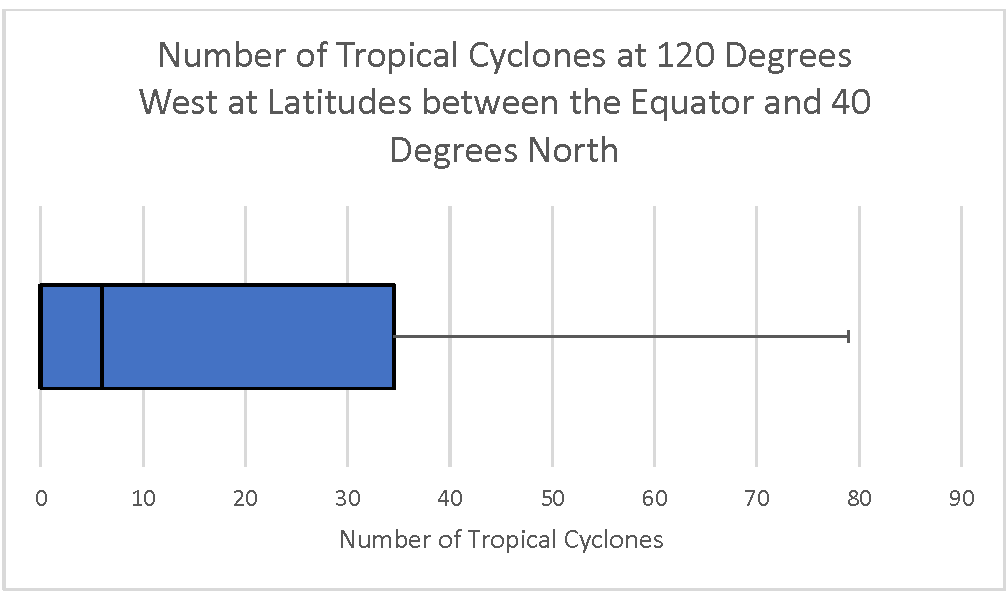
Number of Cyclones at 120 degrees west at latitudes between the equator and 40 degrees north
https://mynasadata.larc.nasa.gov/sites/default/files/inline-images/Box%20Plot%20120%20West%20horizontal_0.png
- What does the box plot show? accept reasonable responses. What does it NOT show? Accept reasonable responses including that it does not show the number of tropical cyclones at particular latitudes. It also does not have a lower whisker. This is because the data are skewed. More than the bottom quartile are all zero. Therefore, there is no whisker. Fifty percent of the dat are from zero to the median at 6.
- What is the overall distribution of the box plot? Is it skewed right (with a longer whisker on the right)? Skewed left (with a longer whisker on the left)? The range is from 0 to 79. The bottom 25% of the data is all the same value (0). The median is much lower than the maximum. It is skewed right, meaning that it looks like it has a tail on the right. This is easier to see if it is horizontal.
- What does the shape of the distribution tell you? Accept reasonable responses including the following. Some latitudes have no tropical cyclones. The median is 6. The maximum is 79. Most latitudes didn’t have many tropical cyclones. A few had a high frequency. 50% of the latitudes had 6 or fewer tropical cyclones. 25% had between 6 and 34, 25% had more than 34.
- What are the maximum, minimum, range, median, first quartile, third quartile, and interquartile range? Maximum- 79; Minimum- 0; Range- 0-79; Median- 6; First quartile 0; Third quartile 34; Interquartile range 34.
-
The map below shows is a thick line at 120 degrees west from the equator to 40 degrees north; the same locations represented in the box plot. (The Tropical Cyclone Counts map was generated in the My NASA Data Earth System Data Explorer. ) Now, compare the box plot to the map image and answer the following questions.

Tropical Cyclone Counts Map showing a line at 120 degrees west from the equator to 40 degrees north
https://mynasadata.larc.nasa.gov/sites/default/files/2022-02/Tropical%20Cyclone%20count%20120%20W.png
- Which visualization shows the number of tropical cyclones at each latitude? map
- What kind of questions about tropical cyclones can you ask that a box pot will help you answer? Accept reasonable responses.
- What do you wonder from the box plot? Can you answer it with the box plot, or do you need to see the data in a different way? Accept reasonable responses.
-
- Tropical Cyclone Counts Histogram
-
Link to Tropical Cyclone Counts Histogram Mini Lesson
- The histogram provided shows the number of tropical cyclones at 120 degrees west for each degree of latitude from the equator to 40 degrees north; the same as represented along the red line in the mapped image below.
- Analyze the histogram and answer the questions that follow. Check with your instructor on how to submit answers.
- What does the histogram show? Accept reasonable responses, including: Most of the latitudes have had few hurricanes. Only a few latitudes had 70 or more tropical cyclones. The total number of latitudes can be calculated by adding the height of each column. It is 40.
- Describe the shape of the distribution of the histogram. Is it skewed left with a long "tail" of data on the left? Skewed right with a long "tail" of data on the right? Uniform (with the data spread equally across x-axis)? Bell shaped? U-shaped? skewed right
- What does the shape of the distribution tell you about the location and frequency of tropical cyclones? Most of the latitudes had few tropical cyclones, or hurricanes.
- What does it NOT show? Accept reasonable responses, including: It does not show the number of hurricanes at each latitude. It also does not show the total number of tropical cyclones at other lines of longitude.
- Compare the histogram to the map image?
- Which visualization, map or histogram, shows the number of tropical cyclones at each latitude? map
- Which visualization, map or histogram, displays the number of latitudes with 6-10 tropical cyclones? histogram
- What kind of questions about tropical cyclones can you ask that a histogram will help you answer? Accept reasonable responses.
- Tropical Cyclone Counts Model
-
Link to Tropical Cyclone Counts Model Mini Lesson
Use the Tropical Cyclone Counts Map Image to answer the questions. Check with your instructor on how to submit your answers.
- What does the information on the map show? It shows how many tropical cyclones there have been between 1842 and 2018 across the world.
- What do the dark colors on the map represent? Darker colors represent a higher number of tropical cyclones at a location between 1842 and 2018. The darkest color is the most.
- Point to a spot on the map that is not white. How many tropical cyclones, or hurricanes, have there been at that spot between 1842 and 2018? Answers will vary.
- Where do the most hurricanes form? The most hurricanes form in the bodies of water between 10 and 30 degrees north of the equator.
- What do you notice about the image? Answers will vary. there are more tropical cyclones in the Pacific Ocean than in the Atlantic Ocean. They tend to form north of the equator but not much above 40 degrees north. There are also tropical cyclones in the southern hemisphere.
- What questions do you have about the image? Answers will vary.
- Tropical Cyclone Counts Scatter Plot
-
Link to Tropical Cyclone Counts Scatter Plot Mini Lesson
-
The Number of Tropical Cyclones at 120 Degrees West Scatter Plot shows the number of tropical cyclones at 120° west for each degree of latitude from the equator (0°) to 40° north; the same as represented along the red line in the mapped image below.
Scatter plot - number of tropical cyclones at 120 degrees west
https://mynasadata.larc.nasa.gov/sites/default/files/inline-images/thumbnail.png - Analyze the scatter plot to answer the questions follow. Check with your instructor on how to submit your answers.
- What does the scatter plot show? What does it NOT show? Accept reasonable responses. It shows how many tropical cyclones, or hurricanes, were at each whole number latitude from 0 to 40 degrees north at the longitude of 120 degrees west. It does NOT show latitudes that are not whole numbers. It does NOT show latitudes outside the 0 to 40 degree north range. It does NOT show any other longitudes in the world.
- Is the plot linear (do the points appear to lie close together along a straight line) or nonlinear (do the points appear to form a curve)? Nonlinear
-
The image shows the number of tropical cyclones around the world from 1842 – 2018. There is a thick line at 120 degrees west from the equator to 40 degrees north; the same as represented by the scatter plot. The Tropical Cyclone Counts map was generated in the My NASA Data Earth System Data Explorer. Now compare the scatter plot to the map image and answer the following questions.
Tropical Cyclone Counts Map showing a line at 120 degrees west from the equator to 40 degrees north
https://mynasadata.larc.nasa.gov/sites/default/files/2022-02/Tropical%20Cyclone%20count%20120%20W.png- Which visualization, the scatter plot, map or both, shows the number of tropical cyclones at each latitude? both the graph and the map.
- Which data visualization, the scatter plot or map, best helps you answer questions about specific number of tropical cyclones at specific locations? The graph could be more precise if it shows the location you want.
- Which data visualization, the scatter plot or map, best helps you answer questions about tropical cyclones around the world? map
- What kind of questions can you ask about tropical cyclones that a scatter plot can help you answer? Accept reasonable responses asking about how the locations and number of cyclones are related.
-
- Using Graphs: Identify and Interpret
- Valuing Albedo
-
Steps:
- Check with your instructor on how to submit your answers.
- How does albedo play an important role in Earth’s Energy Budget? Albedo is the fraction of the sun’s energy that is reflected back into space.
- What reflects the most sunlight and has the biggest impact on Earth’s albedo? Bright, white clouds.
- Contrast lighter colors and darker colors in terms of reflection. Lighter colors show more reflection whereas darker colors show less reflection.
- How do humans modify Earth’s albedo and impact the global energy balance? Human activities such as ship tracks, jet contrails, agricultural burning, and land-use change, all modify Earth’s albedo.
- View the bar graph Albedo of Common Surfaces.
- Identify the surface with the highest albedo. What does this indicate about the reflectivity of this surface? The surface with the highest albedo is snow. This indicates that snow reflects much of the Sun’s energy.
- Name the surface with the lowest albedo. What does this indicate about the reflectivity of this surface? The surface with the lowest albedo is asphalt (black top). This indicates that asphalt absorbs more energy from the Sun than it reflects.
- What are two other surfaces that have low albedos? Answers may include the moon, a dark roof, crops/grasslands, and forests.
- Describe the relationship between color of a surface and its reflectivity. Darker colored surfaces reflect less of the Sun’s energy than lighter colored surfaces.
- Predict what would happen to Earth’s Energy Budget if the snow started to melt. Answers may vary. Students might make a connection to melted snow joining ocean water and absorbing more of the Sun’s energy than reflecting it.
- What is Albedo?
-
Link to What is Albedo? Mini Lesson
- What is albedo? The fraction of the incoming Sun's energy that is reflected.
- What do the colors represent in the weekly maps of reflected solar radiation for the past 10 years? Lighter colors show more reflection and darker colors show less reflection.
- How do these colors relate to albedo? Lighter colors represent a higher albedo than darker colors.
- Why is albedo important for Earth's climate? Incoming solar energy must equal outgoing energy. The amount of energy absorbed and reflected can impact this balance.
- What pattern did you notice? More reflected energy where there are persistent clouds, dust, smoke and pollution and snow and ice. Also, albedo increases at the poles during their respective fall and winter seasons and decrease in their respected summer months. Missing data peaks at the poles in their respective summers. Deserts have a higher albedo than areas with a lot of vegetation.