Check with your instructor on how to submit your answers.
What is the range of values shown on the scale bar? 0-100
Where in the world do you find the highest and lowest extreme values of the data in your images? The highest extreme values are in the Arctic regions, beginning as far South as the middle of Asia. The lowest extreme values are those surrounding the equator through the oceans.
Identify the patterns that you see. Regions that are closer to the North and South poles have higher extreme values of ice, while those closer to the equator have lower extreme values. The data varies over water. The levels of ice tend to remain lower over the water than over the land.
Predict what month this plot to represents and give evidence for your prediction. This plot represents January. There is more ice in the Northern Hemisphere, indicating that this is the winter in the Northern Hemisphere.
What changes do you observe? There is now more ice in the South Pole region.
Choose a location or region to compare both maps. If there was a change, explain why it happened. Students will choose a location and compare. What explanations can you suggest for the timing of those extremes? Winter occurs during different months for the North and South Hemispheres.
Identify and explain why some regions experience both extreme highs and lows and some do not. Northern regions of North America and Asia experience both the highs and the lows. Regions surrounding the border between the extreme highs and lows do not experience such extreme values because they allow the transition between the extremes.
Explain why some regions remain relatively unchanged over the year. Regions that remain relatively unchanged are those surrounding the equator and those at the extreme poles in the Arctic and Antarctic regions. This occurs because these regions are constantly hot and cold, respectively, regardless of the season.
Predict what month this plot to represents and give evidence for your prediction. This month represents July. It is summer in the Northern Hemisphere, as there are not as many extreme lows there, while it is winter in the Southern Hemisphere where there are more extreme lows.
Check with your instructor on how to submit your answers.
Identify the range of methane emissions displayed on the model. The model in the video shows a range of methane concentrations from 1800 ppb (parts per billion) to 2100 ppb.
Identify and describe two anthropogenic sources of methane emissions. Answers Vary - the following are identified in the video: Rice cultivation and livestock, use of fossil fuels.
Identify and describe two natural sources of methane emissions. Answers Vary - the following are identified in the video: Seasonal flooding of wetlands, thawing permafrost.
Develop a scientific question that could lead to an investigation about a particular source of methane emissions. (QUESTION DEVELOPMENT GUIDELINES: The questions SHOULD NOT be rhetorical in nature, the questions SHOULD NOT be able to answered with Yes/No, the questions SHOULD be able to lead to a specific hypothesis, generally cause and effect questions are harder to answer (but not necessarily inappropriate for this exercise), guide your students to develop questions that help with identifying correlations.) Answers Vary - the following are examples: How will changes in precipitation in the Arctic region impact methane emissions? How will construction of a fossil fuel pipeline affect methane emissions? What type of agricultural activities result in the highest methane emissions? How can methane emissions from rice cultivation be reduced?
Identify the range of methane emissions displayed on the model. How does this compare to the movie model? The model in the video shows a range of methane concentrations from 1.74 ppm (parts per billion) to 1.98 ppm. Note that a part per billion is 1000 times smaller than a part per million. Therefore to compare the datasets, it may be useful to change the concentration to 1,740ppb to 1,980 ppb for the Alaskan Region emissions.
Use specific data to describe a seasonal trend observed in methane emissions in the Alaska region. Answers Vary - but descriptions should always be supported to include specific data as evidence as opposed to simply noting general directional trends. The following is an example: Methane concentrations over in the north interior of Alaska (~58oN, 156oW) show a consistent seasonal increase from winter to late summer/early fall. Winter methane concentrations display a lower value around 1.90ppm while late summer/early fall show values at the highest range of 1.98ppm.
Explain how seasonal trends affect carbon cycling, including methane emissions in the Arctic region.
Answers Vary - the following are examples. The Arctic range is snow and ice covered in the winter months. These conditions limit the amount of carbon exchanged between the geosphere and the atmosphere. As seasonal temperatures rise, rates of decomposition increase and previously frozen soils that are saturated and have limited oxygen will emit methane.
Permafrost is extensive in the Arctic range. This is ground that remains completely frozen for at least two years. If the seasonal thaw period is extended, the greater the depths to which the soils will thaw. This increases the amount of thawing permafrost soils which result in a release of trapped carbon in the geosphere to the the atmosphere. When freezing occurs this condition in reversed and plant/organic material that has taken up atmospheric carbon becomes trapped in the frozen soils.
Refer to the Earth’s energy budget diagram below to discuss how methane emissions in the Arctic are part of a positive feedback loop that is associated with an increasing rate of warming Arctic temperatures. Since methane is a potent greenhouse gas, when it is emitted from the geosphere into the atmosphere it will affect the how energy is transferred in the atmosphere since it traps longwave radiation (terrestrial radiation). The more longwave radiation is trapped in the atmosphere, the greater the amount of longwave radiation stays in the atmosphere and is not allowed to escape the Earth’s system. This causes and increase in Earth’s surface temperatures as more energy is now available to warm the Earth’s surface. As Earth’s surface warms, more methane is potentially emitted from the thawing of frozen Arctic soils (permafrost) which then leads to higher concentrations of greenhouse gases in the atmosphere.
Watch the video from NASA's Goddard Space Flight Center.
As the video displays, Arctic sea ice reaches its minimum each September. Review the graph of Average Annual September Sea Ice Extent from NSIDC/NASA. This graph demonstrates the average monthly Arctic sea ice extent each September since 1979, derived from satellite observations.
Answer the following questions about the graph. Check with your instructor on how to submit your answers.
Which year has had the lowest recorded Arctic sea ice? 2012
Which year had the highest recorded Arctic sea ice? 1980
What is the overall trend in the annual Arctic sea ice minimum? It is declining.
What factors might explain the trend in the annual Arctic sea ice minimum? More ice is melting and not as much is forming. Albedo can be one contributing factor.
The Link between Albedo and Sea Ice
Answer the following questions about the short animation from NASA Scientific Visualization Studio. Check with your instructor on how to submit your answers.
What do you notice about the areas of increased solar radiation? This visual shows that NASA satellite instruments have observed a marked increase in solar radiation absorbed in the Arctic since the year 2000 – a trend that aligns with the drastic decrease in Arctic sea ice during the same period.
What do you notice about the areas of decreased sea ice? While sea ice is mostly white and reflects the sun's rays, ocean water is dark and absorbs the sun's energy at a higher rate.
What is the connection between the two images? A decline in the region's albedo – its reflectivity, in effect – has been a key concern among scientists since the summer Arctic sea ice cover began shrinking in recent decades. As more of the sun's energy is absorbed by the climate system, it enhances ongoing warming in the region, which is more pronounced in the Arctic than anywhere else on the planet.
Exit Ticket
Summarize the link between albedo and sea ice as an exit ticket. Check with your instructor on how to submit your answer. The influence of sea ice on the Earth is not just regional; it’s global. The white surface reflects far more sunlight back to space than ocean water does. (In scientific terms, ice has a high albedo.) Once sea ice begins to melt, a self-reinforcing cycle often begins. As more ice melts and exposes more dark water, the water absorbs more sunlight. The sun-warmed water then melts more ice. Over several years, this positive feedback cycle (the ice-albedo feedback) can influence global climate.
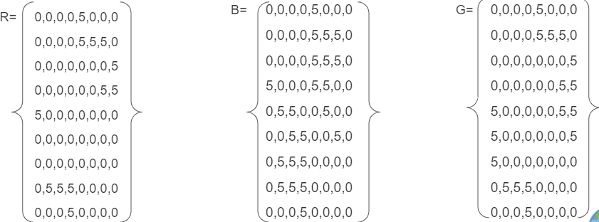
Answer the following questions if the data are wind speed in km per hour.
What color is the fastest? white Slowest? black
Where is the wind between 21-25 km per hour? red squares or the color chosen
Answer the following questions if the numbers are elevation in meters above sea level.
What color is the lowest? black Highest? white
Where is the elevation between 31 and 35 meters above sea level? white squares
Do you notice any pattern in the image? Accept reasonable responses. The highest values are in the center. Numbers decrease the farther they are from the center. Learners are likely not to think the red color would be the highest, which is not the case.
How does the size of the grids in the grid paper affect the image that you created? Accept reasonable responses. Smaller grids can have different values which can provide more detail. Larger grids will provide less detail.
Which do you think would be more realistic, larger grid sizes or smaller? Why? Accept reasonable responses. Smaller grids will provide more detail, which can be more realistic.
Students work in groups of four. Each member within the group will become an expert on one of the resources below. (All resources are found in the Google Slide provided.) Students spend five minutes observing and analyzing the data with the expectation that they need to be able to explain the data's pattern and trends to their groups.
After time to analyze data has passed, students fill out their square on the chart (on the PDF or Google Slide). Students with the same resource come together to discuss what they learned. Students address the following questions in the space for each resource.
Summarize your resource clearly.
What do you still need clarification on from within your resource?
What was the significance of the information you learned
Now the original group of four from Step 1 return together. Each member has two minutes to summarize what their resource group has discussed. Students need to fill in the other three parts as group members shares. They can use the questions above as a guide for what they should share out.
After each member had a chance to share their summary, together the groups need to answer:
What do the data tell you?
What was similar within resources?
What was different?
For all questions, accept reasonable responses.
After analyzing the various data visualizations, students should claim that the average global sea level has increased over the last 20 years and will likely connect the effects of land ice melt to this phenomenon. Students should also observe that sea level change does not happen evenly over the globe; some sea levels in the global ocean are increasing while others decreasing, and still other regions are staying relatively the same over time. They should cite evidence from the data table that land ice in Greenland and Antarctica has melted since 2002. Students will likely deduce that this land ice melt is contributing to global sea level change.
Check with your instructor on how to submit your answers.
Explain why the Arctic is more sensitive to warming then other regions on Earth. Albedo changes when snow and ice melt. This leads to increased energy absorption and more warming.
Review the circle diagram. Explain what you think is the relationship between melting sea ice, lowered albedo, and increasing solar radiation. When sea ice melts, albedo is lowered. That leads to more energy being absorbed. That leads to more ice melting and lowering the albedo even more.
Identify what role sea ice plays in polar bears' lives. Accept reasonable responses.
Think of another animal that may be affected by changes in sea ice. How would this animal be affected? Accept reasonable responses.
Explain how changes in sea ice extent could benefit some animals. Accept reasonable responses including that some animals such as the bowhead whale may gain habitat.
Can you think of another animal that may benefit from changes in sea ice extent? How would this animal benefit from the changes? Accept reasonable responses.
Exit Ticket
Explain how albedo can be linked to changes in habitats for polar bears and bowhead whales. Accept reasonable responses. Example: The albedo changes have led to a loss of sea ice which has decreased the polar bear habitat area and increased bowhead whale habitat area.
What can happen to the energy as it travels through the Earth system? It can be reflected or absorbed.
Where does the largest percentage of energy go in the Earth system? It is absorbed by land and oceans.
What kinds of ways is the energy used once it enters the Earth system (i.e., Hydrosphere, Atmosphere, Biosphere, etc.)? Accept reasonable responses. Energy that is absorbed can heat the surface and land (geosphere), atmosphere, and oceans (hydrosphere). Energy can also be used by plants for photosynthesis (biosphere).
What is the role of the atmosphere (including clouds) as it relates to Earth’s energy? The energy can be both reflected and absorbed by the atmosphere and by clouds.
Check with your instructor on how to submit your answers.
What time period does this video show longwave radiation on Earth? 01/26/2012 - 01/27/2012
What colors represent areas where the most energy is being emitted out to space? brightest yellow
What are the units of these measurements? Watts per square meter
Where do you expect to find the warmest temperatures? where the atmosphere is transparent Coldest? where you find clouds, aerosols, or bright surfaces
What drives Earth's climate engine? Sun
What parts of the Earth system absorb the most energy? Oceans and land. What evidence do you have to support this claim? The oceans consistently show the highest values in the 300-380 range. Some parts of the Earth's geosphere also show these large values, too.
Check with your instructor on how to submit your answers.
What time period does this video show shortwave radiation on Earth? from January 26 and 27, 2012
What colors represent areas where the most energy is being reflected back out to space? brighter, whiter regions show where more sunlight is reflected Least energy? blue
What are the units of these measurements? Watts per square meter
What drives Earth's climate engine? The Sun's radiant energy
What system of the Earth system is constantly adjusting to maintain a balance between the energy that reaches the Earth from the Sun and the energy that flows from the Earth back out to space? Atmosphere
What parts of the aforementioned system reflect energy back to space? clouds, aerosols, bright surfaces
Review the NASA Climate Bits: Albedo video and answer the following questions. (Check with your instructor on how to submit your answers.)
What is albedo? The fraction of the incoming Sun's energy that is reflected.
What do the colors represent in the weekly maps of reflected solar radiation for the past 10 years? Lighter colors show more reflection, or higher albedo, and darker colors show less reflection, or lower albedo.
Why is albedo important for Earth's climate? Incoming solar energy must equal outgoing energy. The amount of energy absorbed and reflected can impact this balance.
What pattern did you notice? More reflected energy where there are persistent clouds, dust, smoke and pollution and snow and ice. Also, albedo increases at the poles during their respective fall and winter seasons and decrease in their respected summer months. Missing data peaks at the poles in their respective summers. Deserts have a higher albedo than areas with a lot of vegetation.
Why do you think there are missing data at the poles during their winter seasons? There is little to no sunlight arriving at the poles during these times. Therefore, there is no sunlight to reflect.
How can humans impact albedo? Contrail and ship trails can temporarily raise albedo. Land use change and burning can also change albedo.
1. Check with your instructor on how to submit your answers.
2. Watch this animation and answer the questions below:
Which latitudes in the Northern Hemisphere (i.e., Arctic, Northern Mid Latitudes, or Tropics) experience the most change in snow and ice extent over the course of a year? Northern Mid Latitudes
During what months do you predict to have the largest amount of frozen soil conditions in the Northern Mid Latitudes? Nov-Jan Thawing soil conditions in the Northern Mid Latitudes? March - August
Describing the Arctic’s Land Surfaces
3. Analyze the maps below to orient yourself to the geographic region being analyzed in the blue and red maps that follow. Answer the following questions.
What is the location that the map is focused on? We are looking at the Arctic in the northern hemisphere
What variable is being analyzed? The state of H2O in the soil changing from solid to liquid during spring thawing, based on the temperature of the soil.
Describe what the shades of red indicate about soil conditions mean? Water within the soil is in the thaw (liquid) state. White?The ratio of the frozen soil to thawed soil equals 0.5.Blue? Water within the soil is in the frozen (solid) state.
What two dates are being compared? April 1st, 2015 and April 13, 2015
The two maps are 12 days apart. What do you predict would happen in 12 more days? Why?There would be more thawing even closer to the North Pole. The hours of daylight increases as we move from winter to spring and the illumination of solar energy increases at the poles, the bright white snow and sea ice reflect a significant portion of the incoming light, reducing the potential for solar heating.
When the surface changes from blue to red, what happens to the environment of that area? Rapid warming releases liquid water. As liquid water becomes more readily available, plant and animal activity are energized. The land greens up, and animals return to graze.
Check with your instructor on how to submit your answers.
Describe the long-term trend that is depicted by the analysis of the polar sea ice covers for the past 40 years. The trend show a decreasing in sea ice over 40 years.
Describe what ICE-SAT2 measures? Sea ice thickness.
Explain why this measurement is important? It will help scientists understand the changes in the Arctic. Seasonal ice is thinner, more saline and weaker while older ice is fresher, stronger and more resilient.
How does sea ice thickness relate to the annual Arctic sea ice minimum extent? If the minimum extent is decreasing, it means that not only seasonal ice is melting. Older sea ice is also melting. If the overall thickness of the ice is decreasing, it suggests the minimum extent is also likely decreasing.
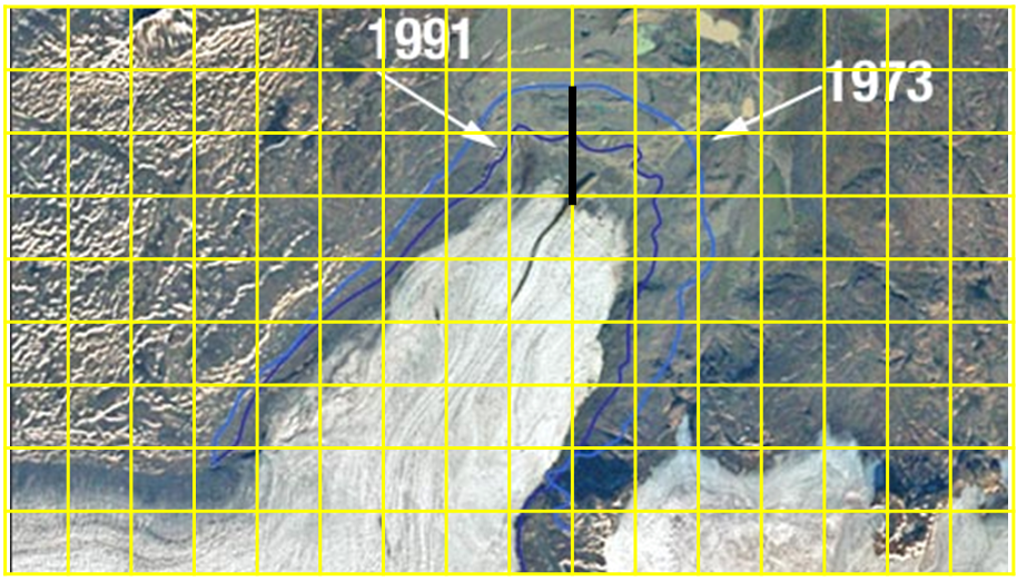
Refer to the image to answer the questions. Check with your instructor on how to submit your answers.
Each box on the image represents 1 km2. Using the conversion 1 kilometer = 0.62137 miles, what is the area of each box in square miles? 1 km2* 0.62127 miles/km * 0.62137miles/km = 0.3861miles2
The change in shape is not the same everywhere. Use the locations shown by the black line on the image to estimate the answer to the question.
How many meters did the glacier retreat between 1973 and 1991? 1991 and 2000? Since this is an estimate, accept reasonable responses.
For 1973 to 1991 - Approximately 0.8 to 0.9 km or 800 to 900 meters
For 1991 to 2000 - Approximately 1.1 km or 1100 meters.
From your answers to Problem 2:
What is the average rate of retreat in meters per year between 1973-1991 and 1991 to 2000?
1973-1991 example: 900 meters / 18 years = 50 meters/year
1991-2000 example 1100meters/9 years = 122.2 meters/year
Is the retreat of the glacier speeding up or slowing down? speeding up because the rate was higher for 1991-2000
What possible explanation do you have for your answer to question 4? accept reasonable responses
Check with your instructor on how to submit your answers.
Describe the phenomenon you observe. This video shows snow and sea ice in the Northern and Southern Hemispheres pulse at exact times of the year from 2011 - 2012.
Identify the patterns you see in this model. This model shows the extent in change at the poles. The northern hemisphere shows a growth of snow and sea ice during the months of November 2011 thru March 2012. The southern hemisphere shows the opposite, showing growth during the winter Months of April 2012 thru August 2012.
What are the limits of this model? This model is depicting the pulse in growth and recession of snow and sea ice at the end of 2011 and all of 2012. It does not show other years to fully compare overall changes that may be occurring at the poles.
What evidence of Earth System interaction (among Atmosphere, Hydrosphere, Biosphere, Cryosphere, Geosphere) do you see? The water cycle is an important aspect of snow and sea ice. This involves the interaction of all of the spheres. The hydrosphere and atmosphere interact with evaporation and condensation. The volume of water in the hydrosphere increases with the melting of ice in the cryosphere. The geosphere and biosphere are affected by changes in season, changing Earth surface conditions, vegetation, and water supply.
Check with your instructor on how to submit your answers.
Review the various images of the Earth's Cryosphere.
Identify at least three different forms of ice that are shown in the video. Any of these three: Alpine glaciers, tidewater glaciers, ice sheets, sea ice, snow.
Describe how ice can moderate temperatures on Earth? Ice's white surface reflects sunlight back into space, while ocean water and land absorbs the sun's energy.
What NASA satellite missions are studying ice? GRACE, Terra's MODIS, and ASTER.
Describe what is happening to the annual sea ice minimum? The Annual Sea Ice minimum is shrinking in the Arctic Ocean.
Why does NASA study ice from space? Studying ice from space helps scientists understand the global effects of climate change.
Check with your instructor on how to submit your answers.
Answer the Exit Ticket Question:
How do visualizations (which show phenomena on a different time scale) help scientists understand what is happening?
Harsh snows have blanketed Antarctica for so long that the continent has built up an ice sheet a mile thick from bedrock to surface in most places. Despite the ice cap's grip on the rocky landmass below, friction can only hold back the ice so much. This map from NASA reveals icy Antarctica as a landscape of constant movement. NASA scientists at the Jet Propulsion Laboratory and University of California, Irvine have charted this movement for the first time, using Canadian, Japanese and European satellite data to create a record of the speed and direction of ice flow across the entire continent. The map reveals glaciers and tributaries in patterned flows stretching hundreds of miles inland, like a system of rivers and creeks. Slow-moving flows found in largely unexplored East Antarctica defied previous understanding of ice migration. And scientists discovered a ridge that splits Antarctica from east to west.
In the first video, slow, interior flows have been sped up to make them more visible. The colors represent the real flow velocity magnitude.
In the second video, all flows are shown at the same scale. At this scale, only the fastest flows are visible.
In the third video, velocity magnitude colors have been removed and the direction of glacial flow stands out clearly against the icy background.
2. Answer the following questions. Check with your instructor on how to submit your answers.
In what seasons do you expect a change in albedo in the Arctic to have the greatest impact in the amount of sunlight absorbed and reflected at the surface? Answers will vary.
Think-Pair-Share:
How does the amount of solar energy received by the Arctic change with the seasons? In the winter months, the polar regions receive less solar energy; during the summer months, the polar regions receive more solar energy.
Why does albedo change seasonally in the Arctic? The albedo of the Arctic changes over the seasons; the albedo decreases and the rate of absorbed solar radiation increases in the Arctic in June, July and August; during the winter months, albedo increases and the rate of absorbed solar radiation decreases.
What is albedo? It is the measure of the percentage of the incoming solar radiation (sunlight) is reflected by a surface.
How does the albedo of ice compare to the albedo of the ocean? The ocean has a lower albedo so more energy is absorbed, where as ice has a higher albedo so more energy is reflected by its surface.
Check with your instructor on how to submit your answers.
What do these graphs show? Both graphs show the seasonal cycles of snow and ice percent coverage in a given area, which depict warming and cooling trends each year from 2000 to 2018.
What variable is on the horizontal axis? The variable on the X-axis shows the time scale from 2000 - 2018.
What variable is on the vertical axis? The variable on the Y-axis shows the percentage of ice/snow coverage.
What is the maximum value for the vertical axis? 100.0 percent.
What pattern do you see for the sea ice? The graph shows significant decreases in the seasonal cycles of snow/ice percent coverage for a certain time for each year (around 82 - 86 percent) which may be depicting the summer months. The warmest periods are recorded in 2000 - 2002 and 2010 - 2011.
What pattern do you see for the land ice? The graph shows that values on land show a much lower decrease in percent coverage during the summer months (around 70 percent). The warmest periods being around 2000 - 2003 and 2010 - 2012.
What are the differences? Both graphs show similar warming trends during the seasonal cycles from 2000 - 2018, however sea ice tends to have higher percent coverage than on land in the arctic. Additionally, both graphs show that the cooling trends on land tend to be more short-lived than sea ice.
2. What color do you see the most of along the edges of the ice shelves? The red color fades to blue at the edges.
3. What do these data mean about the thickness of the ice sheets?
The visualization shows the interaction of modeled ocean currents and Antarctic ice shelves, where red areas represent ice thicker than about 1,800 feet (about 550 meters) and blue areas represent ice thinner than about 650 feet (about 200 meters). Notice how the ice shelves generally become thinner- a rainbow of colors indicates intermediate thicknesses- as they extend farther from land.
4. What factors may contribute to this phenomenon?
There are warm ocean currents moving around the coast of Antarctica. These currently are indirectly increasing global sea levels. These currents flow around the continent's frozen edges and beneath the floating ice shelves. They are slowly melting the ice from below.
What is albedo? The fraction of the incoming Sun's energy that is reflected.
What do the colors represent in the weekly maps of reflected solar radiation for the past 10 years? Lighter colors show more reflection and darker colors show less reflection.
How do these colors relate to albedo? Lighter colors represent a higher albedo than darker colors.
Why is albedo important for Earth's climate? Incoming solar energy must equal outgoing energy. The amount of energy absorbed and reflected can impact this balance.
What pattern did you notice? More reflected energy where there are persistent clouds, dust, smoke and pollution and snow and ice. Also, albedo increases at the poles during their respective fall and winter seasons and decrease in their respected summer months. Missing data peaks at the poles in their respective summers. Deserts have a higher albedo than areas with a lot of vegetation.