Using NASA Earth Observations (NEO) in 10 Easy Steps

Credit: NASA NEO
NASA Earth Observations (NEO) strives to make global satellite imagery as accessible as possible. Here you can browse and download imagery of satellite data from NASA's constellation of Earth Observing System satellites. Over 50 different global datasets are represented with daily, weekly, and monthly snapshots, and images are available in a variety of formats including JPEG, PNG, Google Earth, and GeoTIFF. The new NEO analysis tool provides an easy way to compare imagery online and this new blog series highlights different Earth science concepts by pairing an introductory video with an investigation of relevant satellite imagery found here.
 Here are the basic steps to explore satellite data.
A. Find a variable of interest:
Search datasets either by selecting the category on the pull-down bar at the top or by expanding BROWSE DATASETS BY CATEGORY below. Datasets are organized by main characteristics and are sometimes included in more than one category. For example, land albedo is under Energy and Land. Some datasets are collected by multiple satellite sensors. For example, True Color (MODIS) and True Color (VIIRS).

B. Select dataset at desired resolution and time:
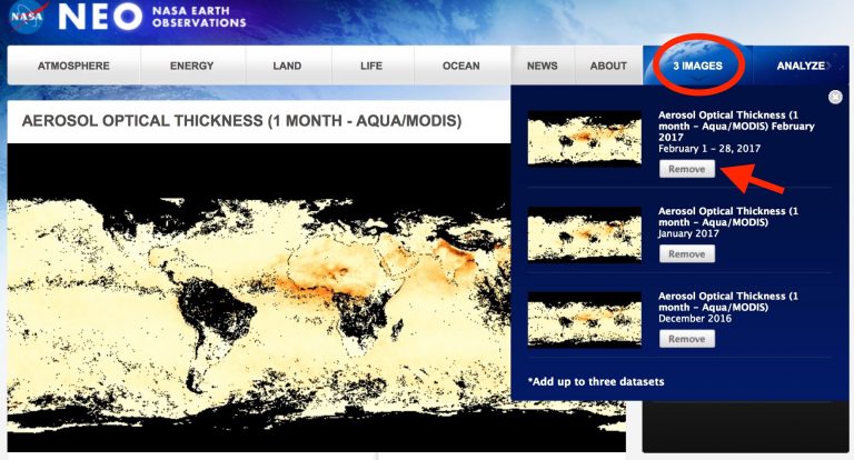
In this example, I select monthly Aerosol Optical Thickness (AOT) for February 2017.
- Under ‘View by date’: 1 mo sets the resolution to monthly.
- Scroll to 2017 under ‘Select Year’.
- Slide the horizontal timeline bar left or right to find the month of interest. If it’s blue, then it exists in the dataset and you can click it to see it in the display.

C. ADD TO ANALYSIS up to three images
- Select ADD TO ANALYSIS in the top right corner. You will see the number of images change in the right, blue side of the top bar.
- Repeat Steps 1-3 for up to two more images.
- Once the top bar indicates ‘3 IMAGES’, you have reached the maximum and will not be able to add any more images to analyze unless you remove something.

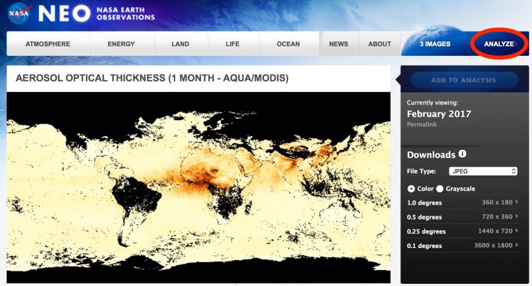
D. View the list of selected images (optional)
- Select IMAGES and a pull-down list appears. To change your selection, ‘remove’ undesired images and repeat steps 1-3.
E. ANALYZE selected images
- After you have selected up to three images you would like to explore, select ANALYZE on the top bar.
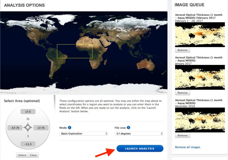
F. Select region of interest and LAUNCH ANALYSIS
- Select an area to analyze by clicking and dragging a region on the map or by entering the latitude/longitude boundaries in the ‘Select Area’ tool.
- Then click on LAUNCH ANALYSIS at the bottom.
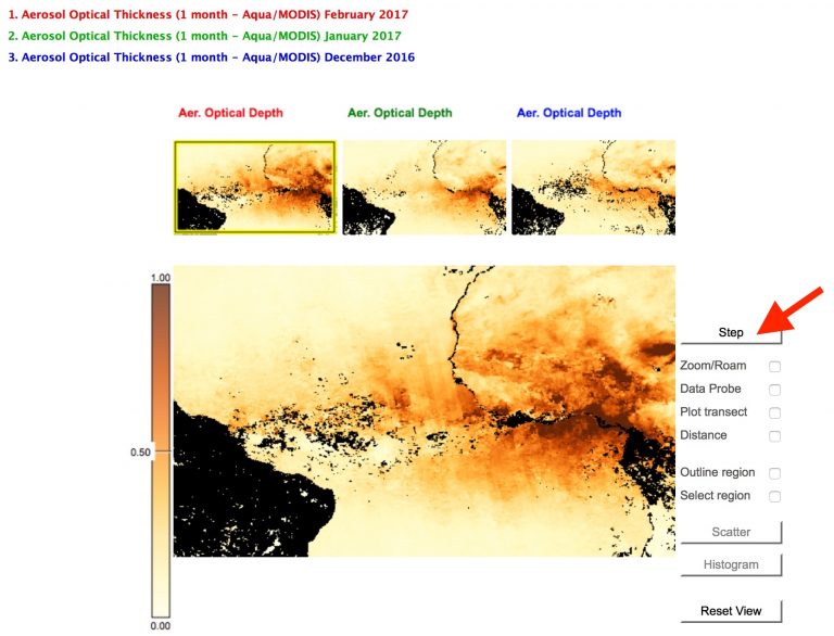
G. View images for the region of interest
- Colored labels (top left) correspond to the color-coded thumbnails. The highlighted thumbnail is mirrored in the main display. Use the ‘Step’ button to see other images in the main display.
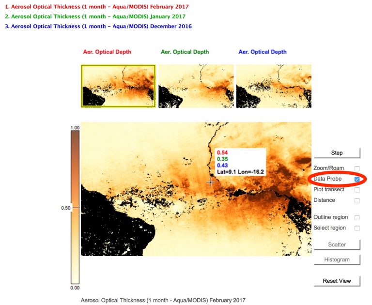
H. Data Probe
- Select ‘Data Probe’ and move the cursor around the main display. The pop-up box shows the values under the cursor, color-coded by the list, and the latitude & longitude. Here, red represents February, 2017; green is January, 2017; blue is December. 2016.
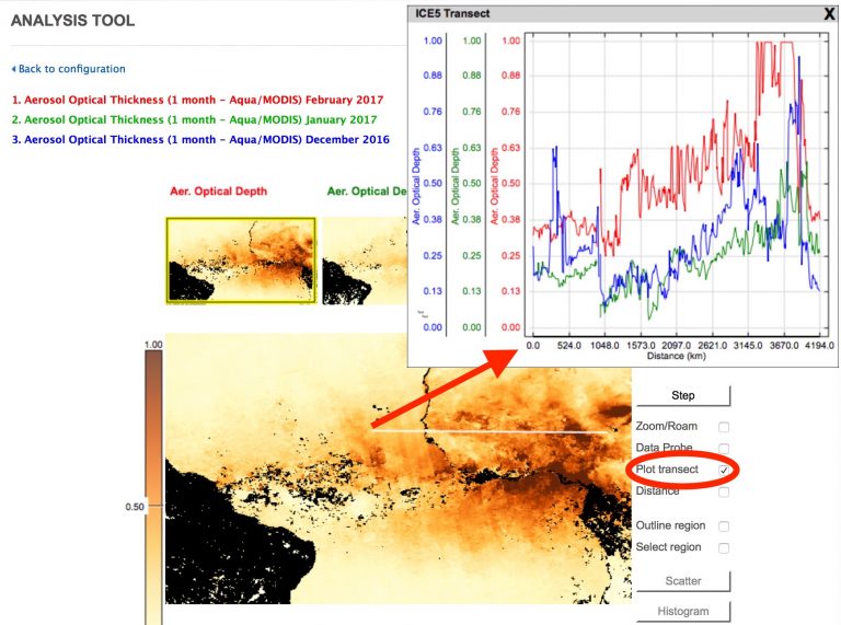
I. Plot transect
- Select ‘Plot transect’ and click and drag the cursor to draw a transect line. Values are plotted in a pop-up window as Distance vs variable, color-coded as before. The start of the line corresponds to the left side of the plot (0 Distance), shown here with the arrow. (You can move the pop-up window around if necessary.)
- If you want to measure the length of a feature, select ‘Distance’ and click and drag the cursor as before.
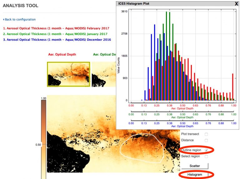
J. Histogram
- To compare the distribution of values in an area, select ‘Outline region’ to control the shape or ‘Select region’ for a box.
- Click and drag to draw the desired region.
- Select ‘Histogram’ and a pop-up window displays the distribution of values for the three images with the variable values on the horizontal line and the number of bins on the vertical line.
- In this example, February 2017 had more than 1000 bins in this area reaching the maximum value (AOT equal to or greater than 1.0), while January only had a few and December had none at the maximum value. Again, the pop-up display can be moved.
- In this example, February 2017 had more than 1000 bins in this area reaching the maximum value (AOT equal to or greater than 1.0), while January only had a few and December had none at the maximum value. Again, the pop-up display can be moved.
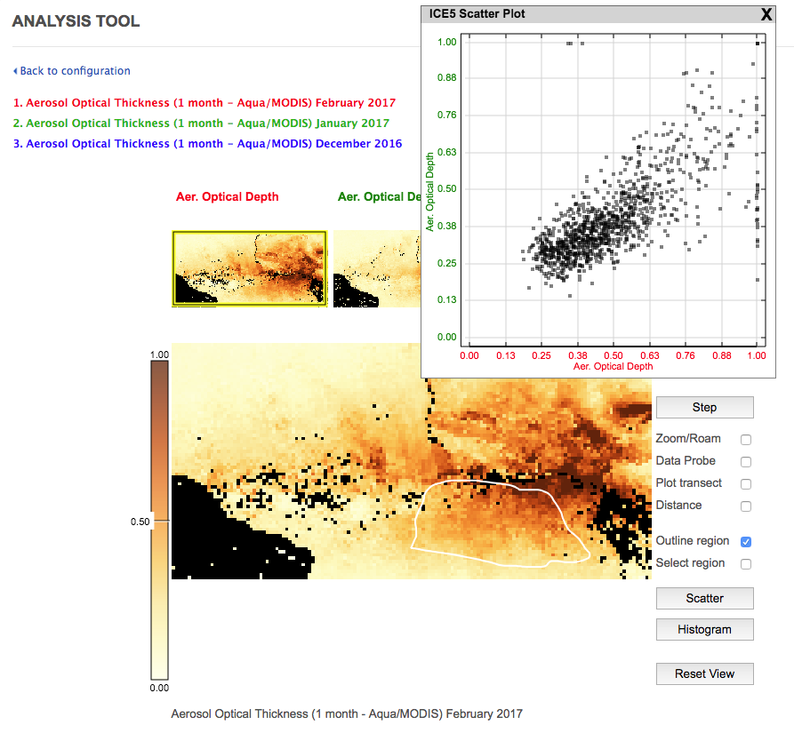
K. Scatter Plot
The scatter plot tool is useful to explore relationships between two different variables. It is not as useful when all of the images are from one data set.
- To make a scatter plot of the values in an outlined region or box. The two images plotted from the highlighted thumbnail and the next one (here it would be February and January 2017).
- Select ‘Step’ to scroll through the plotted images.
Here are a few examples to try for yourself:
Disciplinary Core Ideas:
Crosscutting Concepts:
- Patterns
- Scale, Proportion, and Quantity
- Systems and System Models