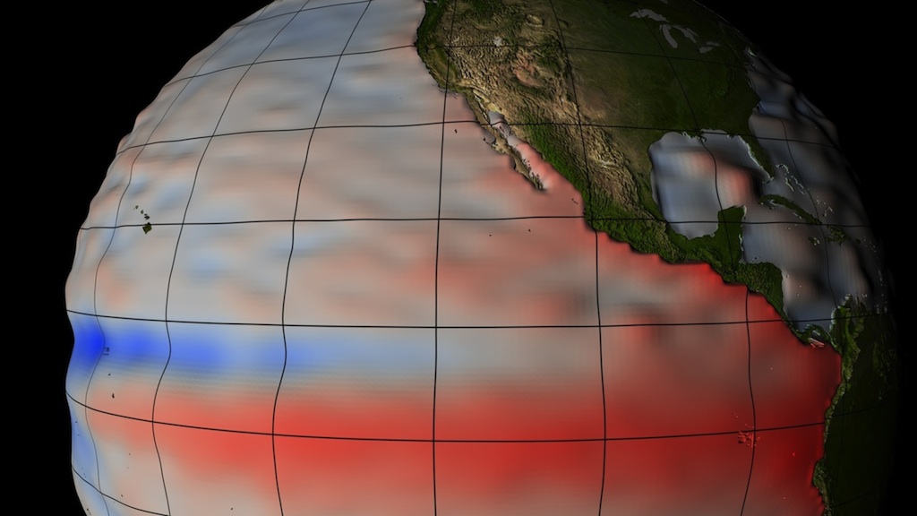
Students analyze the stability and change of sea level after watching a visualization of sea level height around the world.
List of all Hydrosphere Mini Lessons


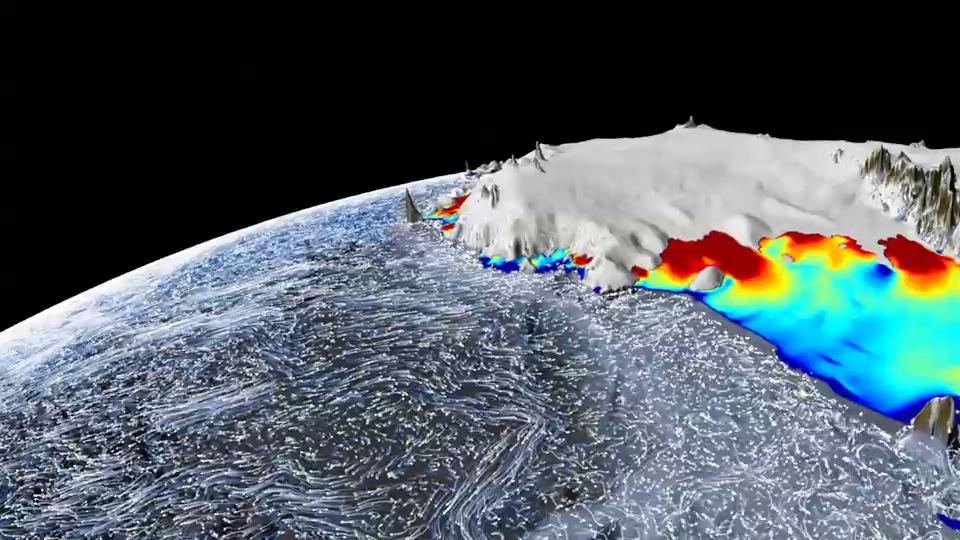
This mini lesson helps students visualize how the Hydrosphere and Cryosphere interact to produce changes in land and sea ice.
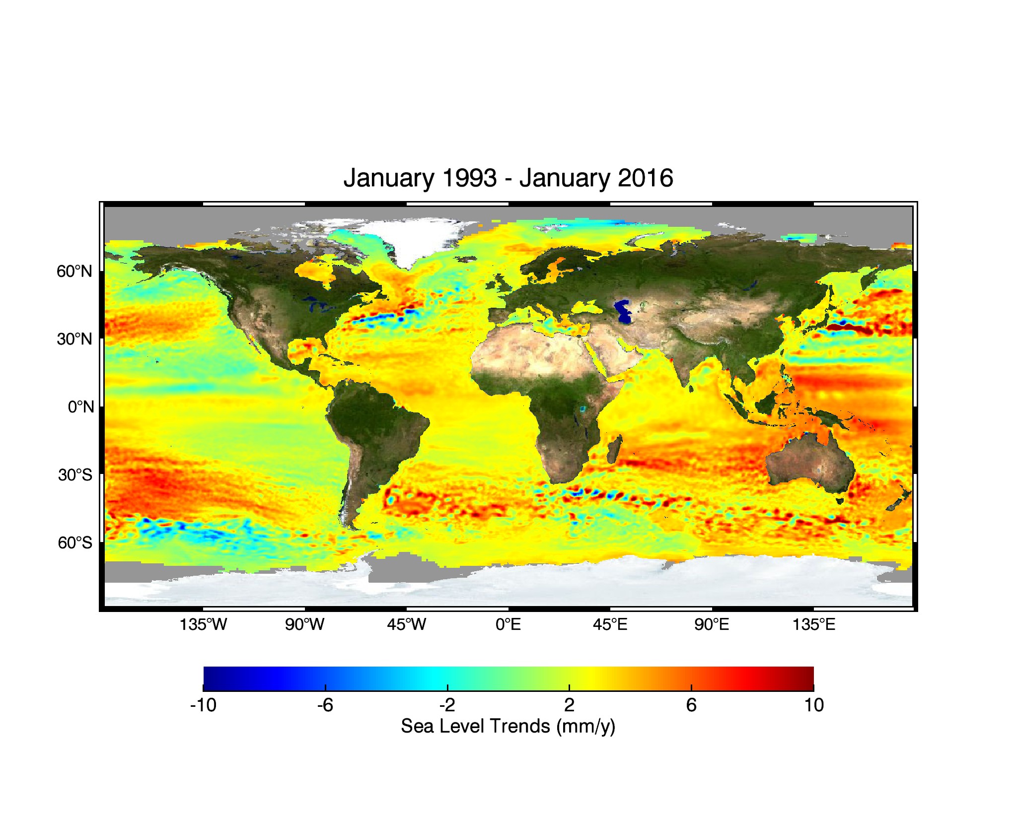
For over 20 years, satellite instruments have measured the sea surface height of our ever-changing oceans. This video of images shows the complicated patterns of rising and falling ocean levels across the globe from 1993 to 2015.
Students analyze four data visualizations focused on the topic of sea level. They use a jigsaw method to explore and communicate their findings to their peers.
In this mini-lesson, students analyze soil moisture quantities associated with Hurricane Harvey around Houston, Texas on August 25, 2017.
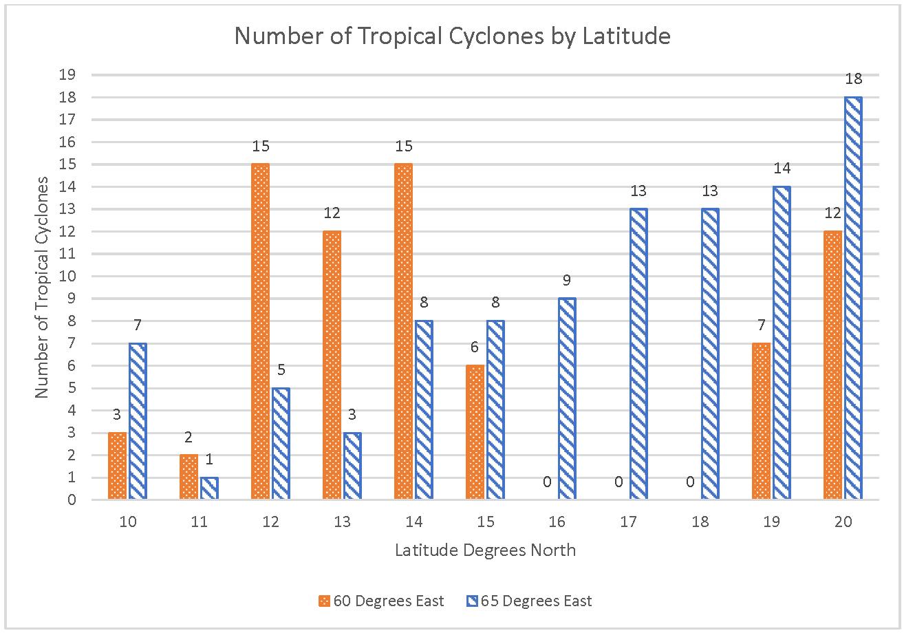
Students interpret a double bar/column chart comparing the number of tropical cyclones in different locations.
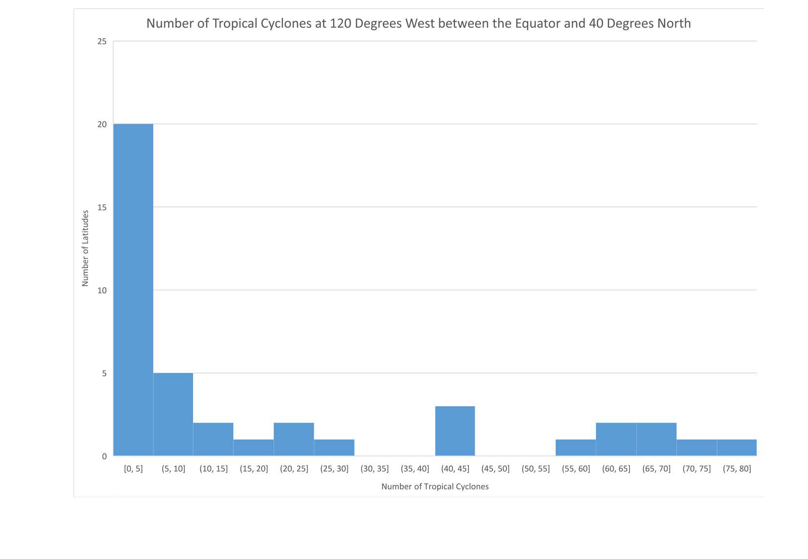
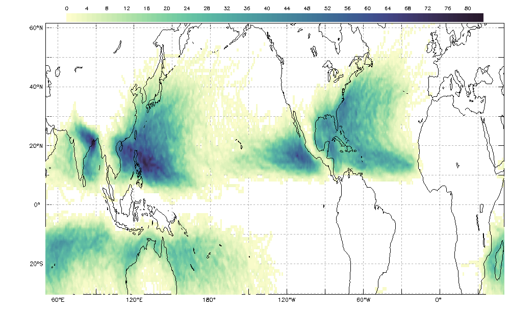
Compare a histogram and map to determine the differences in the information conveyed in each data display.
Interpret the map, or model, to find patterns in the occurrence of tropical cyclones from 1842 through 2018.
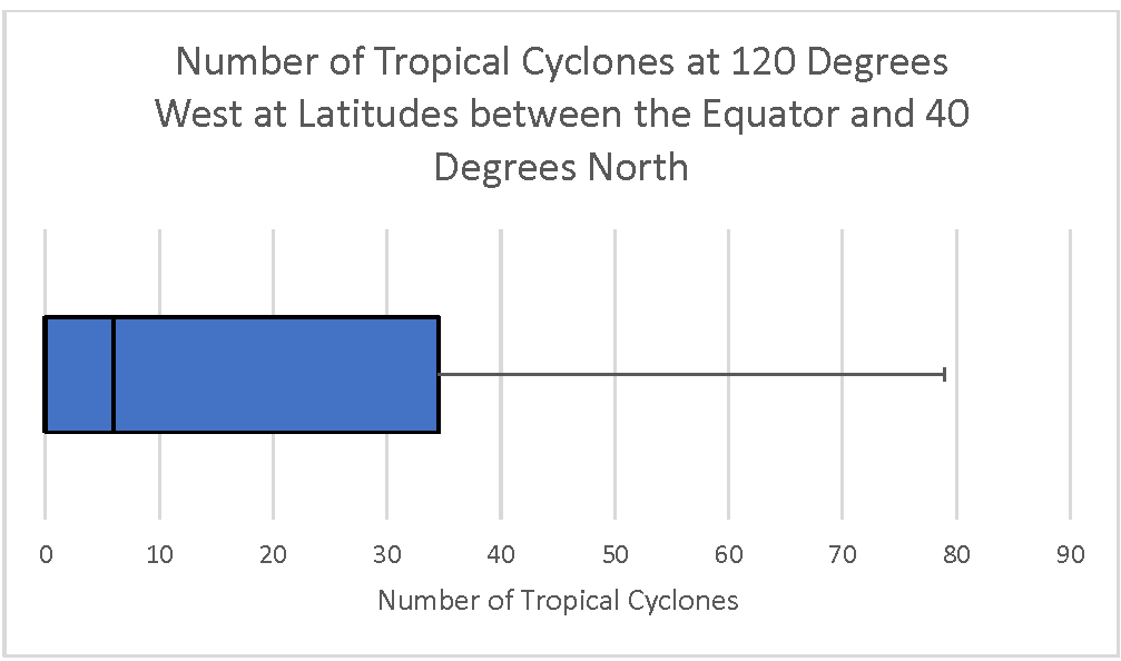
Learners will analyze and interpret a box plot and evaluate the spread of the data. Learners will compare it with a different visualization of the data to see how the two compare, discuss the limitations of the two types of data displays and formulate questions.
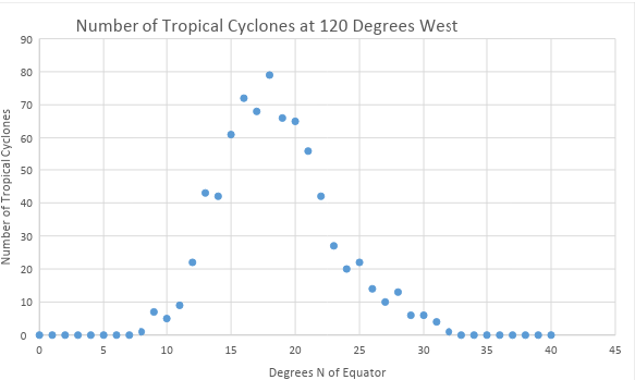
Interpret a scatter plot to find patterns in the number of tropical cyclones from 1842 to 2018.


