Grade Level: 6-8
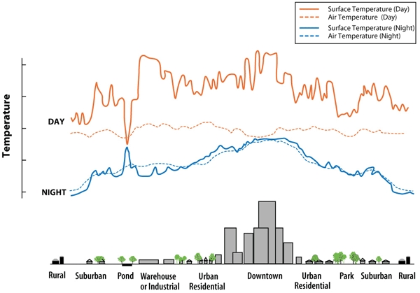
Students will analyze a line graph that shows how the surface temperature and air temperature values change over the course of 24 hours.
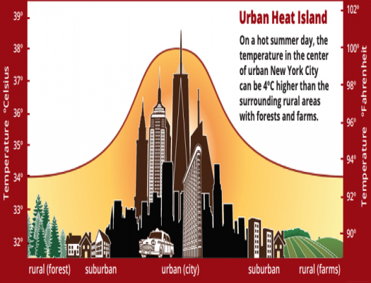
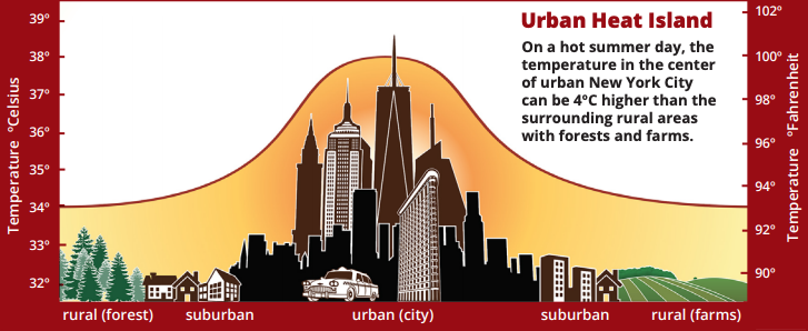
An urban heat island is a phenomenon that is best described when a city experiences much warmer temperatures than in nearby rural areas. The sun’s heat and light reach the city and the country in the same way. The difference in temperature between urban and less-developed rural areas has to do with how well the surfaces in each environment absorb and hold heat.

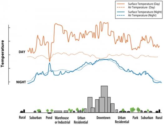
Students will analyze a line graph that shows how the surface temperature and air temperature values change over the course of 24 hours.
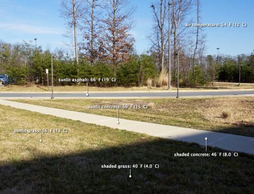
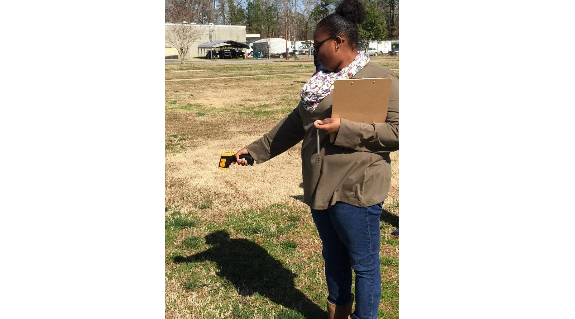
Students observe the surface temperatures of a variety of surface types found in a suburban environment.
Students interpret a graph of surface temperatures taken from city districts and other types of communities.


Conduct this modified EO Kids mini-lesson with your students to explore the phenomenon of Urban Heat Island Effect.
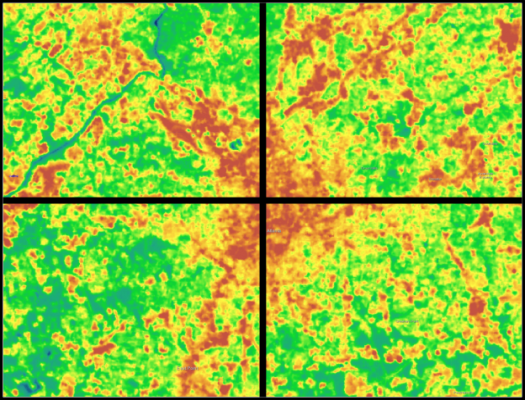
Students analyze Landsat images of Atlanta, Georgia to explore the relationship between surface temperature and vegetation.
Students will analyze a line graph that shows how the surface temperature and air temperature values change over the course of 24 hours.

Students observe the surface temperatures of a variety of surface types found in a suburban environment.
Students interpret a graph of surface temperatures taken from city districts and other types of communities.
Conduct this modified EO Kids mini-lesson with your students to explore the phenomenon of Urban Heat Island Effect.

Students analyze Landsat images of Atlanta, Georgia to explore the relationship between surface temperature and vegetation.
