Mini Lesson/Activity
Interpreting a Graph of Surface Temperature of Urban Areas
Overview
Students interpret a graph of surface temperatures taken from city districts and other types of communities.
Student Directions
Review the Urban Heat Island Profile graph below showing surface temperatures taken from different types of communities.
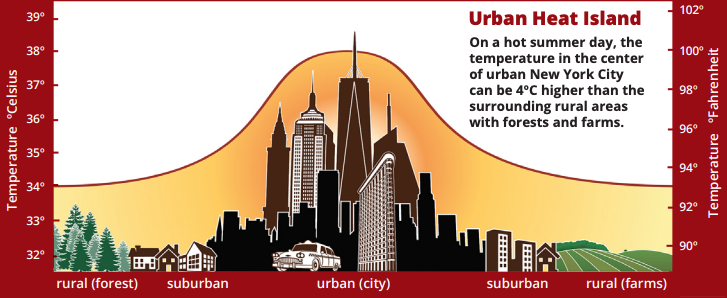
Credit: NASA EOKids Urban Heat Islands - Hot Times in the City
https://mynasadata.larc.nasa.gov/sites/default/files/2019-08/Screen%20Shot%202019-08-27%20at%202.17.53%20PM.png
Steps
- Answer the questions. Check with your instructor on how to submit answers.
- What is the highest temperature in Celsius on the graph?
- What is the highest temperature in Fahrenheit on the graph?
- Identify which community (rural, suburban, urban) has the highest surface temperatures and explain why.
- Identify which community (rural, suburban, urban) has the lowest surface temperatures and explain why.
- What kind of community do you live in? Describe the surface temperature of your neighborhood by comparing it with other parts of your community.
Teacher Note
Teachers, these mini lessons/student activities are perfect "warm up" tasks that can be used as a hook, bell ringer, exit slip, etc. They take less than a class period to complete. Learn more on the "My NASA Data What are Mini Lessons?" page.
Teachers who are interested in receiving the answer key, please complete the Teacher Key Request and Verification Form. We verify that requestors are teachers prior to sending access to the answer keys as we’ve had many students try to pass as teachers to gain access.
Disciplinary Core Ideas:
- ESS2D: Weather and Climate
- ESS3C: Human Impacts on Earth Systems
Crosscutting Concepts:
- Patterns
Science and Engineering Practices:
- Developing and Using Models
- Analyzing and Interpreting Data

