Geosphere Mini Lesson/Activity Teacher Key


- Analyzing a Volcanic Ash Model
-
Link to Analyzing Volcanic a Ash Model
Watch the videos and answer the questions. Check with your instructor on how to submit your answers. Frist, watch the What's Ash Anyway? video to find out about volcanic ash and answer the questions below.
- How is volcanic ash different from fireplace ash? (Accept reasonable responses. Ash in the fireplace is the residue of burning wood and is organic. Volcanic ash is a mix of ground up rock and glass and is not organic.)
- Why is volcanic ash dangerous? (It can be a hazard to people on the ground and for aircraft. It can get into aircraft engines and damage them making flights unsafe.)
Watch the video Tracking Volcanic Ash with Satellites. It describes tracking volcanic ash with satellites and shows the Calbuco volcano eruption. Then answer the questions below.
- What do you notice about how the ash from the Calbuco volcano traveled? (Accept reasonable responses including the following: It traveled far. It looked like it was traveling around the world. It was at different heights in the atmosphere.)
- Why does NASA study volcanic ash? (The information is used to help make forecasts to keep aircraft from being damaged by the volcanic ash and improving air traffic management.)
- An Island Transforms through Erosion and Deposition
-
Link to An Island Transforms through Erosion and Deposition Mini Lesson
- Watch the The Birth of a New Island video about the formation of the island Hunga Tonga-Hunga Ha'apai and why NASA is interested in studying the island. Check with your instructor on how to submit answers.
- After the video, answer the following questions.
- How did the island form? (From a volcanic eruption.)
- Why is NASA interested in studying this island? (It can help NASA learn about how features seen on other planets formed.)
- What sort of changes did you notice in the island? (Answers will vary.)
- How did the geosphere and hydrosphere interact in the changes of the island? (The geosphere had a newly formed land feature that experienced erosion and deposition. The water in the hydrosphere eroded portions of the island, transported and deposited the sediments.)
- Do you think about the timescale involved in these videos is faster or slower than many other areas on Earth? (Much faster than many areas on Earth.)
- Comparing Global Land Use Over Time
-
- Examine the images to see the projected differences between 1900 and 2100 and answer the questions. Check with your instructor on how to submit answers.
- What differences do you see?Aaccept reasonable responses
- Which color shows the highest primary land cover percentage? Lowest? highest - red, lowest white
- Describe where you would expect to find the highest percentage of primary land cover in 2100. Lowest? Accept reasonable responses.
- Examine the images of Africa and answer use the I² writing technique to write a caption for the images of Africa.
- What do you observe in Africa for 1900? In 1900 the primary land cover is highly variable in Northern Africa. Central Africa has a high degree of 0 primary land cover, with some minor amounts in primary land cover in the very center. Southern Africa appears to have about 70% primary land cover.
- What do you observe in Africa for 2100? By 2100, Africa is predicted to mostly loose all of its primary land cover, with the exception of a few spots around the country.
- What are the differences? There are several countries that have retained their primary land cover to a partial degree.
- What do these differences signify? Accept all reasonable answers. Answers could include the following. The differences could be due to population growth, access to resources and technology, industry development, health and public safety, etc.
- Write the caption. Accept all reasonable answers. "Africa loses most of primary land cover in two centuries."
- Examine the images to see the projected differences between 1900 and 2100 and answer the questions. Check with your instructor on how to submit answers.
- Computing Carbon Dioxide Amounts: Student Activity
- Creating and Interpreting Images as Models
-
Link to Creating and Interpreting Images
Array tables to be created:
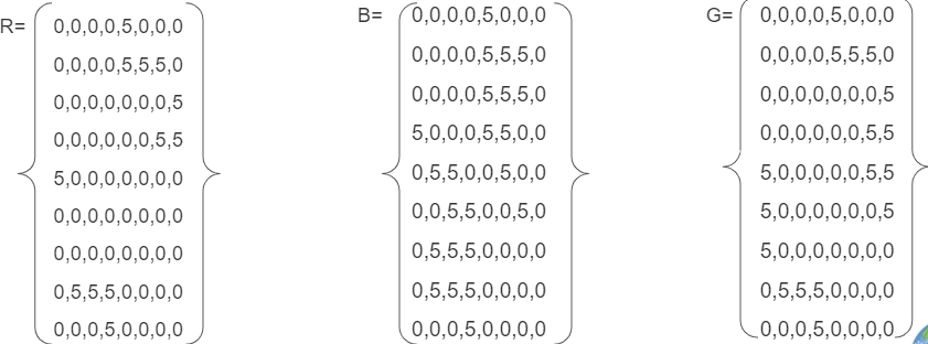
Combined Array Table:

Pixel Grid:
6. Where is the ice represented in the image? In the center of top and bottom. This could be representative of poles on a planet.
- Creating Images from Numbers
-
Link to Creating Images from Numbers
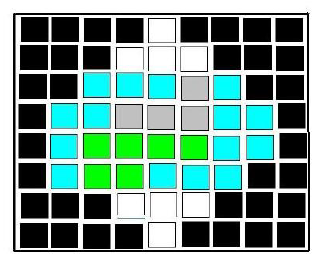
Creating Images from Numbers sample answer using assigned colors. The answers will vary if students select other colors.
https://mynasadata.larc.nasa.gov/sites/default/files/inline-images/creating%20images%20from%20numbers.jpg- Answer the following questions if the data are wind speed in km per hour.
- What color is the fastest? white Slowest? black
- Where is the wind between 21-25 km per hour? red squares or the color chosen
- Answer the following questions if the numbers are elevation in meters above sea level.
- What color is the lowest? black Highest? white
- Where is the elevation between 31 and 35 meters above sea level? white squares
- Do you notice any pattern in the image? Accept reasonable responses. The highest values are in the center. Numbers decrease the farther they are from the center. Learners are likely not to think the red color would be the highest, which is not the case.
- How does the size of the grids in the grid paper affect the image that you created? Accept reasonable responses. Smaller grids can have different values which can provide more detail. Larger grids will provide less detail.
- Which do you think would be more realistic, larger grid sizes or smaller? Why? Accept reasonable responses. Smaller grids will provide more detail, which can be more realistic.
- Answer the following questions if the data are wind speed in km per hour.
- Earth System Energy Travels
-
Link to Earth System Energy Travels Mini Lesson
- What can happen to the energy as it travels through the Earth system? It can be reflected or absorbed.
- Where does the largest percentage of energy go in the Earth system? It is absorbed by land and oceans.
- What kinds of ways is the energy used once it enters the Earth system (i.e., Hydrosphere, Atmosphere, Biosphere, etc.)? Accept reasonable responses. Energy that is absorbed can heat the surface and land (geosphere), atmosphere, and oceans (hydrosphere). Energy can also be used by plants for photosynthesis (biosphere).
- What is the role of the atmosphere (including clouds) as it relates to Earth’s energy? The energy can be both reflected and absorbed by the atmosphere and by clouds.
- Energy and Matter: Dust Transport
-
Link to Energy and Matter: Dust Transport
Steps:
- Check with your instructor on how to submit your answers.
- Where does the dust originate or come from? Explain what is important about the location of where the dust originates. The dust originates from the Sahara Desert in northern Africa. The Sahara is the world's largest desert, and it contains phosphorus, an essential nutrient that acts like a fertilizer.
- What location does the dust travel to? Explain what is important about this location. The dust travels 3000 miles to South America, over to the Amazon Basin. This location is important because the Amazon Rainforest is replenished by the phosphorus-rich dust from the Sahara, which is an important nutrient for plants to flourish. This essentially "feeds" the rainforest.
- How does the dust travel from one place to the other? The dust travels by wind.
- What NASA satellite collects the data? Cloud-Aerosol Lidar and Infrared Pathfinder Satellite Observation (CALIPSO).
- Explain how the biosphere and geosphere are connected in this example. Answers may vary. The geosphere includes rocks, sediments, and surface soils. The sediments from the Sahara which contain the phosphorous can be associated with the Geosphere. The Amazon Rainforest is part of the biosphere. Without the generation of sediments that have been formed through Earth's processes in the Sahara, the Amazon would not flourish, therefore this example of the biosphere is dependent on the geosphere for replenishment.
- Exploring Cryosphere's Seasonal Thaw
-
Link to Exploring Cryosphere's Seasonal Thaw
Observing Changes in Land’s Surfaces
1. Check with your instructor on how to submit your answers.
2. Watch this animation and answer the questions below:
- Which latitudes in the Northern Hemisphere (i.e., Arctic, Northern Mid Latitudes, or Tropics) experience the most change in snow and ice extent over the course of a year? Northern Mid Latitudes
- During what months do you predict to have the largest amount of frozen soil conditions in the Northern Mid Latitudes? Nov-Jan Thawing soil conditions in the Northern Mid Latitudes? March - August
Describing the Arctic’s Land Surfaces
3. Analyze the maps below to orient yourself to the geographic region being analyzed in the blue and red maps that follow. Answer the following questions.
- What is the location that the map is focused on? We are looking at the Arctic in the northern hemisphere
- What variable is being analyzed? The state of H2O in the soil changing from solid to liquid during spring thawing, based on the temperature of the soil.
- Describe what the shades of red indicate about soil conditions mean? Water within the soil is in the thaw (liquid) state. White? The ratio of the frozen soil to thawed soil equals 0.5. Blue? Water within the soil is in the frozen (solid) state.
- What two dates are being compared? April 1st, 2015 and April 13, 2015
- The two maps are 12 days apart. What do you predict would happen in 12 more days? Why? There would be more thawing even closer to the North Pole. The hours of daylight increases as we move from winter to spring and the illumination of solar energy increases at the poles, the bright white snow and sea ice reflect a significant portion of the incoming light, reducing the potential for solar heating.
- When the surface changes from blue to red, what happens to the environment of that area? Rapid warming releases liquid water. As liquid water becomes more readily available, plant and animal activity are energized. The land greens up, and animals return to graze.
- Hurricane Harvey's Effect on Soil Moisture
-
Link to Hurricane Harvey's Effect on Soil Moisture Mini Lesson
- What does the size of the dot represent? The rate of change in the amount of moisture in the soil
- What does the color represent? The quantity of moisture per cm cubed per cm cubed
- What area was the most impacted by Hurricane Harvey? How do you know? North West of Houston because it has the largest and darkest hexagons.
- Why do you think there was not a change in soil moisture in the city of Houston? The surface of a city is mainly impermeable so the water isn’t able to soak into the soil but rather runs off into its watershed
- What is one question you have when looking at this map? Answers can vary but examples are; why did the East side of Houston not have as drastic soil moisture change compared to the west side of the city; what was the path the storm took; how much water dumped onto the city?
- Identifying Changes in Land Use
-
Link to Identifying Changes in Land Use
- Check with your instructor on how to submit your answers.
- Clear Cut:
- Identify the trend in the Pacific Northwest before the clear cut. The trend was stable at around 825 on the vegetation index before around 1999.
- When did the clear cut in the Pacific Northwest occur? Before 1999.
- Explain the impact of the forest after the clear cut. The soil gets covered with grasses and then continues to recovering vegetation.
- Bark Beetle
- Identify the trend in the forest before the Bark Beetle epidemic. The trend was stable at around 250 on the vegetation index.
- When was the Bark Beetle epidemic? It began around 2004.
- Explain the impact of the forest after the Bark Beetle epidemic. The events after the epidemic include a large decrease in the forest's needles and the satellite's instruments collected a much different lower of NDVI as compared to before the beetle infestation.
- Western Spruce Budworm
- Identify the trend in the forest before the Western Spruce Budworm infestation. Stable forest, around 700 NDVI
- When was the Western Spruce Budworm infestation? Around 2000
- Explain the impact of the forest after the Western Spruce Budworm infestation. Changed the type of vegetation to a shrub instead of a forest.
- How might these problems influence human activity? Answers may vary.
- Explain the differences between what the visualization shows and what the graph shows. The graphs and visualizations use the same data. The graphs can show how a particular area changes over time. These are useful for making quick assessments. Visualizations show large volumes of data and help provide scientists tools. They help to reveal trends and patterns over a large area. Both are useful for analyzing, interpreting, and communicating a scientific story.
- Impact of a Volcanic Eruption
-
Link to Impact of a Volcanic Eruption
- In early 2022, there was a series of volcanic eruptions that resulted in changes to the island of Hunga Tonga-Hunga Ha'apai. The images show the land formation before and after the eruptions. Examine the images from 2021 and 2022 and answer the questions below. Check with your instructor on how to submit answers.
- What sort of changes do you notice in the island? A large portion of the island is gone. It appears to have gone back to close to the landform in 2015 before the eruption that joined the two small islands. There are now two small islands again.
- Do you think the timescale involved in this change is faster or slower than many other areas on Earth? Faster
- Can volcanic eruptions cause more than one type of change to land formations? Yes. First eruptions joined the two small islands with new land. Then, eruptions removed the new land.
- What evidence is there that volcanic eruptions can impact land formations? The images show the land formation before eruptions in 2015 and after. This shows the formation of new land. Then, in 2022, eruptions removed land reducing the land form and causing major changes. The images show the changes.
- In early 2022, there was a series of volcanic eruptions that resulted in changes to the island of Hunga Tonga-Hunga Ha'apai. The images show the land formation before and after the eruptions. Examine the images from 2021 and 2022 and answer the questions below. Check with your instructor on how to submit answers.
- Interpreting a Graph of Surface Temperature of Urban Areas
-
Link to Interpreting a Graph of Surface Temperature of Urban Areas Mini Lesson
Review the Urban Heat Island Profile graph below showing surface temperatures taken from different types of communities.
- Answer the questions. Check with your instructor on how to submit answers.
- What is the highest temperature in Celsius on the graph? 38 degrees Celsius
- What is the highest temperature in Fahrenheit on the graph? 100 degrees Fahrenheit
- Identify which community (rural, suburban, urban) has the highest surface temperatures and explain why. Urban environments will have the highest surface temperatures because cities are full of these rocky surfaces — asphalt, brick, and concrete — that absorb heat by day and release it at night. These materials are used to make the sidewalks, parking lots, roads, and basketball courts of urban areas.
- Identify which community (rural, suburban, urban) has the lowest surface temperatures and explain why. Rural environments will have the lowest surface temperatures because they have more vegetation. Plants take up water from the ground through their roots. Then, they store the water in their stems and leaves. The water eventually travels to small holes on the underside of leaves. There, the liquid water turns into water vapor and is released into the air. This process is called transpiration. By releasing water, plants cool themselves and the surrounding environment. Like how sweat cools the human body, energy is absorbed and transported away from a warm object by the evaporation of water.
- What kind of community do you live in? Describe the surface temperature of your neighborhood by comparing it with other parts of your community. Answers will vary.
- Answer the questions. Check with your instructor on how to submit answers.
- Introduction to Volcanic Ash
-
Link to Introduction to Volcanic Ash Mini Lesson
- Watch the videos and answer the questions. Check with your instructor on how to submit answers.
- Watch the NASA's Earth Minute: All About Aerosols video.
- Identify different sources of aerosols. Some sources of aerosols are dust, salt, volcanic ash, fire, smoke stacks, and engine emissions.
- What are the effects of aerosols? Aerosols can cool or heat the air, damage the ozone through chemical reactions, and cause health issues.
- How does NASA study aerosols? NASA studies aerosols using equipment on satellites, aircraft, and ground-based devices.
- Watch the NASA video: Fire, Ice, and Safer Skies: NASA Satellites Track Volcanic Clouds which describes hazards of volcanic emissions.
- How does volcanic ash demonstrate an interaction between the geosphere and the atmosphere?
- Why are volcanic emissions a problem? Volcanic emissions are a big problem for aviation, which can cause economic downturn. The volcanic ash can be hard to distinguish from clouds when flying, making it an even bigger challenge. The ash can damage or destroy the exterior and interior of aircraft, including the engine, posing a real danger.
- What is NASA tracking to try to help predict emissions? NASA is tracking SO2 columns via satellite to determine the location of atmospheric sulfur dioxide, characteristic of volcanic emissions.
- Kuril Islands Volcanoes
-
- Examine the images to complete a graphic organizer and answer questions. Check with your instructor on how to submit answers.
- Examine the image snapped from the International Space Station of the Sarychev Volcano in the Kuril Islands which are northeast of Japan. It is a photo of an early stage of eruption on June 12, 2009.
- Describe the impact you think the eruption could have on the Earth spheres: Atmosphere, Biosphere, Cryosphere, Geosphere, and Hydrosphere. Use the graphic organizer provided. NOTE: You will be filling it in for another image as well. Plan to use a different color or font to tell them apart. Answers will vary but may include:
- Atmosphere - clouds are forming among the smoke and ash over the volcano; there is also an area around the central cloud that doesn't have any clouds
- Biosphere - plant and animal life are affected by the eruption
- Cryosphere - any ice located at the top of the mountain melted and evaporated.
- Geosphere - sediment, rock, and ash have been dispersed in the atmosphere and the land surrounding the volcano
- Hydrosphere - sediment, rock, and ash also enter into the watershed where this volcano is located. This combination is a volcanic hazard.
- Now, examine the image (also taken from the International Space Station) of the Raikoke Volcano, also in the Kuril Islands. This eruption occurred on June 22, 2019.
- Describe the impact you think the eruption could have on the Earth spheres: Atmosphere, Biosphere, Cryosphere, Geosphere, and Hydrosphere. Use the same graphic organizer provided. Record your observations for the new volcano in a different font or a different color. Answers will vary and may include the following:
- Atmosphere - the volcanic plume interacts with storm clouds. There are different kinds of clouds formed along the plume and they have different colors.
- Biosphere - plant and animal life are affected by the eruption
- Cryosphere - any ice located at the top of the mountain melted and evaporated.
- Geosphere - sediment, rock, and ash have been dispersed in the atmosphere and the land surrounding the volcano
- Hydrosphere - sediment, rock, and ash also enter into the watershed where this volcano is located. This combination is a volcanic hazard.
- Compare the two images and use your graphic organizer to answer the following questions.
- Compare the two images. What are the similarities and differences in the images?
- Similarities: Sarychev Volcano & Raikoke Volcano: Plumes both reach the atmosphere and impact cloud formation
- Differences:
- Sarychev Volcano - the plume does not seem to spread to other regions.
- Raikoke Volcano ash plume seems to have risen higher in the atmosphere and the ash is mixing with the clouds and spreading out.
- The volcanoes happened approximately 30 km apart. What does this tell you about the area? Answers will vary. Example, this is a very tectonically active region.
- Make a claim about the volcanoes in the area. Use the evidence from the images and give your reasoning. Answers will vary. Example, volcanoes in this region erupt material high into the atmosphere which may be observed in regions beyond the North Pacific Ocean.
- Compare the two images. What are the similarities and differences in the images?
- Land Cover Changes
-
- Check with your instructor on how to submit your answers.
- What is different about the two images (Slide 2)? There are noticeable changes along the road.
- What do you think could have happened here between 2017 and 2020 (Slide 3)? A new building facility has been built in the green area.
- What information can satellite images provide us with (Slide 4)? Answers may vary but could include: information such as changing vegetation or the expansion of urban buildings.
- What information do we need to observe from the ground because it is not shown in satellite images (Slide 4)? Answer may vary but can include: information on the change urban construction could have on ground soils or to specify what is causing the change.
- How could this operations and maintenance facility impact the environment (Slide 7 & 8)? When vegetation is removed, it is more likely that soils can be loosened during a storm water runoff and cause landslides.
- How much do you think the construction of the operations and maintenance facility will impact the environment (Slide 9)? Answer may vary but can include: The impact is very high if construction takes place in areas where flooding is more frequent due to impervious surfaces like sidewalks and buildings. More water is collected than would otherwise run off to nearby streams or be absorbed in the soils and vegetation.
- Provide evidence from the previous slides to support your claims (Slide 9). Images such as sidewalks, do not allow runoff to be absorbed in the soils.
- Make a claim about what should be considered when making decisions about urbanizing a land cover (Slide 11)? (i.e. cutting down a forest or building over a grassland). Answers may vary.
- Soil Moisture Analysis
-
Steps
- Observe the map above, and complete the tasks. Check with your instructor on how to submit your answers.
- I see...
- Spend five minutes coming up with as many things you observe on this map.
- Start each item with, "I see..." Some general questions are:
- What is represented within this map?
- What is the range of the data?
- Where are the extreme values located?
- I think...
- Next, list as many thoughts as possible on what this map makes you think.
- Start each item with, "I think..."
- I wonder...
- The last step is to think of questions about this map.
- Create at least five statements that begin with, “I wonder…”
Accept reasonable responses for all questions.
Examples:
I think soil moisture changes as seasons change so this is the soil moisture for the end of spring. I think this information is vital for farmers. I think there was likely a weather system that moved across from South Dakota to Pennsylvania. I think another storm system went up the East Coast dropping precipitation. I wonder how much the soil moisture can change over a few days or a week.
- Surface and Air Temperatures Throughout the Day
-
Link to Surface and Air Temperatures Throughout the Day Mini Lesson
This line graph shows how the surface temperature and air temperature values change over the course of 24 hours. Surface temperatures vary more than air temperatures during the day, but they both are fairly similar at night.
- Review the line graph of surface temperature and air temperature throughout the day and answer the questions below. Check with your instructor on how to submit your answers.
- What do you observe in the line graph of surface temperature and air temperature throughout the day?
- What do you the two different colors represent? Day (orange) vs Night (blue)
- What is the difference between the dashed and the full lines? The dashed lines indicate the Air Temperature, while the solid lines indicate the Surface Temperature.
- What do these variables mean? How are they the same? Different?
- Surface Temperature: This quantity represents the temperature of the first few centimeters at the top of the surface.
- Air Temperature: This quantity refers to the temperature of the air about 2 meters above the surface.
- Describe the X Axis and what it represents.
- The X-axis - The x-axis shows land use areas. Ask students to think about what you will find in the different areas (e.g., When you visit a big city, you won’t see many plants. Instead, you’ll see sidewalks, streets, parking lots and tall buildings. These structures are usually made up of materials such as cement, asphalt, brick, glass, steel and dark roofs). As you head to rural areas, you will probably find that most of the region is covered with plants (grass, trees, and farmland covered with crops).
- Describe the Y Axis and what it represents.
- The Y-axis - The y-axis represents temperature. It should be the same for all four variables. There is no scale because this graphic is a generic representation and doesn't represent any particular geographic region, over a particular time. It shows the general pattern of these changes over a 24-hour cycle over a variety of land-use areas.
- Analyze the line graphs and answer the following questions.
- What do you see? [Answers may vary. Answers may include: Surface temperatures vary more than air temperatures during the day, but they both are fairly similar at night. The temperatures generally increase from the outskirts of the urban areas as you move towards the city center.]
- What do these trends and differences mean? [City-related materials such as black roofs, roads, etc. cause urban areas to absorb and retain heat. Also, the heat produced by automobiles, factories, and homes may also contribute to the higher temperatures.]
- What is something you would like to know about this graph? Come up with a research question you would like to know the answer to. [Answers will vary.)
- What are Tectonic Plates?
-
Link to What are Tectonic Plates?
- Watch the NASA Space Place video Tectonic Forces and answer the questions. Check with your instructor on how to submit answers.
- What is the name of the supercontinent that began to break up about 180 million years ago? Pangea
- What happened when the Americans and Africa drifted apart? The Atlantic Ocean formed.
- What causes Earth's tectonic plates to move? Convection in the mantle
- What happens when tectonic plates move apart at the bottom of the ocean? New crust is formed and new oceans can be created.
- Where does the creation of new oceanic crust occur? mid-ocean ridges
- Where is old ocean floor destroyed or recycled? subduction zones
- What happens when the seafloor is created and destroyed? It drives the shift in the continents on Earth.
- Watch the NASA Space Place video Tectonic Forces and answer the questions. Check with your instructor on how to submit answers.
- What is a Volcano?
-
Steps
Follow your instructor's directions to work alone or in groups. Check with your instructor on how to submit answers. Examine the images and answer the questions.
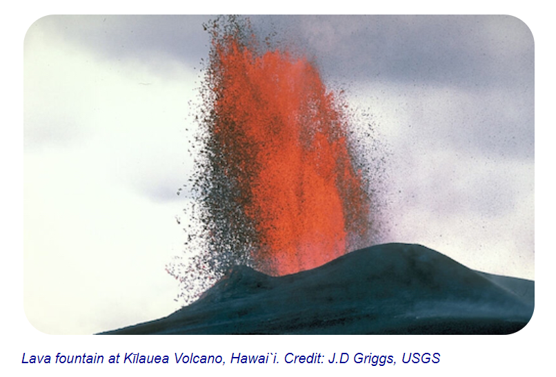
Image 1: Lava fountain at Kilauea Volcano, Hawai'i.
Image Credit: J.D. Griggs, USGS
https://mynasadata.larc.nasa.gov/sites/default/files/inline-images/fire%20eruption_1.PNG
-
Look at Image 1. What did you see in the first volcano image? Material escapes from the opening of a volcano called an eruption.
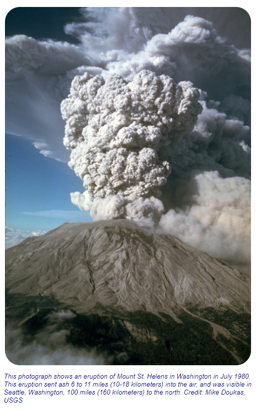
Image 2: Mount Saint Helens eruption, July 1980
Image Credit: Mike Doukas, USGS
https://mynasadata.larc.nasa.gov/sites/default/files/inline-images/Mount%20St%20Helens.PNG -
Look at Image 2. What did you see in the second volcano image? This eruption is explosive, sending material high into the sky.
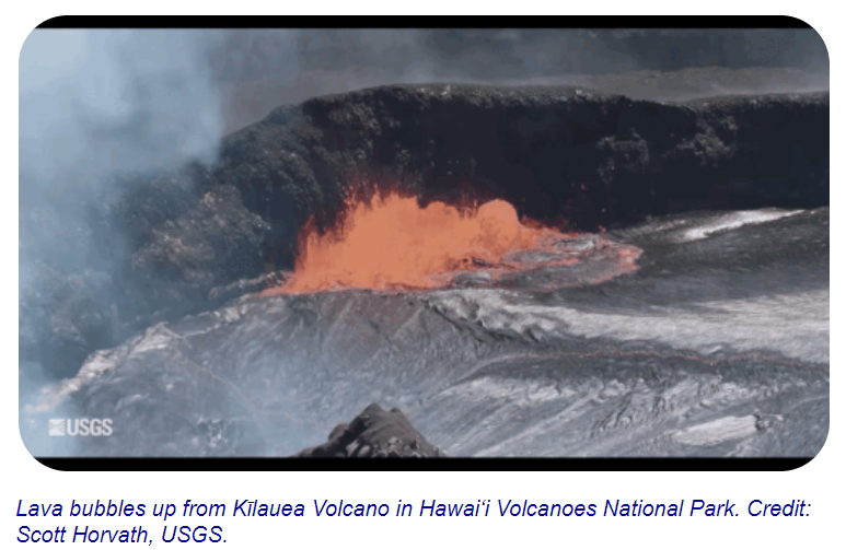
Image 3: Lava bubbles up from Kilauea Volcano in Hawai'i
Image Credit: Scott Horvath, USGS
https://mynasadata.larc.nasa.gov/sites/default/files/inline-images/Lave%20Bubbles.PNG - Look at Image 3. What did you see in the third volcano image? This eruption appears calmer than the others, with gentle flows of material.
- How are the three images different? The way the material erupts from the volcano is different. Also the kind of material appears differently.
- How are the three images similar? They are all volcanoes (an opening on the surface of a planet) that allows material warmer than its surroundings to escape from its interior.
Review the introductory information provided in "What is a Volcano?" available from NASA's Space Place to answer the following question.
- What are three ways magma can reach the surface of Earth There are three reasons why magma might rise and cause eruptions onto Earth’s surface.
- Magma can rise when pieces of Earth's crust called tectonic plates slowly move away from each other. The magma rises up to fill in the space. When this happens underwater volcanoes can form.
- Magma also rises when these tectonic plates move toward each other. When this happens, part of Earth's crust can be forced deep into its interior. The high heat and pressure cause the crust to melt and rise as magma.
- A final way that magma rises is over hot spots. Hot spots are exactly what they sound like--hot areas inside of Earth. These areas heat up magma. The magma becomes less dense. When it is less dense it rises. Each of the reasons for rising magma are a bit different, but each can form volcanoes.
-


