Biosphere Mini Lesson/Activity Teacher Key


- Analysis & Application of Seasonal Vegetation Data
-
Link to Analysis & Application of Seasonal Vegetation Data Mini Lesson
Students observe the PDF images of satellite images taken of seasonal vegetation.
- Check with your instructor on how to submit your answers
- Students predict the best arrangement of the images by putting them in (what they believe to be) chronological order (February 2017, June 2017, October 2017, and December 2017).
- Correct Order: Plot C - February 2017, Plot B - June 2017 , Plot D - October 2017, Plot A - December 2017
- Identify the seasonal cycles for vegetation throughout the year by answering the following questions.
-
What changes do you see through the year? There is a greening that appears to follow the spring/summer seasons in each hemisphere. What explanations can you suggest for these patterns? Axial tilt explains why the Northern Hemisphere experiences spring/summer during March- August; Southern Hemisphere - September - February.
-
Choose a location or region. During which months do the extreme highs and lows occur? What explanations can you suggest for the timing of those extremes? Answers will vary depending on location.
-
Which regions experience both the extreme highs and lows? Which regions don’t experience the extremes? Why do you think this happens? The higher latitudes have more extreme highs and lows due to the tilt of the Earth's axis affecting the amount of incoming solar radiation received on Earth. The low latitudes do not have such extremes due to lack of fluctuation of solar radiation.
-
- Analyzing Historic Ocean Chlorophyll Concentration Data with Maps
-
Link to Analyzing Historic Ocean Chlorophyll Concentration Data with Maps
Steps:
- Check with your instructor on how to submit your answers.
- Identify what living organisms may be observed using chlorophyll data. Phytoplankton, plants, etc.
- Recall that phytoplankton are microscopic, floating, plant-like organisms that live in oceans, lakes, and rivers. They use photosynthetic pigments (like chlorophyll) to convert energy from the Sun into organic matter. For this reason, NASA satellites can observe the amount of phytoplankton present in the ocean by measuring chlorophyll concentrations.
- Review the color bar scale below. What do the different colors mean with respect to phytoplankton? When phytoplankton populations are large, the color of the water appears greener because of high concentrations of chlorophyll.
- Identify each region using the numbers listed on the map. 1. Alaskan Coast, 2. Canadian West Coast, 3. West Coast (U.S), 4. East Coast (U.S.), 5. Canadian East Coast, 6. Pacific (Hawaii)
- Analyze the Chlorophyll Concentrations in Surface Ocean Waters image at each region you listed.
- Compare the Chlorophyll Concentrations in the coastal areas to the open ocean in the Pacific. What do you observe? Coastal areas tend to have higher concentrations of chlorophyll than the open ocean.
- How do the lower latitudes like those in Florida or Hawaii compare to the higher latitudes like those in Alaska? There are high concentrations in the higher latitudes than the lower ones.
- Compare the West Coast and East Coast concentrations. The higher concentrations are more evident along the west coast of North America.
- Analyzing Seasonal Phytoplankton & Energy Flow
-
Link to Analyzing Seasonal Phytoplankton & Energy Flow
Steps:
- Check with your instructor on how to submit your answers.
- Analyze the graph displaying Monthly Flow of Energy into Surface by Shortwave Radiation between the years of 2016 and 2018 in the North Atlantic Ocean. Answer the the following questions.
- What variable is represented on the x-axis? Time. What is the range of values? 2016-2018
- What variable is represented on the y-axis? Watts per square meter, which is the flow of energy spread out over an area. What is the range of values? 20-240 w/m2
- Describe the pattern that is revealed over the three years. The shortwave radiation values are sinuous in that the increase in the spring, peak in the summer, decline in the fall through winter and steadily repeat this pattern.
- Analyze the graph displaying Monthly Average Chlorophyll Concentration between the years of 2016 and 2018 in the North Atlantic Ocean and then answer the following questions. The units for chlorophyll concentration in this graph is milligrams of chlorophyll per cubic meter of seawater. This is a very small mass unit. To compare, the average mass of a feather from a chicken is about 8 milligrams.
- What variable is represented on the x-axis? Year What is the range of values? 2016-2018
- What variable is represented on the y-axis? Chlorophyll concentration
- Describe the pattern that is revealed over the three years. The chlorophyll values tend to decline around the middle of summer in both 2016 and 2017 but rebound in early fall, only to decline for the remainder of the calendar year.
- Compare the two line graphs. Describe what these graphs have in common? How are they different? They are both cyclical and highly variable. They both peak in the summer and decline in the winter. How are they different? The chlorophyll values tend to decline around the middle of summer in both 2016 and 2017 but rebound in early fall, only to decline for the remainder of the calendar year. On the other hand, the shortwave radiation values are sinuous in that the increase in the spring, peak in the summer, decline in the fall through winter and steadily repeat this pattern.
- Brainstorm the factors that may contribute to their differences. Answers will vary.
- Analyzing Seasonal Vegetation & Leaf Area
-
Link to Analyzing Vegetation & Leaf Area
Students observe seasonal images of Monthly Leaf Area, looking for any changes that are occurring throughout the year.
Steps:
- Check with your instructor on how to submit your answers.
- The Monthly Leaf Area Index maps (Plots A-D) are in chronological order, starting with the time periods: February 2016, June 2016, October 2016, and February 2017. Identify the seasonal cycles for leaf changes throughout the year by answering the following questions:
- What changes do you see through the year? What explanations can you suggest for these patterns? Answers will vary depending on location.
- Choose a location or region. During which months do the extreme highs and lows occur? What explanations can you suggest for the timing of those extremes? Answers will vary depending on location.
- Which regions experience both the extreme highs and lows? Which regions don’t experience the extremes? Why do you think this happens? Answers will vary depending on location.
- Carbon Dioxide Production and Sequestration
-
Link to Carbon Dioxide Production and Sequestration
- Use the image of forested and deforested land to answer the questions. Check with your instructor on how to submit answers.
- The picture shows a plot of landscape measuring 1 kilometer on a side.
- Each box on the image covers 2.5 acres.
- The land and soil with green trees sequester carbon dioxide at a rate of 1 ton per acre per year. So, a box that is all trees will sequester 2.5 tons of carbon dioxide per year.
- The deforested land and soil have smaller amounts of vegetation and only sequesters carbon dioxide at a rate of 0.2 tons per acre per year. So, a box that is all deforested, or bare, land will sequester 0.5 tons of carbon dioxide per year.
- Estimate the size of the forested (dark green) area of the picture in acres. If one box has more than one type of cover, estimate how much is trees and how much is not. How many forested acres are in this picture?
- Approximately 2/3 of the picture is covered in green. 2.5 * 100 * .66 = 165 acres
- Accept reasonable estimates.
- Estimate the size of the deforested, bare area of the picture. How many deforested acres are in this picture?
- Approximately 1/3 of the picture is covered in green. 2.5 * 100 * .33 = 82.5 acres
- Accept reasonable estimates.
- How much carbon dioxide is sequestered by trees?
- (Number of boxes covered by trees X 2.5 tons of carbon dioxide per year)
- Approximately 66 * 2.5 tons/year = 165 tons/year
- Accept reasonable estimates
- How much carbon dioxide is sequestered by bare land?
- (Number of boxes covered by bare land x 0.5 tons of carbon dioxide per year)
- Approximately 33 * .5 tons/year = 16.5 tons/year
- What is the total rate of carbon dioxide sequestration in this particular area in terms of tons per year?
- Approximately 165 tons/year + 16.5 tons/year = 181.5 tons/year
- A typical American home produces about 10 tons of carbon dioxide per year. The image shows one house. What is the is the overall (or net) sequestration of carbon dioxide in the image including the house?
- 181.5 tons/year - 10 tons/year = 171.5 tons/year
- Assume someone built 50 more homes on the land in the image. What would the overall (or net) carbon dioxide sequestration be?
- There are 51 houses total.
- 181.5 tons/year - 51(10 tons/year) = 181.5 tons/year - 510 tons/year = -328.5 tons/year.
- This means that there is a production of 328.5 tons/year that is NOT sequestered.
- Use the image of forested and deforested land to answer the questions. Check with your instructor on how to submit answers.
- Carbon Dioxide: Production and Sequestration
-
Link to Carbon Dioxide: Production and Sequestration Mini Lesson
Carbon dioxide concentration in the atmosphere is affected, among other things, by processes involving forests including fires, deforestation and plant respiration. Evaluate a Landsat image to determine the rate of carbon dioxide sequestration in a particular area.
- Cause and Effect: How do our forests change over time?
-
Link to Cause and Effect: How do our forests change over time?
Steps:
- Check with your instructor on how to submit your answers.
- Describe the phenomenon you observe. Using Landsat to image the processes that affect landscapes, primarily changing forest areas.
- What patterns do you see in this model? Colors changing from blue to spotted orange.
- What are the limits of this model? Answers may vary.
- What benefits are there in using this model? The model can pick out various changes such as forest clear cutting and removal, and bark beetle and budworm infestation.
- Predict the future of the phenomenon based on the model you've observed. If the processes mentioned continue to occur, then more landscapes are likely to show a decrease in vegetation.
- Describe the evidence of Earth System interaction (among Atmosphere, Hydrosphere, Biosphere, Cryosphere, Geosphere) do you see? Answers may vary.
- Comparing Global Land Use Over Time
-
- Examine the images to see the projected differences between 1900 and 2100 and answer the questions. Check with your instructor on how to submit answers.
- What differences do you see?Aaccept reasonable responses
- Which color shows the highest primary land cover percentage? Lowest? highest - red, lowest white
- Describe where you would expect to find the highest percentage of primary land cover in 2100. Lowest? Accept reasonable responses.
- Examine the images of Africa and answer use the I² writing technique to write a caption for the images of Africa.
- What do you observe in Africa for 1900? In 1900 the primary land cover is highly variable in Northern Africa. Central Africa has a high degree of 0 primary land cover, with some minor amounts in primary land cover in the very center. Southern Africa appears to have about 70% primary land cover.
- What do you observe in Africa for 2100? By 2100, Africa is predicted to mostly loose all of its primary land cover, with the exception of a few spots around the country.
- What are the differences? There are several countries that have retained their primary land cover to a partial degree.
- What do these differences signify? Accept all reasonable answers. Answers could include the following. The differences could be due to population growth, access to resources and technology, industry development, health and public safety, etc.
- Write the caption. Accept all reasonable answers. "Africa loses most of primary land cover in two centuries."
- Examine the images to see the projected differences between 1900 and 2100 and answer the questions. Check with your instructor on how to submit answers.
- Computing Vegetation Cover: Student Activity
-
Leaf Area Index March 2018
Credit: My NASA Data
https://mynasadata.larc.nasa.gov/sites/default/files/inline-images/LAI%20Using%20Units%20in%20Calculations%20Image%202_0.png- Use the information and image provided to answer the questions. Check with your instructor on how to submit answers.
- Calculate leaf area index for the following examples. Use the units in the calculations.
- 1 m2 of leaves for 1 m2 of available land surface (answer: 1)
- 3.2 m2 of leaves for 2 m2 of available land surface (answer: 1.6)
- 100 m2 of leaves for 250 m2 of available land surface(answer: 0.4)
- Look at the monthly leaf index image for March 2018 and identify some areas where the LAI is at least 2. Where are they located? (answer: south of the equator)
- Identify some areas where the LAI is less than 1. Where are they located? (answer: Northern Africa and polar regions)
- What do you predict would happen to LAI in an area if there were deforestation? (Answer: It would decrease.)
- Computing Vegetation Health: Student Activity
-
Steps
- Watch the Let’s Focus on Preservation not Deforestation video. Two minutes into the video, the formula for calculating NDVI is given. Answer the following questions. Check with your instructor on how to submit answers.
- Answer the following questions. Check with your instructor on how to submit answers.
- Why is NDVI dimensionless? NDVI is a ratio where the units cancel out.
- How is NDVI used to help determine changes in the forest? NDVI helps us monitor vegetation to: monitor the health of vegetation, monitor ecosystems for disturbances, determine where vegetation is thriving, and identify where plants are under stress
- Calculate the following NDVI ratios.
- Reflected near infrared light 0.5, Reflectance of red-light 0.06 = 0.79
- Reflected near infrared light 0.4, Reflectance of red-light 0.25 = 0.23
- Which ratio above shows green, leafier vegetation? Sparser vegetation? 0.79 shows leafier green vegetation, 0.23 shows sparser vegetation
- Creating and Interpreting Images
-
Link to Creating and Interpreting Images
Array tables to be created:
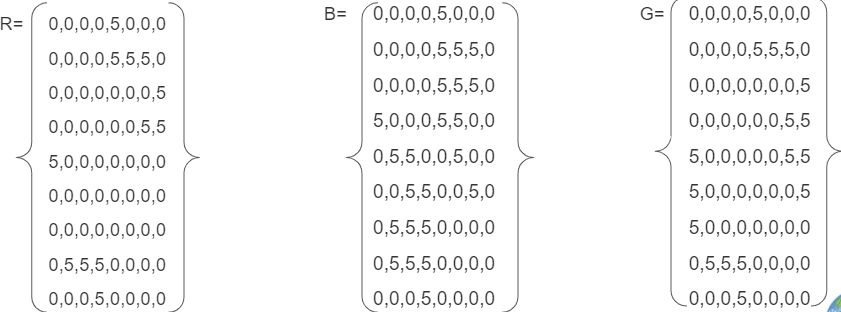
Combined Array Table:

Pixel Grid:

6. Where is the ice represented in the image? In the center of top and bottom. This could be representative of poles on a planet.
- Creating Images from Numbers
-
Link to Creating Images from Numbers
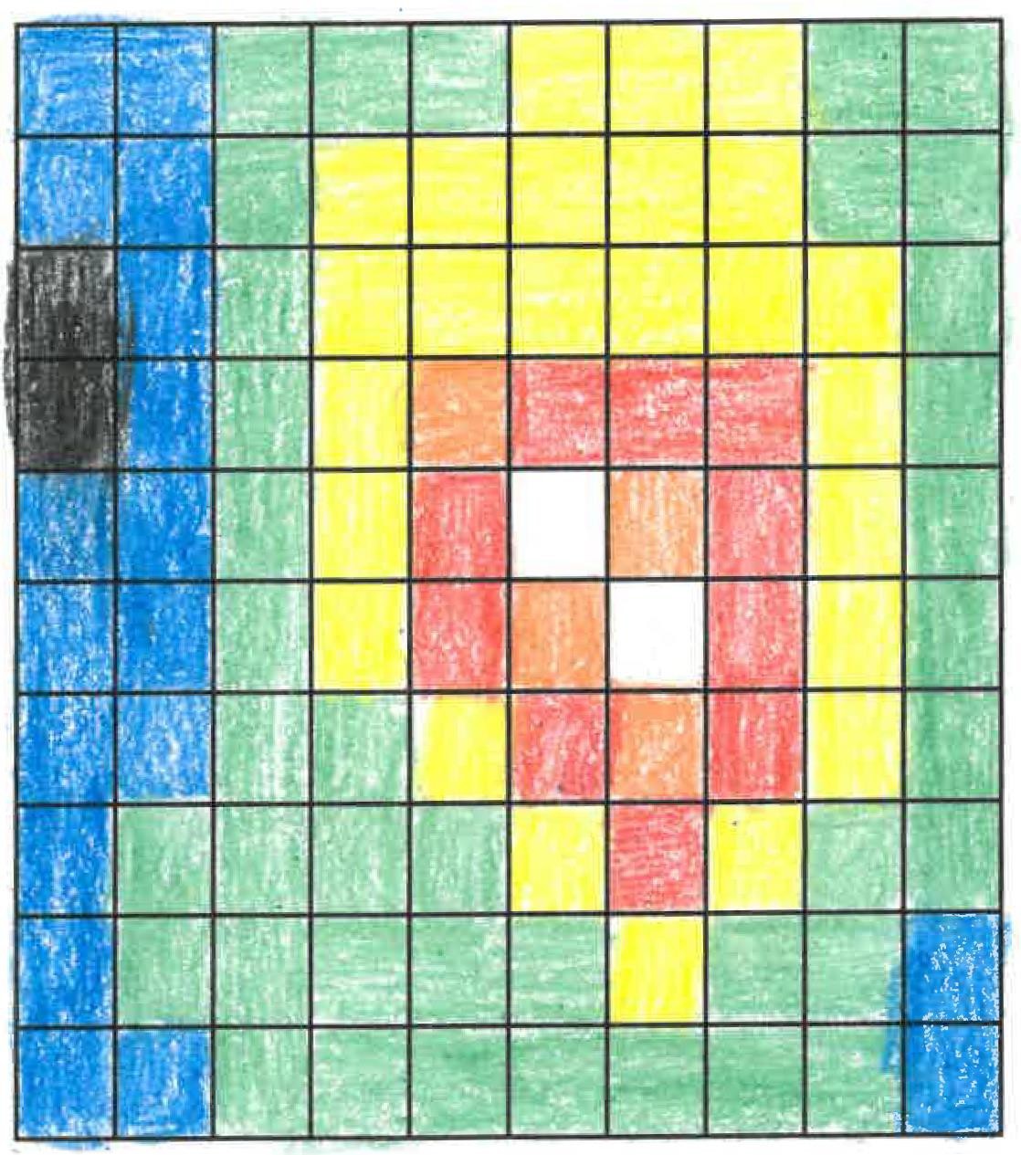
Creating Images from Numbers sample answer using assigned colors. The answers will vary if students select other colors.
https://mynasadata.larc.nasa.gov/sites/default/files/inline-images/creating%20images%20from%20numbers.jpg- Answer the following questions if the data are wind speed in km per hour.
- What color is the fastest? white Slowest? black
- Where is the wind between 21-25 km per hour? red squares or the color chosen
- Answer the following questions if the numbers are elevation in meters above sea level.
- What color is the lowest? black Highest? white
- Where is the elevation between 31 and 35 meters above sea level? white squares
- Do you notice any pattern in the image? Accept reasonable responses. The highest values are in the center. Numbers decrease the farther they are from the center. Learners are likely not to think the red color would be the highest, which is not the case.
- How does the size of the grids in the grid paper affect the image that you created? Accept reasonable responses. Smaller grids can have different values which can provide more detail. Larger grids will provide less detail.
- Which do you think would be more realistic, larger grid sizes or smaller? Why? Accept reasonable responses. Smaller grids will provide more detail, which can be more realistic.
- Answer the following questions if the data are wind speed in km per hour.
- Earth System Energy Travels
-
Link to Earth System Energy Travels Mini Lesson
- What can happen to the energy as it travels through the Earth system? It can be reflected or absorbed.
- Where does the largest percentage of energy go in the Earth system? It is absorbed by land and oceans.
- What kinds of ways is the energy used once it enters the Earth system (i.e., Hydrosphere, Atmosphere, Biosphere, etc.)? Accept reasonable responses. Energy that is absorbed can heat the surface and land (geosphere), atmosphere, and oceans (hydrosphere). Energy can also be used by plants for photosynthesis (biosphere).
- What is the role of the atmosphere (including clouds) as it relates to Earth’s energy? The energy can be both reflected and absorbed by the atmosphere and by clouds.
- El Niño & Spread of Human Disease
-
Link to El Nino & Spread of Human Disease
- Check with your instructor on how to submit your answers.
- Reflect on what you learned in the article and video.
- Analyze the 2 maps below of El Niño and Rainfall and Elevated disease risk. Answer the following questions.
- Identify the environmental changes that are associated with El Niño events. High temperatures and drought in some locations, as well as excess rain in other locations.
- Identify which diseases were elevated in Colorado and New Mexico. Plague and hantavirus. What do these states have in common? These diseases are both vector-born diseases, spread to humans by mosquitos, rodents, ticks, and other animals.
- Identify which disease were elevated in Tanzania? Cholera.
- Identify which disease were elevated in Brazil and Southeast Asia. Dengue fever. What do these countries have in common and what was the impact? In both locations, drought changed the habitat and behavior of mosquitos that carry dengue fever. This change resulted in more cases of dengue fever in humans
- How do the environmental changes caused by El Niño relate to the spreading of certain diseases (plague, hantavirus, cholera, and dengue fever)? Accept all reasonable responses. See examples:
- Plague and hantavirus in the southwestern U.S. are due to above-normal rainfall; the additional rainfall is associated with an increase in vegetation that rodents feed upon, leading to an increase in the rodent population. The rodents contribute to the spread of the diseases.
- Rainfall is associated with cholera in Tanzania. Outbreaks of cholera, E coli, and other diarrheal diseases can be caused by a lack of water supply and sanitation, as well as damaged infrastructure.
- Dengue in Brazil and SE Asia are associated with above-average surface temperatures and drought. Mosquito populations also increase in drought events because mosquitoes’ predators and competition are reduced, additionally, the high temperatures changed the metabolism of mosquitos and allowed them to reproduce more quickly. Also, during drought events, it is common to find water storage containers and rainwater collecting devices that provide additional habitat.
General Background: ENSO-associated events include extreme rainfall and high temperatures. These extremes are known to be drivers of a range of diseases, including vector-borne and water-borne diseases. Where there is limited access to clean water, sanitation, and food, there is a risk of communicable disease.
El Nino causes above-average rainfall events such as storms and cyclones that trigger floods. Floods and other large precipitation events create environmental changes that affect disease-bearing insects and their interaction with their animal hosts. Examples of diseases from these causes include malaria, dengue, hantavirus, chikungunya, West Nile virus, Rift Valley Fever, Zika, and more. Mosquitos are important vectors that transmit pathogens during times of increased rainfall. This is due to the availability of increased habitat made possible through the additional rainfall.
These diseases are also associated with other ENSO conditions such as low rainfall and higher temperatures. Mosquito populations may also increase in drought events. During these extreme conditions, mosquitoes’ predators and competition are reduced, allowing the mosquitos to populate. Additionally, during drought events, it is common to find water storage containers and rainwater collecting devices that provide additional habitat. Dengue in Brazil and SE Asia are associated with above-average surface temperatures and drought.
When water quality is impacted by contamination from drought, wildfires, flooding and/or storm events, water-borne diseases increase. This can be due to a lack of water supply and sanitation, as well as damaged infrastructure. Outbreaks of cholera, E coli, and other diarrheal diseases are examples. Plague and hantavirus in the SW U.S. are due to above-normal rainfall. Rainfall is also associated with cholera in Tanzania.
- Estimating Biomass Loss from a Large Fire
-
Link to Estimating Biomass Loss from a Large Fire Mini Lesson
- Use a paper copy of the image to complete this activity. Check with your instructor on how to submit answers.
- Using a metric ruler, and the conversion 1 mile = 1.61 kilometers, what is the scale of the image in meters per millimeter? The legend on the lower right indicates that 12 miles = 12 millimeters, so in kilometers, this becomes 19.4 km/12 mm = 1.6 km/mm.
- About what is the total area, in square kilometers, of this photo of Greece and its surroundings? The field on the right measures 78 mm x 98 mm= 125 km x 127 km = 19,700 km2.
- About what was the land area, in square kilometers, that was burned? (Burned areas show up in red in the image on the right.) To estimate the area of irregular regions, divide the image into a suitable number of smaller squares, for example, 5mm on a side (= 8 km on a side or an area of 64 km2) as shown in the figure below. The full area has 13 squares across and 19 squares vertically, for a total of 247 cells and a total area of 16,000 km2. Because the drawn cells are slightly irregular, we can recalculate their average area as 19,700 km2/247 cells = 80 km2. The land area is covered by 173 cells for a total area of 173 x 80 km2 = 13,800 km2. The red areas that were burned total about 30 cells or 2,400 km2. Student answers will vary depending on how they counted the cells. Students may combine their counts and average the to get a more accurate estimate.
- What percentage of the total area was lost to the fires? 100% x 2400km2/13,800km2 = 17%.
-
Suppose that a typical forest in this region contains about 5.0 kilograms of biomass per square meter. How many metric tons of biomass were lost during the fires? 5.0 kg/m2 x (1,000,000 m2/km2) x 2,400 km2 = 12,000,000,000 kg or 12,000,000 metric tons.

Sample Grid
Source: NASA Earth Math Educator Guide
https://mynasadata.larc.nasa.gov/sites/default/files/inline-images/Estimating%20Biomass%20from%20a%20Large%20Fire.PNG
Source:
Dunbar, Brian. “Earth Math Educator Guide.” NASA, NASA, 30 May 2013, https://www.nasa.gov/audience/foreducators/topnav/materials/listbytype/….
- Evaluating Plants as Energy Stores
-
Steps:
In which month do you predict the most energy will be taken in by plants? Why? Accept all reasonable answers.
1. Check with your instructor on how to submit your answers.
DATE Monthly Average Shortwave Energy Flow (Watts/m^2) Monthly Leaf Area Index Photosynthesis Efficiency =
0.046 (value estimated by scientists for a typical plant)Energy Taken in By Plants (W for every square meter of ground) Apr-2019 160.027 0.697028 0.046 1. 5.130991789 Jul-2019 276.433 2.49856 0.046 2. 31.77148408 Sep-2019 178.14 1.72661 0.046 3. 14.14860205 Dec-2019 53.6093 0.622693 0.046 4. 1.535578249 5. In which month did the plants take in the most energy? July Least energy? December Explain how the variables of Energy Flow and Monthly Leaf Area Index impacted these data values. July had the largest amount of incoming solar energy (during the summer) with the largest leaf area, as compared to the other months. Conversely, December, had the lowest amount of solar energy (winter) and the least amount of leaf area.
6. How might the type of plants surveyed affect the efficiency rate? For example, how would a deciduous forest compare to a coniferous forest at the same latitude? Conifers have less leaf area as compared with deciduous leafy trees, thus having a smaller LAI value. Deciduous forests sharing nearly the same latitude, longitude, climate and other conditions would be expected to be more efficient in harnessing energy from photosynthesis.
- Exploring Energy and Matter with Chlorophyll Data
-
Link to Exploring Energy and Matter with Chlorophyll Data Mini Lesson
The following video, NASA SeaWiFS Biosphere Data over the North Atlantic, shows satellite data as an animation, displaying 10 years of phytoplankton growth. This animation begins with Earth's rotation until it reaches the North Atlantic.
Review the video and then answer the following questions.
Steps:
- Check with your instructor on how to submit your answers.
- Describe how can you tell what season is showing in the video. Identify the indicators of seasonal change? By observing the land cover, changing vegetation becomes evident as seasons change. For example, land vegetation appears in the northern hemisphere during summer.
- Describe what the dark blue areas of the ocean represent? These are areas where phytoplankton are scarce, often due to the lack of nutrients.
- Describe what the greens and reds in the ocean indicate? They indicate an abundance of phytoplankton, which often correlates with nutrient-rich areas. These can include coastal regions where cold water rises from the seafloor and near the mouths of rivers.
- Compare the Chlorophyll Concentrations in the coastal areas to the open ocean in the Pacific. What do you observe? Coastal areas tend to have higher concentrations of chlorophyll than the open ocean.
- Compare the Chlorophyll Concentrations of the North Atlantic. What differences do you in the summertime versus the wintertime? Chlorophyll concentrations surge during the wintertime months and fall back during the summertime months.
- Exploring Historic Ocean Chlorophyll Concentrations for Different Regions with Graphs: Student Activity
-
- Review the Chlorophyll Concentration map below.
- Students analyze locations 1-6 to determine how the chlorophyll values for these locations have changed over the last 20 years. Do not spend time analyzing the mapped image here; only focus on the location of these sites.
- Select one location site to analyze to maximize time. Students may use the Graph Cube to help with data analysis.
- 1 Cube per group/student
- Consider using Virtual Dice in place of dice/cubes
- 1 matching Question Sheet per group/student
4. Students work together to:
- Identify changes, trends, or differences of the chlorophyll concentrations on their graph and draw an arrow to each observation with a "What I See" comment.
- Next, students interpret their observations by drafting a "What It Means" comment for each.
- Next they write a caption under the graph to help remind them of their interpretation of the graph as a whole.
- If you have copies of the graphs for the students, direct them to draw arrows and draft comments on and around the graph in order to create connections to the graph they are analyzing.
5. Present the graphs individually or collectively as the graph below shows. Individual graphs are available in the Document Resources.
6. Share your findings and I2 .
7. Answer the following questions:
- What similarities do you observe among the different locations? What differences? [Some of the highest average chlorophyll concentrations are located near continental coasts of the Pacific and Atlantic Oceans. Students should also observe that phytoplankton are generally more abundant in colder waters and less abundant in warmer waters. ]
- What inferences can you make about the causes of these differences? [Primary production by phytoplankton can be affected indirectly by climatic factors, such as changes in water temperatures and surface winds, which affect mixing within the water column and the availability of nutrients. Changes in cloud cover, which can reduce or increase solar energy available for photosynthesis, can also affect primary production. ]
- Why are these data important? [Changes in phytoplankton populations may impact fish and other marine life, which can affect economic productivity and food availability. Decision makers can use this indicator to understand the health and productivity of marine ecosystems that depend on phytoplankton.]
- Exploring Seasonal Chlorophyll Concentrations
-
Link to Exploring Seasonal Chlorophyll Concentrations
Observe the monthly seasonal chlorophyll concentration images in our global oceans for the four different months of 2017. Answer the following questions.
- Check with your instructor on how to submit your answers.
- The chlorophyll maps (Plots A-D) are in chronological order, starting with the time periods: February 2017, June 2017, October 2017, and December 2017. Identify the seasonal cycles for chlorophyll concentrations throughout the year by answering the following questions:
- What changes do you see through the year? What explanations can you suggest for these patterns? Spring brings increased sunlight and warming temperatures, which traps nutrients at the ocean surface. This allows phytoplankton to absorb energy and take in the nutrients they need to photosynthesize and multiply. The warming of the surface layer keeps this water less dense, so it stays afloat. Phytoplankton respond very quickly when the right conditions occur, growing and reproducing as soon as a slight stratification of the water column occurs.
- Choose a location or region. During which months do the extreme highs and lows occur? What explanations can you suggest for the timing of those extremes? Answers will vary depending upon location selected. These regions vary due to upwelling, runoff, or shortwave radiation.
- Which regions experience both the extreme highs and lows? Which regions don’t experience the extremes? Why do you think this happens? Answers will vary.
- What differences, if any, do you find between the year’s variations over the coastal versus the year’s variations over the open oceans? Answers will vary. The coastal regions may experience seasonal rains which bring nutrients from the watershed.
- Are there regions that remained relatively unchanged over the year? Why do you think this happens?
- Waters where there are few nutrients keep phytoplankton from growing all year. Conversely, areas that have continuous nutrients such as estuaries, may provide the right environments for phytoplankton to thrive.
- Nitrogen and phosphorous are the most critical nutrients to phytoplankton blooms because they require large amounts of them to stay alive and reproduce. Most of these nutrients exist in deep ocean waters and are brought closer to the surface where phytoplankton live in areas of ocean upwelling. This is where ocean currents drive deep waters to the ocean surface.
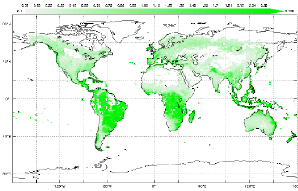
- Global Seasonal Vegetation on Land and Sea
-
Under development.
1. Which color bar shows values that represent vegetation in the oceans? Chlorophyll Concentration (mg/m3)
2. Which color bar would you use to help you identify vegetation values on your continent? Normalized Difference Vegetation Index (NDVI- no units)
3. What color would represents the highest concentration of vegetation in the ocean? whitish yellow Least vegetation? dark blue
4. What color represents the highest concentration of vegetation on land? dark green Least vegetation? whitish tan
5. Find the northern half of South America. Estimate the highest value of vegetation. 0.8-0.9 What features would you expect to find here? forest
6. What values do you estimate that are found along the upper part of Africa? -0.1 What factor might explain these values? desert
7. Choose a continent of your choice. Using this map of June 2018, describe the extreme high and low vegetation found.
a.) Identify your continent. Answers will vary.
b.) Describe any patterns that you observe. Answers will vary.
c.) What explanations can you suggest for the timing of those extremes?
8. Choose an ocean basin of your choice. Using this map of June 2018, describe the extreme high and low vegetation found. Answers will vary.
a.) Identify your ocean basin (e.g., Atlantic, Pacific, Indian, Southern, Arctic). Answers will vary.
b.) Describe any patterns that you observe. Answers will vary.
c.) What explanations can you suggest for the timing of those extremes? Answers will vary.
9. Choose a continent of your choice. Using this map of December 2018, describe the extreme high and low vegetation found. Answers will vary.a.) Describe any patterns that you observe of the same continent. Answers will vary.
b.) What explanations can you suggest for the timing of those extremes? Answers will vary.
10. How does this continent change from June to December? Answers will vary.
a.) How did the range of values (from minimum to maximum) change? Answers will vary.
b.) Identify an area on the continent that changed more than others. What explanations can you suggest for the timing of those extremes? Answers will vary.
11. Choose an ocean basin of your choice. Using this map of December 2018, describe the extreme high and low vegetation found. Answers will vary.
a.) Describe any patterns that you observe in your ocean basin in December. Answers will vary.
b.) What explanations can you suggest for the timing of those extremes? Answers will vary.
12. How does this ocean basin change from June to December? Answers will vary.
a.) How did the range of values (from minimum to maximum) change? Answers will vary.
b.) Identify an area on the ocean that changed more than others. What explanations can you suggest for the timing of those extremes? Answers will vary.13. Describe your observations of vegetation (and chlorophyll) during the other seasons in the year.
By the summer, the Northern Hemisphere experiences a summer growing season and this spreads to high latitudes. In the oceans, there are a higher concentrations of chlorophyll as seen in the North Atlantic; this is due to the phytoplankton growth.
As we move to winter, in the Northern Hemisphere, the NDVI values drop as fewer land plants are growing and many are decaying. All the while, NDVI values in the Southern Hemisphere increase, including chlorophyll values in the ocean indicating phytoplankton blooms. South America, Africa, and Australia also experiences greening of vegetation but, but they do not change as much as the Northern Hemisphere in its summer.
14. Identify regions that remained relatively unchanged over the year. Why do you think this happens?
Both maps and the video show that phytoplankton and land plants stay nearly the same near the equator, where nutrients, temperatures, rainfall, and sunlight are fairly consistent throughout the year.
- How are Phytoplankton and Sea Surface Temperatures Related?
-
Link to How are Phytoplankton and Sea Surface Temperatures Related?
Steps:
- Check with your instructor on how to submit your answers.
- Analyze the Chlorophyll Concentrations color bar provided with the map.
- Describe what you think the color bar legend represents. When phytoplankton populations are large, the color of the water appears greener because of high concentrations of chlorophyll.
- Describe where do you observe the highest concentrations? Lowest? Highest concentrations are located at he higher latitudes and coastal waters Lowest? Lowest concentrations are located at the lower latitudes.
- What factors do you think control where phytoplankton are distributed? Access to sunlight and nutrients
- Now, analyze the Sea Surface Temperature mapped image, paying specific attention to the color bar provided and answer the following questions.
- Where do you observe the highest concentrations? Lowest? The highest concentrations are located at the higher latitudes and coastal waters, while the lowest concentrations are located at the lower latitudes.
- Review following video visualizing Chlorophyll & Sea Surface Temperature from 2002 to 2019. Answer the following questions:
- Where are the highest concentrations of chlorophyll generally located? Do the trends that you observed in the Northern Atlantic also occur in the Southern Hemisphere? Cold, polar waters in both hemispheres (and places where ocean currents bring cold water to the surface, such as around the equator and along the continents) experience high levels of chlorophyll.
- How do the values of chlorophyll change over the seasons? In the hemisphere experiencing summer, we can see the biggest differences between the equatorial regions and polar regions.
- Why do you think that the polar regions experience these changes during the spring/summer seasons? Day length increases so phytoplankton flourish with more sunlight.
- Observing Annual Vegetation Changes: Student Activity
-
- Review the changes in vegetation over the course of 2017. The six images show change in vegetation across the world as time progresses throughout the year.
- What do the colors represent? Dark green areas show where there was a lot of green leaf growth; light greens show where there was some green leaf growth, and tan areas show little or no growth. Black means "no data."
- What changes do you see through the year? What explanations can you suggest for these patterns? There is a greening that appears to follow the spring/summer seasons in each hemisphere. What explanations can you suggest for these patterns? Axial tilt explains why the Northern Hemisphere experiences spring/summer during March- August; Southern Hemisphere - September - February.
- Choose a location or region. During which months do the extreme highs and lows occur? What explanations can you suggest for the timing of those extremes? Answers will vary.
- Which regions experience both the extreme highs and lows? Polar regions experience extremes. Which regions don’t experience the extremes? Why do you think this happens? The higher latitudes have more extreme highs and lows due to the tilt of the Earth's axis affecting the amount of incoming solar radiation received on Earth.
- Are there regions that remained relatively unchanged over the year? Why do you think this happens? The low latitudes do not have such extremes due to lack of fluctuation of solar radiation.
- Relationship Between Surface Temperature and Vegetation
-
Link to Relationship Between Surface Temperature and Vegetation Mini Lesson
- Answer the questions below. Check with your instructor on how to submit your answers.
- Review the Landsat mapped image showing Vegetation of the Atlanta, Georgia region May 1, 2018. It shows Vegetation Index; it is a measure of how much near-infrared radiation is reflected at the surface and can be used to identify the locations of plants.
- Review the color bar below. On the legend below, areas with a vegetation index closer to 1 contain plant life, while areas less than 0 represent areas that do not contain plant life.
- Select a quadrant to analyze in the image below and answer the questions.
- Where do you find the largest and the smallest values in your quadrant. (Answers will vary. Overall, there is mostly green representing up to 0.6 on the vegetation index. There are concentrations of purple up to -0.4 on the vegetation index mostly in the center of image where the four quadrants meet, as well as near the river.)
- What kinds of environments may exist in an urban environment like Atlanta that would include areas of more/less vegetation? (Parks and suburbs are likely found where the green locations are located; developments where roads, sidewalks, businesses, and homes, etc. are found.)
- Using the vegetation map, make predictions about where you would likely find the hottest and coolest temperatures in the Atlanta metro area. (Answers will vary. The most forested areas will have the coolest temperatures because plants take up water from the ground through their roots and store the water in their stems and leaves. The water eventually travels to small holes on the underside of leaves. There, the liquid water turns into water vapor and is released into the air. This process is called transpiration. By releasing water, plants cool themselves and the surrounding environment.)
- Now observe the surface temperature image from Landsat below and review the color bar. This image shows Surface Temperature, of the Atlanta, Georgia region May 1, 2018; it represents the temperature of the Earth’s surface (expressed in degrees Fahrenheit).
- Now analyze the same quadrant as with the previous map.
- Students answer the the following questions.
- Are your predictions correct? Why or Why not? (Answers will vary.)
- What patterns do you observe? (Generally, the inverse patterns emerges as with the Vegetation map above. The most vegetated are the coolest, while the lease vegetated surfaces are the warmest.)
- What are the tradeoffs to urban development? (The benefit of urban development is that there are more shared communal resources such as transportation. People live within a smaller footprint. The costs are that the developed surfaces create warmer micro climates.)
- Soil Moisture Analysis
-
Link to Mini Lesson
Steps
- Observe the map above, and complete the tasks. Check with your instructor on how to submit your answers.
- I see...
- Spend five minutes coming up with as many things you observe on this map.
- Start each item with, "I see..." Some general questions are:
- What is represented within this map?
- What is the range of the data?
- Where are the extreme values located?
- I think...
- Next, list as many thoughts as possible on what this map makes you think.
- Start each item with, "I think..."
- I wonder...
- The last step is to think of questions about this map.
- Create at least five statements that begin with, “I wonder…”
Accept reasonable responses for all questions.
Examples:
I think soil moisture changes as seasons change so this is the soil moisture for the end of spring. I think this information is vital for farmers. I think there was likely a weather system that moved across from South Dakota to Pennsylvania. I think another storm system went up the East Coast dropping precipitation.
- Stability and Change: Observing and Measuring Plants
-
Link to Stability and Change: Observing and Measuring Plants
-
What do the terms "stability" and "change" mean as they relate to the Biosphere?
NSTA states that "Stability denotes a condition in which some aspects of a system are unchanging, at least at the scale of observation. Stability means that a small disturbance will fade away—that is, the system will stay in, or return to, the stable condition...By contrast, a system with steady inflows and outflows (i.e., constant conditions) is said to be in dynamic equilibrium...A repeating pattern of cyclic change...can also be seen as a stable situation, even though it is clearly not static."
NSTA: https://ngss.nsta.org/CrosscuttingConcepts.aspx?id=7 - Provide examples of times when the Biosphere is stable and when it changes. Accept all reasonable answers.
- Watch the visualization to see how Earth's plant life changes over the course of a year.
- In this video, what do areas of dark green represent? The dense green areas on the globe represent thriving flora.
- What do areas that are colored light green or tan represent? The light green or tan areas represent sparse plant life or struggling vegetation.
- Observe the eastern United States in the beginning of the video. What pattern do you notice in the months of March and April? Why do you think that is? There is an increase in greening in the eastern United States. This is occurring during the spring season.
-
- Surface and Air Temperatures Throughout the Day
-
Link to Surface and Air Temperatures Throughout the Day Mini Lesson
This line graph shows how the surface temperature and air temperature values change over the course of 24 hours. Surface temperatures vary more than air temperatures during the day, but they both are fairly similar at night.
- Review the line graph of surface temperature and air temperature throughout the day and answer the questions below. Check with your instructor on how to submit your answers.
- What do you observe in the line graph of surface temperature and air temperature throughout the day?
- What do you the two different colors represent? Day (orange) vs Night (blue)
- What is the difference between the dashed and the full lines? The dashed lines indicate the Air Temperature, while the solid lines indicate the Surface Temperature.
- What do these variables mean? How are they the same? Different?
- Surface Temperature: This quantity represents the temperature of the first few centimeters at the top of the surface.
- Air Temperature: This quantity refers to the temperature of the air about 2 meters above the surface.
- Describe the X Axis and what it represents.
- The X-axis - The x-axis shows land use areas. Ask students to think about what you will find in the different areas (e.g., When you visit a big city, you won’t see many plants. Instead, you’ll see sidewalks, streets, parking lots and tall buildings. These structures are usually made up of materials such as cement, asphalt, brick, glass, steel and dark roofs). As you head to rural areas, you will probably find that most of the region is covered with plants (grass, trees, and farmland covered with crops).
- Describe the Y Axis and what it represents.
- The Y-axis - The y-axis represents temperature. It should be the same for all four variables. There is no scale because this graphic is a generic representation and doesn't represent any particular geographic region, over a particular time. It shows the general pattern of these changes over a 24-hour cycle over a variety of land-use areas.
- Analyze the line graphs and answer the following questions.
- What do you see? [Answers may vary. Answers may include: Surface temperatures vary more than air temperatures during the day, but they both are fairly similar at night. The temperatures generally increase from the outskirts of the urban areas as you move towards the city center.]
- What do these trends and differences mean? [City-related materials such as black roofs, roads, etc. cause urban areas to absorb and retain heat. Also, the heat produced by automobiles, factories, and homes may also contribute to the higher temperatures.]
- What is something you would like to know about this graph? Come up with a research question you would like to know the answer to. [Answers will vary.)
- Systems and System Models: Observing Our Planet on Fire
-
Link to Systems and System Models: Observing Our Planet on Fire Mini Lesson
Accept reasonable responses for all questions. Some possible answers are outlined below.
- Describe the phenomenon you observe. Global impact of smoke from fires
- What patterns do you see in this model?
- From South America smoke is carried far into the Atlantic.
- Smoke from Southern Africa is also carried into Atlantic.
- Fires in Northeast India produce thick smoke which is trapped by the Himalayas.
- Unusually large human set fires in Indonesia create haze and reduce air quality and visibility.
- Australian fires mostly ignited by lightning burn on eastern and southern coasts, and the smoke is sucked into the constant swirl of storms around Antarctica and mixed with sea salt.
- Africa is home to 70% of world’s fires and smoke merges with dust from Sahara and travels across the Atlantic.
- Fires are common in dry season in South America and Southern Mexico.
- Fires in North America are more rare and occur in the Southeast and Mississippi River Valley.
- Southeast Asia fires extend 1000s of miles and reach distant lands.
- What are some limits of this model? The entire Earth cannot be seen at once. Specific events may not be included.
- How is this model precise? It does capture some specific events such as the volcano. It shows the different types of aerosols in the atmosphere such as smoke, sea salt and dust. It shows wind patterns.
- What benefits are there in using this model? It may help predict the impact of large fires in different parts of the world.
- Predict the future of the phenomenon based on the model you've observed. Fires in different parts of the world are likely to follow similar patterns of smoke transport.
- What evidence of Earth System interaction (among Atmosphere, Hydrosphere, Biosphere, Cryosphere, Geosphere) do you see?
- Biosphere is burning and impacting atmosphere with smoke.
- Farmers ignite fires to clear fields for new crops (biosphere) which impacts atmosphere.
- Smoke from Australian fires is sucked into storms formed around Antarctica (cryosphere) and mixed with sea salt from the Hydrosphere.
- Volcanic eruptions (geosphere) can emit smoke into the atmosphere as well.
- UnEarthing Data: Phytoplankton Part 1
- UnEarthing Data: Phytoplankton Part 2
-
Link to UnEarthing Data: Phytoplankton Part 2
Link to UnEarthing Data: Phytoplankton Part 2 Teacher Key
Link to UnEarthing Data Activity
- Using Models to Explore Chlorophyll and Radiation Data
-
Link to Using Models to Explore Chlorophyll and Radiation Data Mini Lesson
Steps:
- Check with your instructor on how to submit your answers.
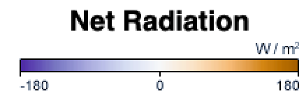
- Review the color bar scale for net radiation. What do the colors mean? The color bar shows changes in the balance of incoming and outgoing energy on Earth. Places where more energy was coming in than going out (energy surplus) are orange. Places where less energy was coming in than going out (energy deficit) are purple. Places where the amounts of incoming and outgoing energy were in balance are white.
- Review the color bar scale for chlorophyll concentration. What do the colors mean? The color bar shows changes in chlorophyll values. Places where chlorophyll amounts are very low, indicating very low numbers of phytoplankton, are blue. Places where chlorophyll concentrations were high, meaning many phytoplankton were growing, are dark green. The observations come from the MODIS sensor on NASA's Aqua satellite. Land is dark gray, and places where MODIS could not collect data (reasons include sea ice, polar darkness, or clouds) are light gray.

- Describe the values for net radiation during the spring and fall in the Northern Hemisphere. In the Northern Hemisphere, net radiation during the spring and fall is closest to zero. There are areas that are more positive or negative, but their difference is less extreme compared to the summer and winter.
- List the value of net radiation in the Northern Hemisphere during the summer, then list the value of net radiation in the Northern Hemisphere during winter. What do you notice? In the Northern Hemisphere during the summer, the value of net radiation is high at 180 Watts per square meter. In the Northern Hemisphere during the winter, the value of net radiation is very low at -180 Watts per square meter. The Northern Hemisphere can experience an extremely large range in net radiation.
- Describe the patterns you observe between net radiation and chlorophyll concentration? Chlorophyll concentration shifts north or south throughout the year in the same manner as positive net radiation. For example, in the summer when net radiation is high throughout the Northern Hemisphere, the chlorophyll concentration is also high. In the winter, when net radiation is low throughout the Northern Hemisphere and high throughout the Southern Hemisphere, chlorophyll concentration also decreases in the Northern Hemisphere and increases in the Southern Hemisphere.
- Observe the contrast between the Northern Hemisphere and the Southern Hemisphere in net radiation values. Explain which two seasons experience a greater difference? Fall and spring or summer and winter? Explain. Summer and winter experience the greater difference in net radiation values. There is a stark contrast between the northern and southern hemispheres during the summer and winter. During these seasons, one hemisphere of the Earth will experience high net radiation and the other hemisphere will experience low net radiation. There is little difference in the fall and spring seasons. Both fall and spring experience more uniform net radiation, that is not extremely high or extremely low.
- Using Precipitation and Vegetation to Study Climate Zones
-
Link to Using Precipitation and Vegetation to Study Climate Zones
- What are some differences between weather and climate? Climate is a pattern of weather in an area over an extended period of time. Weather reflects the current conditions in an area.
- What are two variables you are reviewing today? Precipitation and Normalized Difference Vegetation Index
- What is the name of this map visualization? Monthly Precipitation
- What does the dark brown represent? Areas with little precipitation.
- What does the dark blue represent? Areas with more precipitation.
- What month and year does this visualization show? March 2012.
- Find two locations where there is high precipitation values but little vegetation and where there is little precipitation but high vegetation. Look at different data sets in order to discover outlier areas. Students will have varying answers to this question.
- What is the name of the map visualization? Normalized Difference Vegetation Index
- What does the bright green represent? Areas with a higher NDVI
- What does the white represent? Areas with a lower NDVI
- What month does this represent? March 2012.
Compare Visualizations: Students will make their own observations about the similarities and differences between the 2 visualizations. They may point out areas that are high or low in one or both phenomena or they may make other observations about patterns, etc.
Investigate Relationships and Patterns: Students will choose areas that are high or low in precipitation and discover how the NDVI in those regions changes based on precipitation level.
