Students analyze surface air temperature anomalies to identify change with respect to different latitudes across the world.
Student Directions
Background
The surface air temperature is how hot air is near the surface of the Earth, measured at 2 meters above the ground or ocean surface. Surface air temperature is the same as the temperature that is included in the daily weather report. Scientists measure surface air temperature at more than ten thousand locations throughout the world.
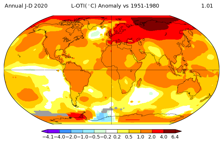
Review the video "Global Surface Air Temperature Anomalies from 1880 to 2017". In this visualization, we can observe changes in surface air temperature across the Earth’s surface. These changes are taking place across different latitudes.
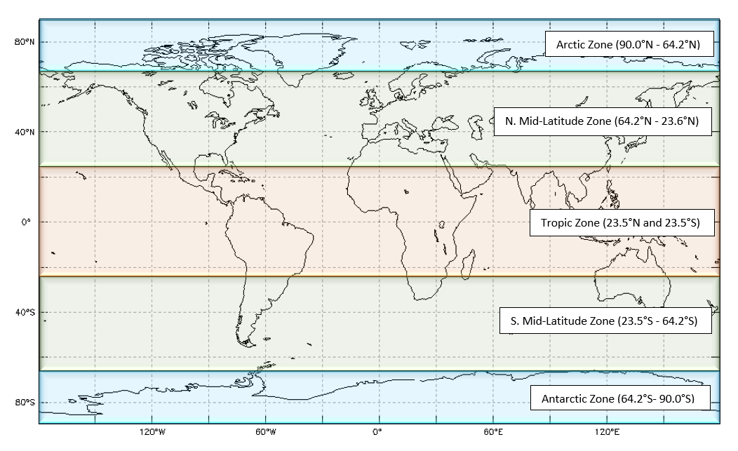
The map below shows groups of latitudes, which are referred to as zones;they include:
The Arctic Zone (90.0°N - 64.2°N)
The N. Mid-Latitude Zone (64.2°N - 23.5°N)
The Tropic Zone (between 23.5°N and 23.5°S)
The S. Mid-Latitude Zone (23.5°S - 64.2°S)
The Antarctic Zone (64.2°S - 90.0°S)
Latitude map by zone. Source: My NASA Data https://mynasadata.larc.nasa.gov/sites/default/files/inline-images/Latzones.png
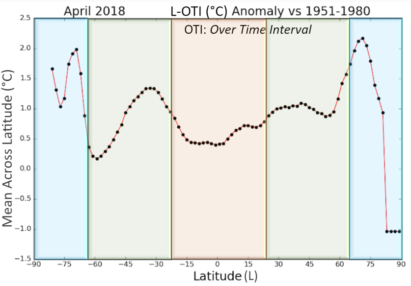
The zones of latitude can also be identified within the graph of surface air temperature data below. Note: latitudes of the Southern Hemisphere are displayed as negative values (-) on the x-axis, while latitudes of the Northern Hemisphere are displayed as positive values (+).
Latitude Surface Temperature Anomalies for April 2018
Notice how the global temperature data are reported in the above graph as anomalies?
An anomaly in this case will refer to any instance when the mean temperature (°C) across a latitude was either higher (+) or lower (-) than normal. Normal is represented by 0.0 on the vertical axis of the graph. In the graph above, surface air temperature data from April of 2018 is being compared against data from a base period in the past when far more typical surface air temperatures were recorded on Earth (e.g., 1951-1980).
Additionally, scientists are always looking for patterns in data. Any recognizable pattern of change (e.g., increase, decrease, stability, variability, or cyclical nature) that can be identified in the data is referred to as a trend.
Putting it all together: Now, let’s take what we know about zones of latitude, as well as anomalies and trends, to answer some questions about this line plot of global surface air temperatures:
Steps:
Answer the questions below. Check with your instructor on how to submit your answers.
At what latitudes and within which zone(s) do you see the most significant surface air temperature positive anomalies? What do these positive anomalies indicate?
At what latitudes and within which zone(s) do you see the most significant surface air temperature negative anomalies? What does these negative anomalies indicate?
What trends in surface air temperature do you observe with respect to latitude? (Do you see places in the graph where a pattern can be recognized? Are there any patterns in the animation?)
What inference(s) or conclusion(s) can you make about these data? Can you provide any scientific explanation(s) for these?
Vocabulary
Anomaly: a departure from average conditions.
Base period: Time interval to which anomalies are relative.
Mean: an average of values calculated by adding all values, then dividing that sum by the total number of values.
Time interval: the years over which temperatures are averaged or trends are found.
Teachers, these mini lessons/student activities are perfect "warm up" tasks that can be used as a hook, bell ringer, exit slip, etc. They take less than a class period to complete. Learn more on the "My NASA Data What are Mini Lessons?" page.
Teachers who are interested in receiving the answer key, please complete the Teacher Key Request and Verification Form. We verify that requestors are teachers prior to sending access to the answer keys as we’ve had many students try to pass as teachers to gain access.