Hydrosphere Mini Lesson/Activity Teacher Key


- Analyze Graph of Tropical Cyclone Counts
-
Link to Analyze Graph of Tropical Cyclone Counts Lesson

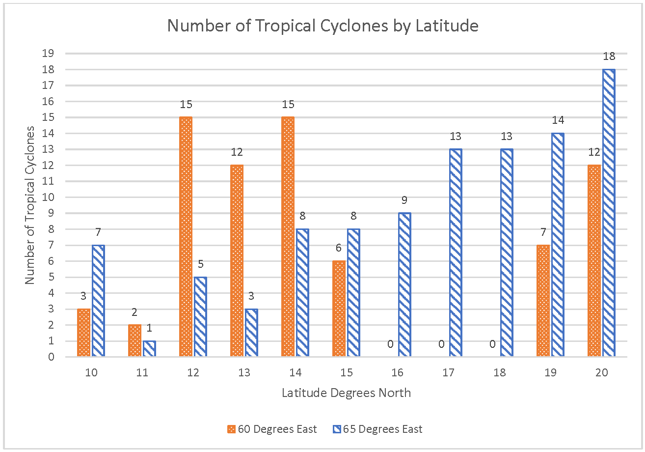
Number of Tropical Cyclones by Latitude
https://mynasadata.larc.nasa.gov/sites/default/files/2022-01/Bar_column%20chart%20cropped.png
Steps
- Analyze the Tropical Cyclone Counts double bar graph and answer the questions. Check with your instructor on how to submit your answers.
- At 14° north, how many more tropical cyclones were at 60° east than at 65° east? 7 more
- At 60 degrees east, how many more tropical cyclones were at 14° north than at 15° north? 9 more
- What was the total number of tropical cyclones at each latitude between 60° and 65° east?
- 10° N – 10 tropical cyclones
- 11° N – 3 tropical cyclones
- 12° N – 20 tropical cyclones
- 13° N – 15 tropical cyclones
- 14° N – 23 tropical cyclones
- 15° N – 14 tropical cyclones
- 16° N – 9 tropical cyclones
- 17° N – 13 tropical cyclones
- 18° N – 13 tropical cyclones
- 19° N – 21 tropical cyclones
- 20° N – 30 tropical cyclones
- In table form:
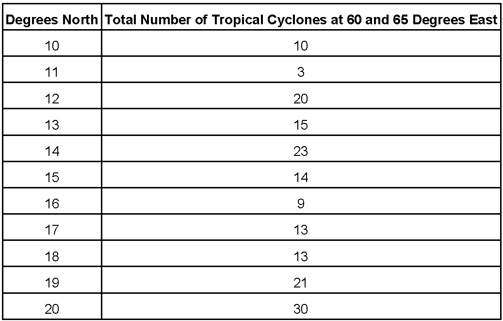
- Which latitude had the highest total number of tropical cyclones at these longitudes? 20 degrees north
- How many fewer total tropical cyclones were at 15° north than at 14° north at these longitudes? 9 fewer
- Look at the locations on the map. Do you think the land around these locations have enough risk of hurricanes that they should develop emergency plans? Answers will vary. It would be a good idea to have plans in place for how to handle hurricanes.
- Analyze the Tropical Cyclone Counts double bar graph and answer the questions. Check with your instructor on how to submit your answers.
- Analyzing Historic Ocean Chlorophyll Concentration Data with Maps
-
Link to Analyzing Historic Ocean Chlorophyll Concentration Data with Maps
Steps:
- Check with your instructor on how to submit your answers.
- Identify what living organisms may be observed using chlorophyll data. Phytoplankton, plants, etc.
- Recall that phytoplankton are microscopic, floating, plant-like organisms that live in oceans, lakes, and rivers. They use photosynthetic pigments (like chlorophyll) to convert energy from the Sun into organic matter. For this reason, NASA satellites can observe the amount of phytoplankton present in the ocean by measuring chlorophyll concentrations.
- Review the color bar scale below. What do the different colors mean as they are related to phytoplankton? When phytoplankton populations are large, the color of the water appears greener because of high concentrations of chlorophyll.
- Identify each region using the numbers listed on the map. 1. Alaskan Coast, 2. Canadian West Coast, 3. West Coast (U.S), 4. East Coast (U.S.), 5. Canadian East Coast, 6. Pacific (Hawaii)
- Analyze the Chlorophyll Concentrations in Surface Ocean Waters image with each region you listed.
- Compare the Chlorophyll Concentrations in the coastal areas to the open ocean in the Pacific. What do you observe? Coastal areas tend to have higher concentrations of chlorophyll than the open ocean.
- How do the lower latitudes like those in Florida or Hawaii compare to the higher latitudes like those in Alaska? There are high concentrations in the higher latitudes than the lower ones.
- Compare the West Coast vs. East Coast concentrations. The higher concentrations are more evident along the west coast of North America.
- Comparing Winds & Surface Ocean Currents
-
Link to Comparing Winds & Surface Ocean Currents Mini Lesson
Reading the Images
-
Orient yourself to the ocean basins, the vectors, the vector legend, and the date/time information. Vector Legend:
-
Observe primarily the data displayed for the Equator and the North Atlantic Ocean.
- Run the animation My NASA Data: Global Wind Vectors 2017 2018. (May need to replay when needed.)
-
Answer the following questions. Check with your instructor on how to submit your answers.
- Observe the winds blowing across Earth’s surface. Which direction do the winds primarily blow around the Equator? West to East
- Focus your attention on the North Atlantic Ocean. What direction are the winds primarily blowing to? East in the North Atlantic (called the Prevailing Westerlies)
- Describe the months where the intensity of the Westerlies are the strongest? (Recall, the wind speed is displayed by the length of the arrow or the vector.) Winter months
- Describe the directions of winds off of the Eastern part of North America. There appear to be two circular patterns: 1.) Subpolar Gyre off of Greenland and 2.) Subtropical Gyre separating North America and Africa with Europe
- Winds blow from high to low pressure, and blow clockwise around areas of high pressure and counterclockwise around areas of low pressure in the Northern Hemisphere. (These directions the wind blows around high and low pressure is opposite in the Southern Hemisphere (clockwise around lows and counterclockwise around highs).)
- Observe the gyre in N. Atlantic - is it a high pressure or low-pressure area? The N. Atlantic Gyre consistently flows in a clockwise path around the North Atlantic Ocean. This would be a low pressure area.
Connecting the Data
- Observe the map of ocean surface currents.
- What similarities do you notice? Students should recognize the gyres.
- What role do winds play in the creation of surface currents? Large global wind systems are created by the uneven heating of the Earth’s surface. These global wind systems, in turn, drive the oceans’ surface currents.
-
- Creating and Interpreting Images as Models
-
Link to Creating and Interpreting Images
Array tables to be created:
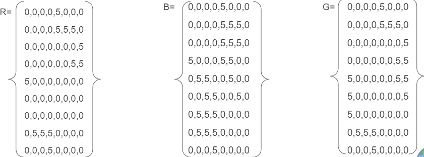
Combined Array Table:
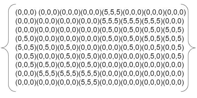
Pixel Grid:
6. Where is the ice represented in the image? In the center of top and bottom. This could be representative of poles on a planet.
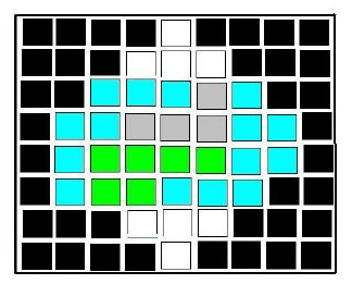
- Creating Images from Numbers: Student Activity
-
Link to Creating Images from Numbers
Creating Images from Numbers sample answer using assigned colors. The answers will vary if students select other colors.
https://mynasadata.larc.nasa.gov/sites/default/files/inline-images/creating%20images%20from%20numbers.jpg- Answer the following questions if the data are wind speed in km per hour.
- What color is the fastest? white Slowest? black
- Where is the wind between 21-25 km per hour? red squares or the color chosen
- Answer the following questions if the numbers are elevation in meters above sea level.
- What color is the lowest? black Highest? white
- Where is the elevation between 31 and 35 meters above sea level? white squares
- Do you notice any pattern in the image? Accept reasonable responses. The highest values are in the center. Numbers decrease the farther they are from the center. Learners are likely not to think the red color would be the highest, which is not the case.
- How does the size of the grids in the grid paper affect the image that you created? Accept reasonable responses. Smaller grids can have different values which can provide more detail. Larger grids will provide less detail.
- Which do you think would be more realistic, larger grid sizes or smaller? Why? Accept reasonable responses. Smaller grids will provide more detail, which can be more realistic.
- Answer the following questions if the data are wind speed in km per hour.
- Earth System Energy Travels
-
Link to Earth System Energy Travels Mini Lesson
- What can happen to the energy as it travels through the Earth system? It can be reflected or absorbed.
- Where does the largest percentage of energy go in the Earth system? It is absorbed by land and oceans.
- What kinds of ways is the energy used once it enters the Earth system (i.e., Hydrosphere, Atmosphere, Biosphere, etc.)? Accept reasonable responses. Energy that is absorbed can heat the surface and land (geosphere), atmosphere, and oceans (hydrosphere). Energy can also be used by plants for photosynthesis (biosphere).
- What is the role of the atmosphere (including clouds) as it relates to Earth’s energy? The energy can be both reflected and absorbed by the atmosphere and by clouds.
- El Niño & Spread of Human Disease: Student Activity
-
Link to El Niño & Spread of Human Disease
- Check with your instructor on how to submit your answers.
- Reflect on what you learned in the article and video.
- Analyze the 2 maps below of El Niño and Rainfall and Elevated disease risk. Answer the following questions.
- Identify the environmental changes that are associated with El Niño events. High temperatures and drought in some locations, as well as excess rain in other locations.
- Identify which diseases were elevated in Colorado and New Mexico. Plague and hantavirus. What do these states have in common? These diseases are both vector-born diseases, spread to humans by mosquitos, rodents, ticks, and other animals.
- Identify which disease were elevated in Tanzania? Cholera.
- Identify which disease were elevated in Brazil and Southeast Asia. Dengue fever. What do these countries have in common and what was the impact? In both locations, drought changed the habitat and behavior of mosquitos that carry dengue fever. This change resulted in more cases of dengue fever in humans.
- How do the environmental changes caused by El Niño relate to the spreading of certain diseases (plague, hantavirus, cholera, and dengue fever)? Accept all reasonable responses. See examples:
- Plague and hantavirus in the southwestern U.S. are due to above-normal rainfall; the additional rainfall is associated with an increase in vegetation that rodents feed upon, leading to an increase in the rodent population. The rodents contribute to the spread of the diseases.
- Rainfall is associated with cholera in Tanzania. Outbreaks of cholera, E coli, and other diarrheal diseases can be caused by a lack of water supply and sanitation, as well as damaged infrastructure.
- Dengue in Brazil and SE Asia are associated with above-average surface temperatures and drought. Mosquito populations also increase in drought events because mosquitoes’ predators and competition are reduced, additionally, the high temperatures changed the metabolism of mosquitos and allowed them to reproduce more quickly. Also, during drought events, it is common to find water storage containers and rainwater collecting devices that provide additional habitat.
General Background: ENSO-associated events include extreme rainfall and high temperatures. These extremes are known to be drivers of a range of diseases, including vector-borne and water-borne diseases. Where there is limited access to clean water, sanitation, and food, there is a risk of communicable disease.
El Nino causes above-average rainfall events such as storms and cyclones that trigger floods. Floods and other large precipitation events create environmental changes that affect disease-bearing insects and their interaction with their animal hosts. Examples of diseases from these causes include malaria, dengue, hantavirus, chikungunya, West Nile virus, Rift Valley Fever, Zika, and more. Mosquitos are important vectors that transmit pathogens during times of increased rainfall. This is due to the availability of increased habitat made possible through the additional rainfall.
These diseases are also associated with other ENSO conditions such as low rainfall and higher temperatures. Mosquito populations may also increase in drought events. During these extreme conditions, mosquitoes’ predators and competition are reduced, allowing the mosquitos to populate. Additionally, during drought events, it is common to find water storage containers and rainwater collecting devices that provide additional habitat. Dengue in Brazil and SE Asia are associated with above-average surface temperatures and drought.
When water quality is impacted by contamination from drought, wildfires, flooding and/or storm events, water-borne diseases increase. This can be due to a lack of water supply and sanitation, as well as damaged infrastructure. Outbreaks of cholera, E coli, and other diarrheal diseases are examples. Plague and hantavirus in the SW U.S. are due to above-normal rainfall. Rainfall is also associated with cholera in Tanzania.
- Energy and Matter: Exploring Ocean Salinity
-
Link to Energy and Matter: Exploring Ocean Salinity Mini Lesson
Review the NASA Video of sea surface salinity observations (September 2011-September 2014) from the Aquarius/SAC-D mission, a collaboration between NASA and the Space Agency of Argentina. The data is shown on a spinning globe.
Answer the following questions. Check with your instructor on how to submit your answers.
- What is salinity? concentration of dissolved salt
- Why is salinity important in the water cycle and in ocean circulation? Salinity is key to studying the water cycle and ocean circulation, both of which are related to climate. Over decades, the amount of salt in ocean basins has been fairly stable. The water cycle operates on much faster time scales, however, causing changes in salinity patterns.
- In the video, what color represents high salinity values? Red Low? Blue
- Where do you see the greatest concentrations of low salinity values? Polar regions, equatorial region, some coast lines. High salinity values? The saltiest areas in the global ocean are the locations where evaporation is high or in large bodies of water where there is no outlet into the ocean.
- Based on what you know about the water cycle, what causes changes in the salinity values? Changes in sea surface salinity, provide a fingerprint of Earth's freshwater cycle. Salinity decreases when freshwater enters the ocean from rivers, melting ice, rain and snow. Processes that cause freshwater to exit the ocean such as evaporation and formation of sea ice raise salinity. Differences in dissolved salt content also play a major role in moving seawater, and the heat it carries, around the globe.
- Create a narration script that describes your observations over the course of this 30 second video. Answers will vary. Higher salinity areas are shown in red. These regions of high evaporation are sometimes called "ocean deserts." Blue colors represent lower salinities, resulting from freshwater inputs into the ocean. These include Amazon River outflow that appears as a ribbon-like feature in the tropical Atlantic, a zone of persistent rainfall that spans the tropical Pacific, and melting ice near Earth's poles.
- Energy and Matter: Sea Surface Temperature (Student Activity)
-
Review the NASA Video below. This visualization shows long-term average sea surface temperature observations shown on a spinning globe. The long-term average (or "climatology") of sea surface temperature used in this animation came from the World Ocean Atlas 2005.
Answer the following questions:
1. In the video, what color represents high temperature values? Red Low? Dark blue
2. Where do you see the greatest concentrations of low temperature values? High temperature values? The most obvious feature of this temperature map is the variation of the temperature by latitude, from the warm region along the equator to the cold regions near the poles. Another visible feature is the cooler regions just off the western coasts of North America, South America, and Africa. In these regions, the combination of Earth's rotation and alongshore winds push water away from the coast, allowing cooler water to rise from deeper in the ocean.
Analyze the line plot showing Sea Surface Temperature in January 2018 in the Atlantic Ocean (15.5 W, 0).
3. Describe what you see in the data visualization. Sea Surface Temperatures are variable along 25.5W in the Atlantic Ocean at different latitudes spanning from pole to pole. The 80-60 degrees S latitudes have waters that stay around 0 degrees Celsius, whereas the waters in the north latitudes are warmer during January 2018. Temperatures increase as waters get closer to the Equator and peak at 28 degrees Celsius around 5 degrees N.
4. How are the ideas and information presented connected to what you already knew? Answers will vary. The polar regions receive less solar radiation than the equator so the higher latitudes' sea surface temperatures will be cooler and the areas around the equator will be warmer.
5. Make a prediction about what you think these data will show in June and September. Answers will vary.
Analyze the line plot showing Sea Surface Temperature in June 2018 (Left) and September 2018 (Right) in the Atlantic Ocean (15.5 W, 0).
6. Describe the evidence that supports or refutes your predictions? Answers will vary.
- Energy and Matter: Water Cycle & The Ocean's Temperature
-
Link to Energy and Matter: Water Cycle & The Ocean's Temperature
- Review the NASA Scientific Visualization Studio video, The Water Cycle: Heating the Ocean on Youtube.
- Answer the following questions. Check with your instructor on how to submit your answers.
- What is the water cycle? The water cycle is a never-ending global process of water circulation from clouds to land, to the ocean, and back to the clouds.
- What drives the movement of air and water in the Earth System? The Earth acts as a giant engine that uses solar power to move air in the atmosphere and water in the ocean.
- Where does this visualization begin in the water cycle? In this visualization series, the cycle begins when the top of the ocean absorbs sunlight.
- Describe what happens to the sun's heat as you progress through the video. The sun's heat is dispersed in the upper ocean by waves and currents.
- How does the Sun and the Hydrosphere's oceans interact in this video? Water has a high heat capacity and the ocean can absorb a lot of heat without much change in temperature.
- Describe what happens in the night to the ocean with respect to energy. The ocean cools off very little at night.
- Describe what happens to the land's temperature over the course of the day and night. Materials forming the land surface such as rocks and soil, however, have lower heat capacity. Thus land temperature changes rapidly, even from night to day.
- Exploring Cryosphere's Seasonal Thaw
-
Link to Exploring Cryosphere's Seasonal Thaw
Observing Changes in Land’s Surfaces
1. Check with your instructor on how to submit your answers.
2. Watch this animation and answer the questions below:
- Which latitudes in the Northern Hemisphere (i.e., Arctic, Northern Mid Latitudes, or Tropics) experience the most change in snow and ice extent over the course of a year? Northern Mid Latitudes.
- During what months do you predict to have the largest amount of frozen soil conditions in the Northern Mid Latitudes? Nov-Jan Thawing soil conditions in the Northern Mid Latitudes? March - August.
Describing the Arctic’s Land Surfaces
3. Analyze the maps below to orient yourself to the geographic region being analyzed in the blue and red maps that follow. Answer the following questions.
- What is the location that the map is focused on? We are looking at the Arctic in the northern hemisphere
- What variable is being analyzed? The state of H2O in the soil changing from solid to liquid during spring thawing, based on the temperature of the soil.
- Describe what the shades of red indicate about soil conditions mean? Water within the soil is in the thaw (liquid) state. White? The ratio of the frozen soil to thawed soil equals 0.5. Blue? Water within the soil is in the frozen (solid) state.
- What two dates are being compared? April 1st, 2015 and April 13, 2015
- The two maps are 12 days apart. What do you predict would happen in 12 more days? Why? There would be more thawing even closer to the North Pole. The hours of daylight increases as we move from winter to spring and the illumination of solar energy increases at the poles, the bright white snow and sea ice reflect a significant portion of the incoming light, reducing the potential for solar heating.
- When the surface changes from blue to red, what happens to the environment of that area? Rapid warming releases liquid water. As liquid water becomes more readily available, plant and animal activity are energized. The land greens up, and animals return to graze.
- Exploring Energy and Matter with Chlorophyll Data
-
Link to Exploring Energy and Matter with Chlorophyll Data Mini Lesson
The following video, NASA SeaWiFS Biosphere Data over the North Atlantic, shows satellite data as an animation, displaying 10 years of phytoplankton growth. This animation begins with Earth's rotation until it reaches the North Atlantic.
Review the video and then answer the following questions.
- How are Phytoplankton and Sea Surface Temperatures Related?
-
Link to How are Phytoplankton and Sea Surface Temperatures Related?
Steps:
- Check with your instructor on how to submit your answers.
- Describe how can you tell what season is showing in the video. Identify the indicators of seasonal change? By observing the land cover, changing vegetation becomes evident as seasons change. For example, land vegetation appears in the northern hemisphere during summer.
- Describe what the dark blue areas of the ocean represent? These are areas where phytoplankton are scarce, often due to the lack of nutrients.
- Describe what the greens and reds in the ocean indicate? They indicate an abundance of phytoplankton, which often correlates with nutrient-rich areas. These can include coastal regions where cold water rises from the seafloor and near the mouths of rivers.
- Compare the Chlorophyll Concentrations in the coastal areas to the open ocean in the Pacific. What do you observe? Coastal areas tend to have higher concentrations of chlorophyll than the open ocean.
- Compare the Chlorophyll Concentrations of the North Atlantic. What differences do you in the summertime versus the wintertime? Chlorophyll concentrations surge during the wintertime months and fall back during the summertime months.
Check with your instructor on how to submit your answers. Analyze the Chlorophyll Concentrations color bar provided with the map.
- Describe what you think the color bar legend represents. When phytoplankton populations are large, the color of the water appears greener because of high concentrations of chlorophyll.
- Describe where do you observe the highest concentrations? Lowest? Highest concentrations are located at he higher latitudes and coastal waters Lowest? Lowest concentrations are located at the lower latitudes.
- What factors do you think control where phytoplankton are distributed? Access to sunlight and nutrients
Now, analyze the Sea Surface Temperature mapped image, paying specific attention to the color bar provided and answer the following questions.
- Where do you observe the highest concentrations? Lowest? The highest concentrations are located at the higher latitudes and coastal waters, while the lowest concentrations are located at the lower latitudes.
Review following video visualizing Chlorophyll & Sea Surface Temperature from 2002 to 2019. Answer the following questions:
- Where are the highest concentrations of chlorophyll generally located? Do the trends that you observed in the Northern Atlantic also occur in the Southern Hemisphere? Cold, polar waters in both hemispheres (and places where ocean currents bring cold water to the surface, such as around the equator and along the continents) experience high levels of chlorophyll.
- How do the values of chlorophyll change over the seasons? In the hemisphere experiencing summer, we can see the biggest differences between the equatorial regions and polar regions.
- Why do you think that the polar regions experience these changes during the spring/summer seasons? Day length increases so phytoplankton flourish with more sunlight.
- Hurricane Harvey's Effect on Soil Moisture
-
Link to Hurricane Harvey's Effect on Soil Moisture Mini Lesson
- What does the size of the dot represent? The rate of change in the amount of moisture in the soil
- What does the color represent? The quantity of moisture per cm cubed per cm cubed
- What area was the most impacted by Hurricane Harvey? How do you know? North West of Houston because it has the largest and darkest hexagons.
- Why do you think there was not a change in soil moisture in the city of Houston? The surface of a city is mainly impermeable so the water isn’t able to soak into the soil but rather runs off into its watershed
- What is one question you have when looking at this map? Answers can vary but examples are; why did the East side of Houston not have as drastic soil moisture change compared to the west side of the city; what was the path the storm took; how much water dumped onto the city?
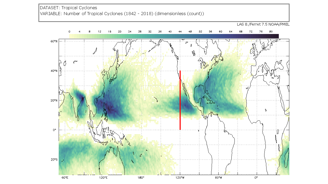
- Interpret Tropical Cyclone Counts Model
-
Link to Interpret Tropical Cyclone Counts Model
Use the Tropical Cyclone Counts Map Image to answer the questions.
- What variable is represented by the colors? The number of tropical cyclones at each location between 1842 and 2018.
- What latitude and longitude ranges have the most cyclones? Approximately five to 10 degrees north of the equator to approximately thirty degrees north. Accept reasonable responses of ranges shown by the darker colors.
- What changes do you see by latitude? There are not many tropical cyclones directly around the equator. As you move north or south of the equator, there are more tropical cyclones. As you more even further away from the equator, the number decreases again.
- What do you think explains the differences by latitude? Tropical cyclones form over large, warm bodies of water.
- Summarize the information you see on the map. Accept reasonable responses. There are clear regions that have experienced larger numbers of tropical cyclones. Areas on land that have been impacted can also be seen.
- What questions do you have about the image? Accept reasonable responses.
- Select a location on land on the map that has a risk of hurricanes. Explain why you think there is a hurricane risk at that location. Accept reasonable responses including land areas that have a darker color showing that there have been multiple tropical cyclones in those locations in the past. This can help predict possible future storms.
-
Link to Interpret Tropical Cyclone Counts Scatter Plot
-
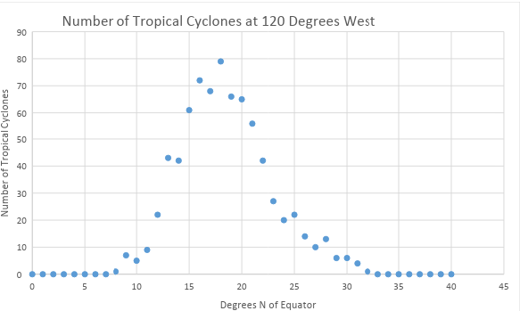
The Number of Tropical Cyclones at 120 Degrees West Scatter Plot shows the number of tropical cyclones at 120° west for each degree of latitude from the equator (0°) to 40° north; the same as represented along the red line in the mapped image below.
Scatter plot - number of tropical cyclones at 120 degrees west
https://mynasadata.larc.nasa.gov/sites/default/files/inline-images/thumbnail.png - Analyze the scatter plot to answer the questions follow. Check with your instructor on how to submit your answers.
- What does the scatter plot show? What does it NOT show? Accept reasonable responses. It shows how many tropical cyclones, or hurricanes, were at each whole number latitude from 0 to 40 degrees north at the longitude of 120 degrees west. It does NOT show latitudes that are not whole numbers. It does NOT show latitudes outside the 0 to 40 degree north range. It does NOT show any other longitudes in the world.
- Is the plot linear (do the points appear to lie close together along a straight line) or nonlinear (do the points appear to form a curve)? Nonlinear
- Is there a correlation between the two variables? If yes, please describe. There is, but it is not a simple positive or negative correlation.
- What does the shape of the distribution tell you about the location and frequency of tropical cyclones? The number of cyclones increases as you move north of the equator to approximately 20 degrees north and then begins to decrease as you move further north.
-
The map below shows the number of tropical cyclones around the world from 1842 – 2018. There is a thick line at 120 degrees west from the equator to 40 degrees north; the same as represented by the scatter plot. The Tropical Cyclone Counts map was generated in the My NASA Data Earth System Data Explorer. Now compare the scatter plot to the map image and answer the following questions.
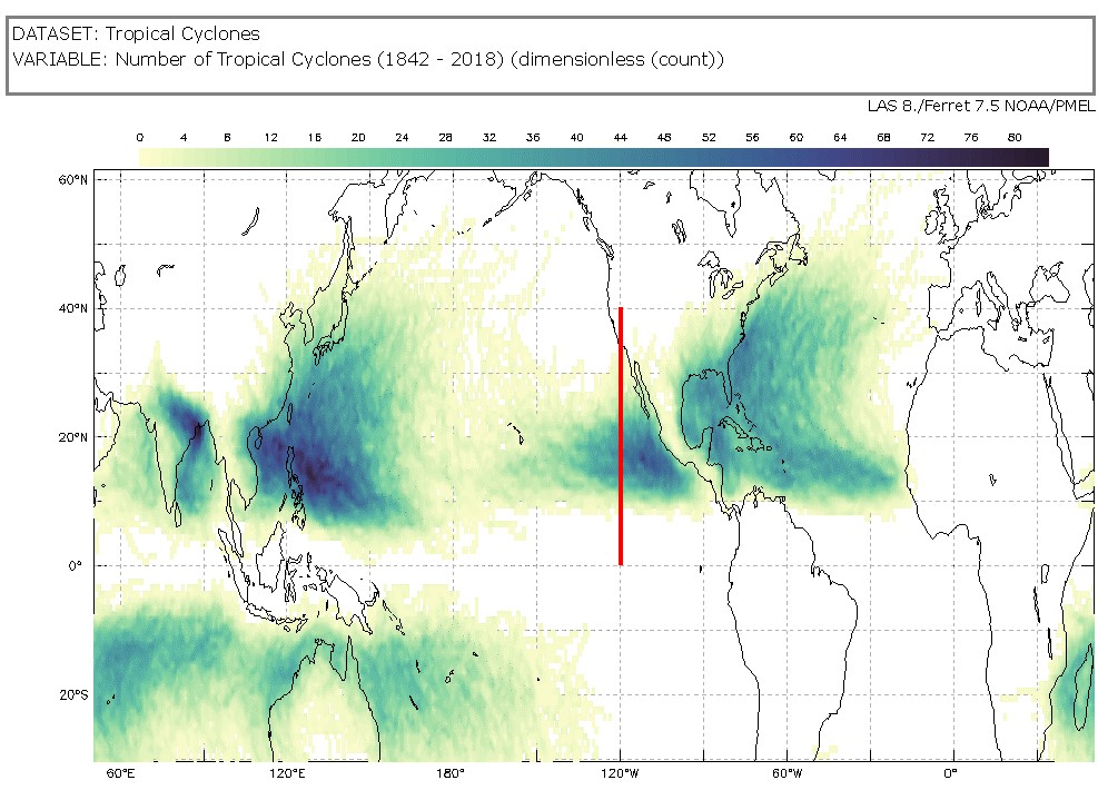
Tropical Cyclone Counts Map showing a line at 120 degrees west from the equator to 40 degrees north
https://mynasadata.larc.nasa.gov/sites/default/files/2022-02/Tropical%20Cyclone%20count%20120%20W.png- Which data visualization, the scatter plot or map, best helps you answer questions about specific number of tropical cyclones at specific locations? The graph could be more precise if it shows the location you want.
- Which data visualization, the scatter plot or map, best helps you answer questions about tropical cyclones around the world? map
- What kind of questions can you ask about tropical cyclones that a scatter plot can help you answer? Accept reasonable responses asking about how the locations and number of cyclones are related.
-
- Land Cover Changes
-
- Check with your instructor on how to submit your answers.
- What is different about the two images (Slide 2)? There are noticeable changes along the road.
- What do you think could have happened here between 2017 and 2020 (Slide 3)? A new building facility has been built in the green area.
- What information can satellite images provide us with (Slide 4)? Answers may vary but could include: information such as changing vegetation or the expansion of urban buildings.
- What information do we need to observe from the ground because it is not shown in satellite images (Slide 4)? Answer may vary but can include: information on the change urban construction could have on ground soils or to specify what is causing the change.
- How could this operations and maintenance facility impact the environment (Slide 7 & 8)? When vegetation is removed, it is more likely that soils can be loosened during a storm water runoff and cause landslides.
- How much do you think the construction of the operations and maintenance facility will impact the environment (Slide 9)? Answer may vary but can include: The impact is very high if construction takes place in areas where flooding is more frequent due to impervious surfaces like sidewalks and buildings. More water is collected than would otherwise run off to nearby streams or be absorbed in the soils and vegetation.
- Provide evidence from the previous slides to support your claims (Slide 9). Images such as sidewalks, do not allow runoff to be absorbed in the soils.
- Make a claim about what should be considered when making decisions about urbanizing a land cover (Slide 11)? (i.e. cutting down a forest or building over a grassland). Answers may vary.
- Observing Sea Level: Student Activity
-
1. What does the JASON-2 satellite measure?
The JASON-2 satellite measures ocean height.
2. How does it make measurements?
The satellite sends radio waves to the surface of the ocean which bounce back to the satellite. The time that it takes for the waves to travel back to JASON-2 tells us the ocean height in that area.
3. What phenomena do the measurements help scientists study?
The measurements help scientists study global warming, the climate, and El Niño events and patterns.
4. How does the JASON-2 satellite contribute to the understanding of El Niño?
JASON-2 measures the ocean and detects changes related to El Niño, predicting how local climates may change due to the event. Watching the ocean levels can tell scientists a lot about local climate change patterns related to El Niño events.
- Ocean Salinity Data Analysis: Student Activity
-
1. Open this link to show the interactive map of surface salinity used to create in-water profiles of how the salinity changes with depth (NOTE: Profiles of temperature and density may also be created using this tool).
- How do we know that map shows only surface conditions? [The title reads Mean Salinity (psu) at 0m Depth.]
2. Observe the color bar. What colors represent the high salinity values? The high salinity values are in red (37 psu). The lowest value is 32 psu in blue.
3. Locate the blue, green, and red dots in the image above showing key locations for maps and in-water salinity profiles. What colors are represented by the coordinates below?
- 5N, 24W? (Blue)
- 18S, 20W (Green)
- 62S, 34W (Red)
4. Click the "Plot" button, located below the "Selected Location List" box. In-water profiles from these locations will appear at right.
5. Review the features of the graph with the students.
6. How does salinity vary with depth? Describe by using evidence for the three sites.
Possible answers could include:- The blue profile - from the equatorial Atlantic Ocean (5N 24W) - shows relatively low salinity at the surface, an increase in the top 50 meters , and then a decrease below 50 meters.
- The green profile is located in in the central South Atlantic Ocean (18S, 20W), a region with very high surface salinity. It shows an unusual gradient with depth: salinity decreases from 37 Practical Salinity Units (psu) to 35 psu in the upper 300 meters (984 feet).
- The red profile is from the Southern Ocean (62S, 34W), a region with low surface salinity. It's the only profile that shows a steady increase of salinity in the top 300 meters and constant salinity values below that. Of these selections, the red profile shows the least variability in salinity in the upper 300 meters. For the other locations, much of the salinity change occurs within the top 200 meters (656 feet), a salinity minimum is reached at about 1000 meters depth (3281 feet), while salinity is fairly constant below 1500 meters (4921 feet) depth.
- You can select other locations (i.e., by clicking on the map and hitting "Plot") to see how salinity varies with depth at various locations.
- Ocean Surface Salinity Data Analysis: Student Activity
-
Link to Ocean Surface Salinity Data Analysis Mini Lesson
1. Explore the sea surface salinity mapped plot for April 2019.
2. Answer the following questions. Check with your instructor on how to submit your answers.
- Is salinity uniform throughout the ocean? No. Although the amount of salt in the ocean is relatively constant on time scales of years to decades, sea surface salinity (SSS) varies because freshwater input & output - part of the global hydrologic or water cycle - varies from place-to-place. The large scale pattern of evaporation and precipitation is established by earth's atmospheric convection cells. In the simplest case - for example, if earth were covered by oceans and not spinning - the atmosphere would move heat between the hot tropics and cold poles in a very simple way. Hot air would rise along the equator, creating a band of low atmospheric pressure. Cold air would sink at the poles, creating regions of high atmospheric pressure.The presence of continents and earth's rotation complicates the idealized "two cell" system. A fairly realistic model of earth's atmospheric circulation consists of six cells: three on each side of the equator. This pattern has atmospheric pressure highs at the poles, 30°N and 30°S. It also has atmospheric lows along the equator, 60°N and 60°S. Away from the poles, cloudiness and precipitation (P) dominate bands of low pressure: these latitudes host the world's rainforests. Dryness and evaporation (E) dominate bands of high pressure: these latitudes are home to deserts.In terms of SSS [sea surface salinity], lower salinity generally occurs where precipitation is greater than evaporation (P>E). Higher SSS generally occurs where evaporation is greater than precipitation (E>P). Compare the "six cell" model with the map of global average SSS (image upper right). How well do SSS patterns mirror bands of high and low atmospheric pressure? In places where they do not match, what other types of freshwater inputs & outputs might be occurring?
- What is the range of ocean surface salinity in Earth's ocean? Ocean surface salinity generally ranges from 32 practical salinity units (psu, which are roughly equivalent to parts per thousand) to 37 psu, but may be as high as 42 psu in the Red Sea or as low as 8 psu in the Baltic Sea.
- Which latitudes have saltiest waters in in the Atlantic, Indian, and Pacific? In all of these ocean basins, the saltiest regions are located at subtropical latitudes, around 20°N and around 20°S.
- Where, in general, are the freshest surface waters? The freshest waters are found in the Antarctic Ocean, also known as the Southern Ocean, and in the high latitudes of the Northern Hemisphere, above 40°N.
- Sea Level Rise By Decade: Student Activity
-
For over 20 years, satellite instruments have measured the sea surface height of our ever-changing oceans. This video of images shows the complicated patterns of rising and falling ocean levels across the globe from 1993 to 2015.
Directions:
- Watch this video.
- Capture three things that you observed in the video related to how sea surface height is measured using NASA technology or how it changes over the course of time. Answers will vary. See below for ideas.
- Document two new things that you learned. Answers will vary. See below for ideas.
- Brainstorm one type of user that changing sea surface height may affect. Answers will vary. See below for ideas.
For over 20 years, satellite altimeters have measured the sea surface height of our ever-changing oceans. This series of images shows the complicated patterns of rising and falling ocean levels across the globe from 1993 to 2015.
Sea levels reflect changing currents (which tilt the sea surface), the redistribution of heat (which makes sea levels higher) and the long-term rise in global sea levels that is the result of human-caused warming. The globally averaged rise is traced out in the bottom right-hand corner. These maps are made using data from at least two satellites at all times, and colors represent highs and lows between 30 cm of normal levels. Toward the end, the expansion of last year's record-breaking El Niño can be seen in the tropical eastern Pacific.
- Stability and Change: Changes in Sea Ice
-
2. What color do you see the most of along the edges of the ice shelves? The red color fades to blue at the edges.
3. What do these data mean about the thickness of the ice sheets?
The visualization shows the interaction of modeled ocean currents and Antarctic ice shelves, where red areas represent ice thicker than about 1,800 feet (about 550 meters) and blue areas represent ice thinner than about 650 feet (about 200 meters). Notice how the ice shelves generally become thinner- a rainbow of colors indicates intermediate thicknesses- as they extend farther from land.
4. What factors may contribute to this phenomenon?
There are warm ocean currents moving around the coast of Antarctica. These currents are indirectly increasing global sea levels. These currents flow around the continent's frozen edges and beneath the floating ice shelves. They are slowly melting the ice shelves from below. The melting of the ice shelves themselves do not result in sea level rise, rather the melting of the ice shelves increases the melt rate of the glaciers on the land behind the ice shelves. The increased melting of the glaciers on land increases the sea level.
- Stability and Change: Monitoring Sea Level
-
Steps:
- Check with your instructor on how to submit your answers.
- Create a mental model to estimate the height measurements used in this video. Twenty inches is roughly equal to what common object? Accept any credible answer. Answers may include the following: approximately the length of a necklace, a newborn baby, etc.)
- What locations have sea surface heights that are higher than average? the Pacific Ocean off the coast of S. America along equatorial region, Red Sea
- What locations have sea surface heights that are lower than average? Indonesia and parts of the equatorial region in the Pacific Ocean
- Identify oceans that have both ends of the extremes. What might cause this? Pacific Ocean, El Nino Southern Oscillation
- What processes cause changes in sea height? Currents, winds, and temperature fluctuations that cause seawater to expand or contract.
- As you review this video, what questions come to mind? Why does the Red Sea have such high values? What causes the variable heights in the Pacific Ocean? Why does the surface seem to ripple?
- Tracking Monthly Salinity Changes in Our Ocean: Student Activity
-
Link to Tracking Monthly Salinity Changes in Our Ocean Mini Lesson
- The following data visualizations were pulled from NASA's Aquarius Mission's Historical Changes in Monthly Mean Data tool to show salinity time series for the two pre-selected profiles in the polar regions. Blue for the Arctic, Red for the Antarctic.
- Observe the salinity values for the polar regions.
- What changes do you observe and when do these changes occur? In the Arctic, ice melt begins in the northern spring (i.e., starting around April). In the Antarctic, ice melt begins about six months later.
- Analyze to see if a relationship exists between these variables and explain your findings. The relationship is inversely proportional [when one amount decreases, the other increases.]
- What may explain this pattern? The tilt of the Earth's axis causes the seasonality of the freeze/melt cycle in the Cryosphere. During summer, Antarctica (near the red dot) is on the side of Earth tilted toward the sun. For a few days at the coast and for a few months at the South Pole, the sun never sets and melting occurs, reducing the saltiness of the water. In winter, Antarctica is on the side of Earth tilted away from the sun. During this season, the sun never rises for a similar length of time, resulting in freezing water. As ice crystals form at the ocean surface, they expel salt, which increases the salinity of the underlying waters.
- Tropical Cyclone Count Bar/Column Chart
-
Link to Tropical Cyclone Counts Bar/Column Chart Mini Lesson
Number of Tropical Cyclones by Latitude at 60 and 65 degrees east
https://mynasadata.larc.nasa.gov/sites/default/files/2022-01/Bar_column%20chart%20cropped.png
Steps
Analyze the Tropical Cyclone Counts double bar graph and answer the questions. Check with your instructor on how to submit your answers.
- At 14° north, how many more tropical cyclones were at 60° east than at 65° east? 7 more
- At 60 degrees east, how many more tropical cyclones were at 14° north than at 15° north? 9 more
- What was the total number of tropical cyclones at each latitude between 60° and 65° east?
- 10° N – 10 tropical cyclones
- 11° N – 3 tropical cyclones
- 12° N – 20 tropical cyclones
- 13° N – 15 tropical cyclones
- 14° N – 23 tropical cyclones
- 15° N – 14 tropical cyclones
- 16° N – 9 tropical cyclones
- 17° N – 13 tropical cyclones
- 18° N – 13 tropical cyclones
- 19° N – 21 tropical cyclones
- 20° N – 30 tropical cyclones
- In table form:
- Which latitude had the highest total number of tropical cyclones at these longitudes? 20 degrees north
- How many fewer total tropical cyclones were at 15° north than at 14° north at these longitudes? 9 fewer
- Tropical Cyclone Counts Box Plot
-
Link to Tropical Cyclone Counts Box Plot Mini Lesson
-
The box plot below shows the number of tropical cyclones at 120 degrees west for each degree of latitude from the equator to 40 degrees north; the same as represented along the red line in the mapped image below. Analyze the box plot and answer the questions that follow. Check with your instructor on how to submit answers.
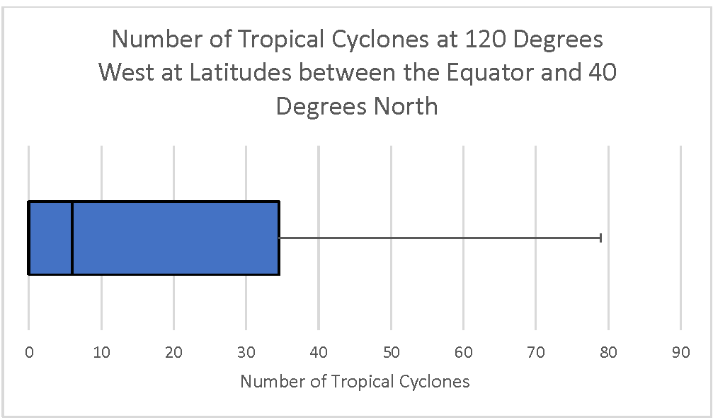
Number of Cyclones at 120 degrees west at latitudes between the equator and 40 degrees north
https://mynasadata.larc.nasa.gov/sites/default/files/inline-images/Box%20Plot%20120%20West%20horizontal_0.png
- What does the box plot show? accept reasonable responses. What does it NOT show? Accept reasonable responses including that it does not show the number of tropical cyclones at particular latitudes. It also does not have a lower whisker. This is because the data are skewed. More than the bottom quartile are all zero. Therefore, there is no whisker. Fifty percent of the dat are from zero to the median at 6.
- What is the overall distribution of the box plot? Is it skewed right (with a longer whisker on the right)? Skewed left (with a longer whisker on the left)? The range is from 0 to 79. The bottom 25% of the data is all the same value (0). The median is much lower than the maximum. It is skewed right, meaning that it looks like it has a tail on the right. This is easier to see if it is horizontal.
- What does the shape of the distribution tell you? Accept reasonable responses including the following. Some latitudes have no tropical cyclones. The median is 6. The maximum is 79. Most latitudes didn’t have many tropical cyclones. A few had a high frequency. 50% of the latitudes had 6 or fewer tropical cyclones. 25% had between 6 and 34, 25% had more than 34.
- What are the maximum, minimum, range, median, first quartile, third quartile, and interquartile range? Maximum- 79; Minimum- 0; Range- 0-79; Median- 6; First quartile 0; Third quartile 34; Interquartile range 34.
-
The map below shows is a thick line at 120 degrees west from the equator to 40 degrees north; the same locations represented in the box plot. (The Tropical Cyclone Counts map was generated in the My NASA Data Earth System Data Explorer. ) Now, compare the box plot to the map image and answer the following questions.

Tropical Cyclone Counts Map showing a line at 120 degrees west from the equator to 40 degrees north
https://mynasadata.larc.nasa.gov/sites/default/files/2022-02/Tropical%20Cyclone%20count%20120%20W.png
- Which visualization shows the number of tropical cyclones at each latitude? map
- What kind of questions about tropical cyclones can you ask that a box pot will help you answer? Accept reasonable responses.
- What do you wonder from the box plot? Can you answer it with the box plot, or do you need to see the data in a different way? Accept reasonable responses.
-
- Tropical Cyclone Counts Histogram
-
Link to Tropical Cyclone Counts Histogram Mini Lesson
- The histogram provided shows the number of tropical cyclones at 120 degrees west for each degree of latitude from the equator to 40 degrees north; the same as represented along the red line in the mapped image below.
- Analyze the histogram and answer the questions that follow. Check with your instructor on how to submit answers.
- What does the histogram show? Accept reasonable responses, including: Most of the latitudes have had few hurricanes. Only a few latitudes had 70 or more tropical cyclones. The total number of latitudes can be calculated by adding the height of each column. It is 40.
- Describe the shape of the distribution of the histogram. Is it skewed left with a long "tail" of data on the left? Skewed right with a long "tail" of data on the right? Uniform (with the data spread equally across x-axis)? Bell shaped? U-shaped? skewed right
- What does the shape of the distribution tell you about the location and frequency of tropical cyclones? Most of the latitudes had few tropical cyclones, or hurricanes.
- What does it NOT show? Accept reasonable responses, including: It does not show the number of hurricanes at each latitude. It also does not show the number of tropical cyclones.
- Compare the histogram to the map image?
- Which visualization, map or histogram, shows the number of tropical cyclones at each latitude? map
- Which visualization, map or histogram, displays the number of latitudes with 6-10 tropical cyclones? histogram
- What kind of questions about tropical cyclones can you ask that a histogram will help you answer? Accept reasonable responses.
- Tropical Cyclone Counts Model
-
Link to Tropical Cyclone Counts Model Mini Lesson
Use the Tropical Cyclone Counts Map Image to answer the questions. Check with your instructor on how to submit your answers.
- What does the information on the map show? It shows how many tropical cyclones there have been between 1842 and 2018 across the world.
- What do the dark colors on the map represent? Darker colors represent a higher number of tropical cyclones at a location between 1842 and 2018. The darkest color is the most.
- Point to a spot on the map that is not white. How many tropical cyclones, or hurricanes, have there been at that spot between 1842 and 2018? Answers will vary.
- Where do the most hurricanes form? The most hurricanes form in the bodies of water between 10 and 30 degrees north of the equator.
- What do you notice about the image? Answers will vary. there are more tropical cyclones in the Pacific Ocean than in the Atlantic Ocean. They tend to form north of the equator but not much above 40 degrees north. There are also tropical cyclones in the southern hemisphere.
- What questions do you have about the image? Answers will vary.
- Tropical Cyclone Counts Scatter Plot
-
Link to Tropical Cyclone Counts Scatter Plot Mini Lesson
-
The Number of Tropical Cyclones at 120 Degrees West Scatter Plot shows the number of tropical cyclones at 120° west for each degree of latitude from the equator (0°) to 40° north; the same as represented along the red line in the mapped image below.
Scatter plot - number of tropical cyclones at 120 degrees west
https://mynasadata.larc.nasa.gov/sites/default/files/inline-images/thumbnail.png - Analyze the scatter plot to answer the questions follow. Check with your instructor on how to submit your answers.
- What does the scatter plot show? What does it NOT show? Accept reasonable responses. It shows how many tropical cyclones, or hurricanes, were at each whole number latitude from 0 to 40 degrees north at the longitude of 120 degrees west. It does NOT show latitudes that are not whole numbers. It does NOT show latitudes outside the 0 to 40 degree north range. It does NOT show any other longitudes in the world.
- Is the plot linear (do the points appear to lie close together along a straight line) or nonlinear (do the points appear to form a curve)? Nonlinear
-
The image shows the number of tropical cyclones around the world from 1842 – 2018. There is a thick line at 120 degrees west from the equator to 40 degrees north; the same as represented by the scatter plot. The Tropical Cyclone Counts map was generated in the My NASA Data Earth System Data Explorer. Now compare the scatter plot to the map image and answer the following questions.
Tropical Cyclone Counts Map showing a line at 120 degrees west from the equator to 40 degrees north
https://mynasadata.larc.nasa.gov/sites/default/files/2022-02/Tropical%20Cyclone%20count%20120%20W.png- Which visualization, the scatter plot, map or both, shows the number of tropical cyclones at each latitude? both the graph and the map.
- Which data visualization, the scatter plot or map, best helps you answer questions about specific number of tropical cyclones at specific locations? The graph could be more precise if it shows the location you want.
- Which data visualization, the scatter plot or map, best helps you answer questions about tropical cyclones around the world? map
- What kind of questions can you ask about tropical cyclones that a scatter plot can help you answer? Accept reasonable responses asking about how the locations and number of cyclones are related.
-
- Using Models to Explore Chlorophyll and Radiation Data
-
Link to Using Models to Explore Chlorophyll and Radiation Data Mini Lesson
Steps:
- Check with your instructor on how to submit your answers.
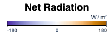
- Review the color bar scale for net radiation. What do the colors mean? The color bar shows changes in the balance of incoming and outgoing energy on Earth. Places where more energy was coming in than going out (energy surplus) are orange. Places where less energy was coming in than going out (energy deficit) are purple. Places where the amounts of incoming and outgoing energy were in balance are white.
- Review the color bar scale for chlorophyll concentration. What do the colors mean? The color bar shows changes in chlorophyll values. Places where chlorophyll amounts are very low, indicating very low numbers of phytoplankton, are blue. Places where chlorophyll concentrations were high, meaning many phytoplankton were growing, are dark green. The observations come from the MODIS sensor on NASA's Aqua satellite. Land is dark gray, and places where MODIS could not collect data (reasons include sea ice, polar darkness, or clouds) are light gray.

- Describe the values for net radiation during the spring and fall in the Northern Hemisphere. In the Northern Hemisphere, net radiation during the spring and fall is closest to zero. There are areas that are more positive or negative, but their difference is less extreme compared to the summer and winter.
- List the value of net radiation in the Northern Hemisphere during the summer, then list the value of net radiation in the Northern Hemisphere during winter. What do you notice? In the Northern Hemisphere during the summer, the value of net radiation is high at 180 Watts per square meter. In the Northern Hemisphere during the winter, the value of net radiation is very low at -180 Watts per square meter. The Northern Hemisphere can experience an extremely large range in net radiation.
- Describe the patterns you observe between net radiation and chlorophyll concentration? Chlorophyll concentration shifts north or south throughout the year in the same manner as positive net radiation. For example, in the summer when net radiation is high throughout the Northern Hemisphere, the chlorophyll concentration is also high. In the winter, when net radiation is low throughout the Northern Hemisphere and high throughout the Southern Hemisphere, chlorophyll concentration also decreases in the Northern Hemisphere and increases in the Southern Hemisphere.
- Observe the contrast between the Northern Hemisphere and the Southern Hemisphere in net radiation values. Explain which two seasons experience a greater difference? Fall and spring or summer and winter? Explain. Summer and winter experience the greater difference in net radiation values. There is a stark contrast between the northern and southern hemispheres during the summer and winter. During these seasons, one hemisphere of the Earth will experience high net radiation and the other hemisphere will experience low net radiation. There is little difference in the fall and spring seasons. Both fall and spring experience more uniform net radiation, that is not extremely high or extremely low.
- Using Precipitation and Vegetation to Study Climate Zones
-
Link to Using Precipitation and Vegetation to Study Climate Zones
- What are some differences between weather and climate? Climate is a pattern of weather in an area over an extended period of time. Weather reflects the current conditions in an area.
- What are two variables you are reviewing today? Precipitation and Normalized Difference Vegetation Index
- What is the name of this map visualization? Monthly Precipitation
- What does the dark brown represent? Areas with little precipitation.
- What does the dark blue represent? Areas with more precipitation.
- What month and year does this visualization show? March 2012.
- Find two locations where there is high precipitation values but little vegetation and where there is little precipitation but high vegetation. Look at different data sets in order to discover outlier areas. Students will have varying answers to this question.
- What is the name of the map visualization? Normalized Difference Vegetation Index
- What does the bright green represent? Areas with a higher NDVI
- What does the white represent? Areas with a lower NDVI
- What month does this represent? March 2012
Compare Visualizations: Students will make their own observations about the similarities and differences between the 2 visualizations. They may point out areas that are high or low in one or both phenomena or they may make other observations about patterns, etc.
Investigate Relationships and Patterns: Students will choose areas that are high or low in precipitation and discover how the NDVI in those regions changes based on precipitation level.