Mini Lesson/Activity
Tropical Cyclone Counts Histogram
Overview
Compare a histogram and map to determine the differences in the information conveyed in each data display.
Student Directions
Tropical cyclones are sometimes called hurricanes or typhoons. Data about the occurrences of tropical cyclones around the world have been collected since 1842. These data may be visualized in a variety of ways.
Below you will find two types of visualizations of the same data, a histogram and a map. You will analyze these and extract information. Recall, a histogram is a type of graph which shows variability (or how spread out the data are) within a group. They show numerical data by grouping them in logical ranges called “bins” (also known as “intervals” or “buckets”) of equal width. One may use a histogram to answer specific kinds of questions about their data.
- How variable are the _____________ data ?
- What is the range and distribution of _____________?
- How different are the values of the _________________ data?
- How similar are the values of the __________________ data?
Steps
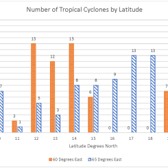
- The histogram below shows the number of tropical cyclones at 120 degrees west for each degree of latitude from the equator to 40 degrees north; the same as represented along the red line in the mapped image below.
-
Analyze the histogram and answer the questions that follow. Check with your instructor on how to submit answers.
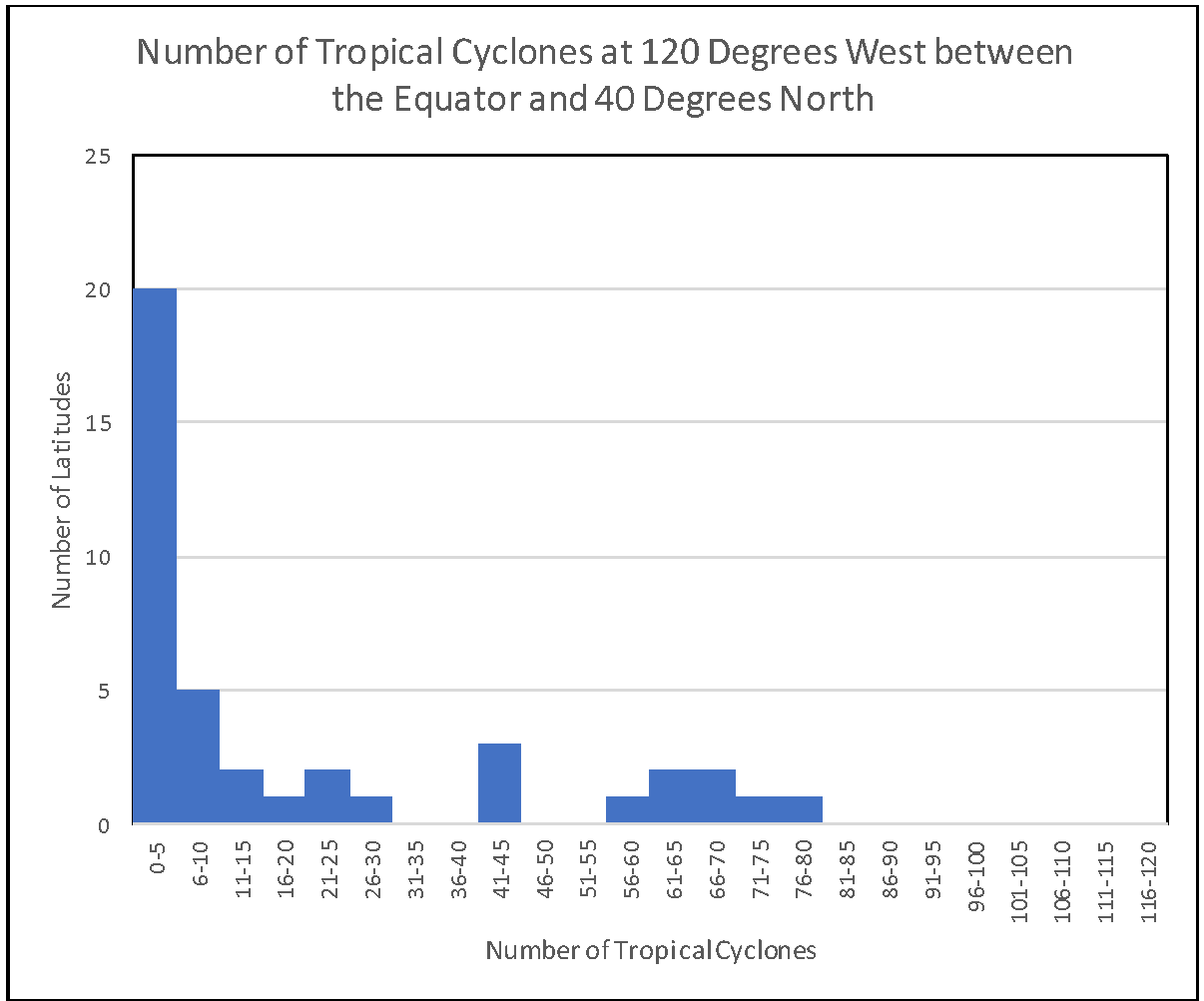
Tropical Cyclone Counts 120 Degrees West
https://mynasadata.larc.nasa.gov/sites/default/files/inline-images/Histogram%20120%20degrees%20west.png
- What does the histogram show?
- Describe the shape of the distribution of the histogram. Is it skewed left with a long "tail" of data on the left? Skewed right with a long "tail" of data on the right? Uniform (with the data spread equally across x-axis)? Bell shaped? U-shaped?
- What does the shape of the distribution tell you about the location and frequency of tropical cyclones?
- What does it NOT show?
-
The map below shows is a thick line at 120 degrees west from the equator to 40 degrees north; the same locations represented in the histogram. (The Tropical Cyclone Counts map was generated in the My NASA Data Earth System Data Explorer.) Now, compare the histogram to the map image and answer the following questions.
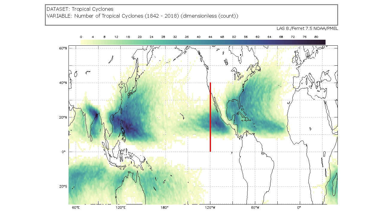
Tropical Cyclone Counts Map showing a line at 120 degrees west from the equator to 40 degrees north
https://mynasadata.larc.nasa.gov/sites/default/files/2022-02/Tropical%20Cyclone%20count%20120%20W.png
- Which visualization, map or histogram, shows the number of tropical cyclones at each latitude?
- Which visualization, map or histogram, displays the number of latitudes with 6-10 tropical cyclones?
- What kind of questions about tropical cyclones can you ask that a histogram will help you answer?


Teacher Note
Teachers, these mini lessons/student activities are perfect "warm up" tasks that can be used as a hook, bell ringer, exit slip, etc. They take less than a class period to complete. Learn more on the "My NASA Data What are Mini Lessons?" page.
Teachers who are interested in receiving the answer key, please complete the Teacher Key Request and Verification Form. We verify that requestors are teachers prior to sending access to the answer keys as we’ve had many students try to pass as teachers to gain access.
Disciplinary Core Ideas:
- ESS2D: Weather and Climate
- ESS3B: Natural Hazards
Crosscutting Concepts:
- Patterns
Science and Engineering Practices:
- Developing and Using Models
- Analyzing and Interpreting Data
- Using Mathematics and Computational Thinking
Complementary Mini Lessons
Complementary Lesson Plans

Interactive Files
Grade Band
- 6-8
Time
- 30 minutes
Visualization Tool
NGSS Three Dimensional Learning
- See drop-down menu at the bottom of the page