Mini Lesson/Activity
Global Air Temperatures Graph
Overview
Students analyze a graph that illustrates the change in global surface temperature relative to 1951-1980 average temperatures.
Student Directions
Analyzing Air Temperature Graphs
This graph below illustrates the change in global surface temperature relative to 1951-1980 average temperatures.
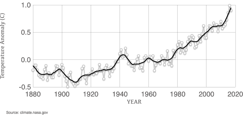
Credit: climate.nasa.gov
https://mynasadata.larc.nasa.gov/sites/default/files/inline-images/GlobalTemp%20%281%29.png
Steps:
- Answer the Questions below. Check with your instructor on how to submit your answers.
- What time frame does the graph cover?
- What do the white dots represent?
- What does the black line represent?
- What is an anomaly?
- What do the changes in the anomaly data mean?
- Do you notice a trend? If so, what direction does the trend go?
This graph is ideal for use with the Data Literacy Cube.

Source:
- Global Temperature | Vital Signs – Climate Change: Vital Signs of the Planet. (n.d.). NASA Climate Change. Retrieved May 11, 2022, from https://climate.nasa.gov/vital-signs/global-temperature/
Teacher Note
Teachers, these mini lessons/student activities are perfect "warm up" tasks that can be used as a hook, bell ringer, exit slip, etc. They take less than a class period to complete. Learn more on the "My NASA Data What are Mini Lessons?" page.
Teachers who are interested in receiving the answer key, please complete the Teacher Key Request and Verification Form. We verify that requestors are teachers prior to sending access to the answer keys as we’ve had many students try to pass as teachers to gain access.
Disciplinary Core Ideas:
- ESS2A: Earth Materials and Systems
Crosscutting Concepts:
- Stability and Change
Science and Engineering Practices:
- Analyzing and Interpreting Data
Complementary Mini Lessons
Complementary Interactives


Document Resources
Grade Band
- 6-8
- 9-12
Time
- 15 minutes
Visualization Tool
NGSS Three Dimensional Learning
- See drop-down menu at the bottom of the page