Mini Lesson/Activity
Analyzing Seasonal Phytoplankton & Energy Flow
Overview
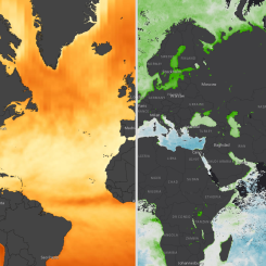
In this mini lesson, students explore the relationship of chlorophyll and solar radiation by analyzing line graphs from the North Atlantic during 2016-2018.
Student Directions
The flow of energy into the surface by shortwave radiation represents visible light coming from the Sun. The units of these data are Watts per square meter, which is the flow of energy spread out over an area. Five Watts per square meter is equivalent to the power used by a standard cell phone charger (5 Watts) passing through a square piece of paper with length and width of 1 meter.
Steps:
- Check with your instructor on how to submit your answers.
-
Analyze the graph below displaying Monthly Flow of Energy into Surface by Shortwave Radiation between the years of 2016 and 2018 in the North Atlantic Ocean. Answer the following questions.
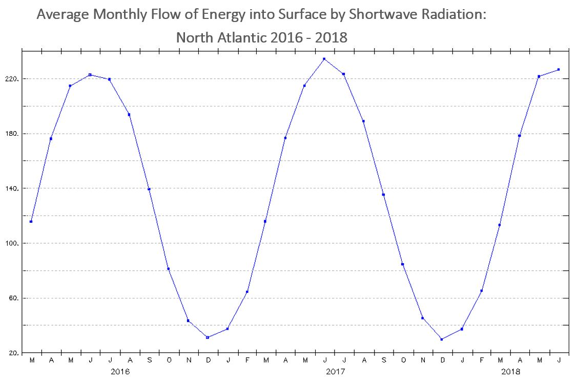
Credit: My NASA Data, Average Monthly Flow of Energy into Surface by Shortwave Radiation: North Atlantic 2016 - 2018; Data courtesy of NASA, Clouds and Earth's Radiant Energy System (CERES) project
- What variable is represented on the x-axis?
- What variable is represented on the y-axis?
- Describe the pattern that is revealed over the three years.
-
Analyze the graph below displaying Monthly Average Chlorophyll Concentration between the years of 2016 and 2018 in the North Atlantic Ocean and then answer the following questions. The units for chlorophyll concentration in this graph is milligrams of chlorophyll per cubic meter of seawater. This is a very small mass unit. To compare, the average mass of a feather from a chicken is about 8 milligrams.
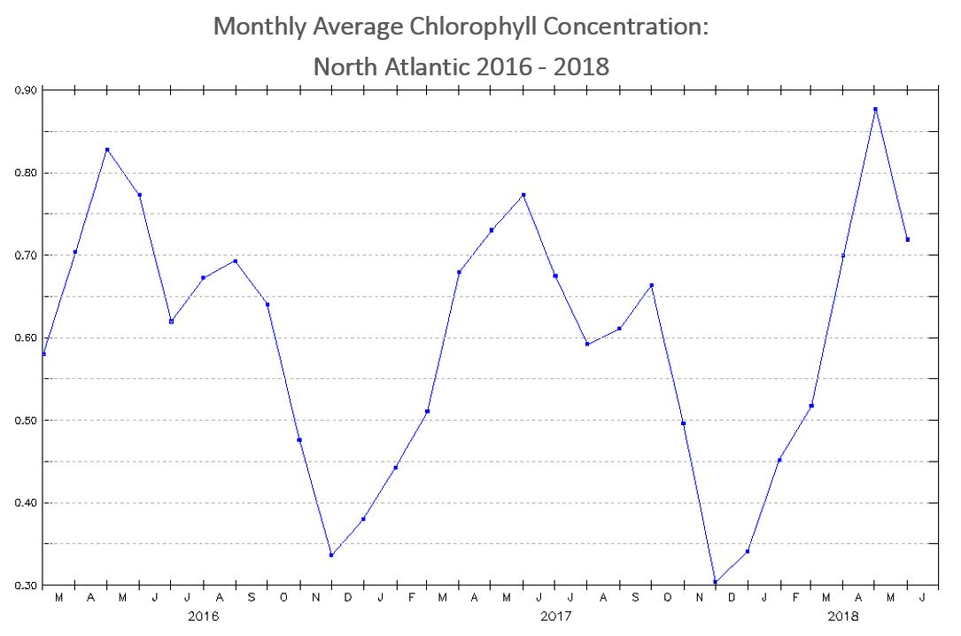
Credit: My NASA Data, Monthly Average Chlorophyll Concentration: North Atlantic 2016 - 2018; Data courtesy of NASA, Moderate Resolution Imaging Spectroradiometer (MODIS) instrument
- What variable is represented on the x-axis?
- What variable is represented on the y-axis?
- Describe the pattern that is revealed over the three years.
- Compare the two line graphs. Describe what these graphs have in common? How are they different?
- Brainstorm on the factors that may contribute to their differences.


Sources:
- LAS UI. (n.d.). My NASA Data. Retrieved July 14, 2022, from https://mynasadata.larc.nasa.gov/EarthSystemLAS/UI.vm#panelHeaderHidden…
- LAS UI. (n.d.). My NASA Data. Retrieved July 14, 2022, from https://mynasadata.larc.nasa.gov/EarthSystemLAS/UI.vm#panelHeaderHidden…
Teacher Note
Teachers, these mini lessons/student activities are perfect "warm up" tasks that can be used as a hook, bell ringer, exit slip, etc. They take less than a class period to complete. Learn more on the "My NASA Data What are Mini Lessons?" page.
Teachers who are interested in receiving the answer key, please complete the Teacher Key Request and Verification Form. We verify that requestors are teachers prior to sending access to the answer keys as we’ve had many students try to pass as teachers to gain access.
Disciplinary Core Ideas:
Crosscutting Concepts:
- Patterns
- Cause and Effect
- Stability and Change
Science and Engineering Practices:
- Developing and Using Models
- Analyzing and Interpreting Data
Complementary Mini Lessons

Complementary Interactives


Document Resources
Grade Band
- 6-8
- 9-12
Time
- 30 minutes
Visualization Tool
NGSS Three Dimensional Learning
- See drop-down menu at the bottom of the page