Lesson Plans
Cloudy vs. Clear - Graphs
Overview
Students will analyze and interpret graphs to compare the flow of (shortwave) energy from the Sun toward China over the course of a year on cloudy versus clear days. Students will draw a conclusion and support it with evidence.
This lesson has been modified from the original Cloudy vs. Clear My NASA Data lesson.
Materials Required
- Cloudy vs. Clear - Graphs Student worksheets
- Blank paper or notebooks to record graph observations
- Data Literacy Cubes (optional)
- Graph Cubes (or number cubes)
- Graph Cube question sheets (Select level/s based upon student readiness.)
Procedure
-
Divide students into groups.
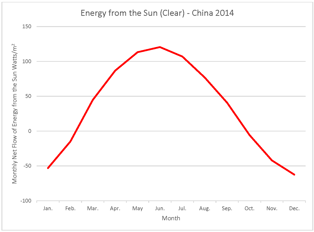

- Distribute the cloudy graph to half the group and the clear graph to the other half.
- Option 1: Have groups use the Data Literacy Cube to analyze the graphs and write answers for at least 6 different questions.
- Option 2: Have groups analyze the graphs without the Data Literacy Cube, record observations and discuss what it means.
- Option 1: Have groups use the Data Literacy Cube to analyze the graphs and write answers for at least 6 different questions.
- Discuss the two different graphs.
- Lead a short discussion on how they might compare their graphs.
- If they haven't already seen double line graphs, explain that one way to make comparisons easier is to put both lines on the same graph with the same scales.
- Give each group the double line graph.
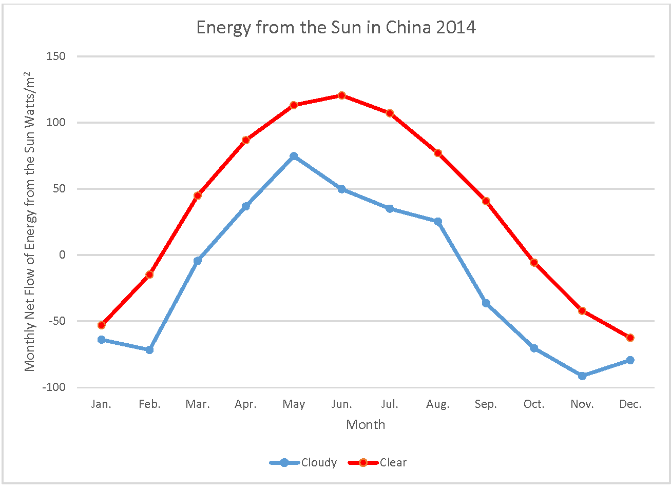
- Have students make a list in their groups of things that are similar and different between the double line plot and the single line plot.
- Some examples of what the students might notice include:
- There are two lines.
- The lines look different.
- There is another color on the plot.
- The numbers on the y-axis may be different.
- Some examples of what the students might notice include:
- Begin the I2 writing exercise with the students.
- Instruct students to write what they see ("I Observe") on the double line plot. This should be observations only.
- Instruct students to write what it means ("I Interpret"). This is where they will interpret the graph.
- Have the students write a caption to summarize the double line graph.
- After they write the caption, have them apply what they have concluded to other questions.
- Identify two locations on the plot that are similar in cloudy and clear sky conditions.
- Sample answers include (January, February, November, and December).
- Find the month with the biggest difference in cloudy and clear sky conditions.
- Answer (June)
- Which line has the higher amount of energy from the Sun throughout the year and why?
- Answer (clear sky because clouds are not blocking the Sun).
- What other things might affect how much of the Sun's energy reaches the Earth's surface?
- Sample answers (aerosols, pollution, dust, ozone layer, smoke).
- Identify two locations on the plot that are similar in cloudy and clear sky conditions.
Disciplinary Core Ideas:
- ESS2D: Weather and Climate
Crosscutting Concepts:
- Cause and Effect
- Scale, Proportion, and Quantity
Science and Engineering Practices:
- Analyzing and Interpreting Data
- Engaging in Argument from Evidence
- Students will analyze line plots of shortwave energy from the Sun on clear and cloudy days.
- Students will draw conclusions about differences in the amount of energy from the Sun that reaches land, water, and air on cloudy versus clear days.
- How do clouds affect the amount of net energy the Earth receives from the Sun?
- What are the seasonal differences in the amount of net energy from the Sun received in China?
- What seasonal differences do you observe in the average cloud cover over China?
Net Radiation
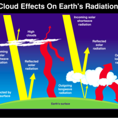
The Sun's radiant energy is the fuel that drives Earth's climate engine. The Earth-Atmosphere system constantly adjusts to maintain a balance between the energy that reaches the Earth from the Sun and the energy that flows from Earth back out to space. Energy received from the Sun is mostly in the visible (or shortwave) part of the electromagnetic spectrum, where Earth's atmosphere is transparent. The solar radiation absorbed by the Earth causes the planet to heat up until it is radiating (or emitting) as much energy back into space as it absorbs from the Sun. The Earth's thermal emitted radiation is mostly in the infrared (or longwave) part of the spectrum, where Earth's atmosphere is not transparent. Thus, much of the emission to space is from the higher levels of the atmosphere.
The balance between incoming and outgoing energy is called the Earth's radiation budget. The difference between the incoming and outgoing energy is called net radiation. A positive value of net radiation means that there is more incoming energy than outgoing energy, which results in the surface and Atmosphere warming. The opposite is true when the net radiation is negative.
Net Radiation, Albedo, and the Urban Heat Island
Not all incoming solar radiation is absorbed. About 30% of the solar energy that comes to Earth is reflected back to space by clouds and aerosols or bright surfaces. The ratio of reflected-to-incoming energy is called "albedo" from the Latin word meaning whiteness. Different surfaces reflect the Sun's energy at different rates and thus have different albedos.
Changing surfaces can lead to changing albedo values and changes to the net radiation. For example, the melting of ice replaces a white surface with a darker surface, decreasing the albedo of the surface. This change allows for more energy to be absorbed at the surface and makes the net radiation more positive. When urbanization causes changes to Earth's surface which change the net radiation and increase temperatures in a local area, this is called an Urban Heat Island effect.
Net Radiation and the Seasons
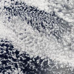
The seasons are caused as the Earth, tilted on its axis, travels in its orbit around the Sun each year. The hemisphere that is tilted toward the Sun absorbs more energy from incoming sunlight (summer) that the hemisphere tilted away from the Sun (winter). During this lesson, students will view NASA data displaying the net radiation in one calendar year during clear and cloudy sky conditions.
Line Plots
Line plots are a useful way to display data, especially change over time. The units on the y-axis for the graphs is Watts per square meter. However, the label says "Average Energy from the Sun". Watts per square meter can be explained to the students as energy from the Sun. This will help them understand that as the line on the graph goes up, the energy from the Sun is what is increasing without the need to explain the units to the students.
- Knowledge that the Sun's energy heats land, water, and air of the Earth
- Knowledge of month abbreviations (or a reference sheet available)
- Familiarity with line plots
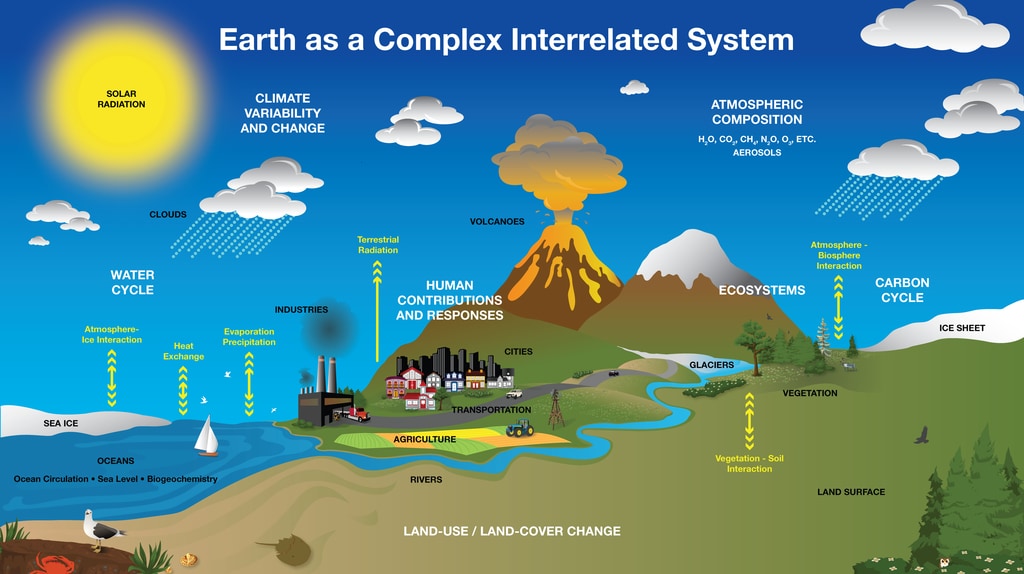
Scientists monitor the Earth System to better understand and meet the challenges of environmental change. For example, knowing how much of the Sun's energy reaches the surface of the Earth helps scientists understand dynamics in the spheres within the Earth System, i.e., Atmosphere, Hydrosphere, Cryosphere, and Biosphere. An important variable in understanding these changes is Net Radiation because it impacts temperatures. The warm air rising off Earth's landscapes influences our world's weather and climate patterns. NASA leads a wide range of efforts, including CERES, to collect and interpret these data acquired from satellites, aircraft, and ground networks, and to integrate these data into numerical models of the Earth’s climate at global and regional scales.
CERES products include both solar-reflected and Earth-emitted radiation from the top of the atmosphere to the Earth's surface, from which the net radiation can be calculated. Cloud properties are determined using simultaneous measurements by other EOS and NPP instruments such as the Moderate Resolution Imaging Spectroradiometer (MODIS) and the Visible Infrared Imaging Radiometer Suite (VIIRS). Analyses using CERES data build upon the foundation laid by previous missions such as the NASA Earth Radiation Budget Experiment (ERBE), leading to a better understanding of the role of clouds and the energy cycle in global climate change.
For more information on CERES see http://ceres.larc.nasa.gov.
- Extension for MLL students or students with different learning abilities: As part of the group’s discussion, you can also hand them a Venn diagram. Have the students write down their observations on the section for energy from Sun - cloudy and energy from the Sun - clear. Use the center of the diagram to write down what things may be similar during some of the months of that year.
- This is a clear/visual way of showing what each graph may have in common, and what some differences may be. For example: the temperature during the months of December and January were similar for both cloudy and clear skies.
- After the students complete the activity, have them write a summary in their science journals or notebooks about what they learned.
- Compare data from China to local data obtained from the Earth System Data Explorer. The date can be found under Atmosphere > All Data > Net Atmospheric Radiation. There are two datasets, one with clouds and one without. Tutorials are available here.
- If students are ready to use negative numbers, use data to have students create their own line graphs for Clear or Cloudy days. They can make individual line graphs or a double line graph.
| Month | Net Radiation |
|---|---|
| Jan. | -53 |
| Feb. | -15 |
| Mar. | 45 |
| Apr. | 87 |
| May | 113 |
| Jun. | 121 |
| July. | 107 |
| Aug. | 77 |
| Sep. | 41 |
| Oct. | -6 |
| Nov. | -42 |
| Dec. | -63 |
| Month | Net Radiation |
|---|---|
| Jan. | -64 |
| Feb. | -71 |
| Mar. | -4 |
| Apr. | 37 |
| May | 75 |
| Jun. | 50 |
| Jul. | 35 |
| Aug. | 25 |
| Sep. | -36 |
| Oct. | -70 |
| Nov. | -91 |
| Dec. | -79 |
- Standalone Lesson (no technology required)
Complementary Lesson Plans

Complementary Mini Lessons

Complementary Interactives

Complementary Pages


Grade Band
- 3-5
- 6-8
- 9-12
Time
- 30 minutes
Visualization Tool
NGSS Three Dimensional Learning
- See drop-down menu at the bottom of the page