
Grade Level: 6-8
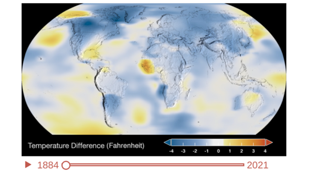
Students will watch and examine a NASA animation of Earth’s rising surface temperatures over an almost 150 year period.
Select a Sphere:


Students will watch and examine a NASA animation of Earth’s rising surface temperatures over an almost 150 year period.
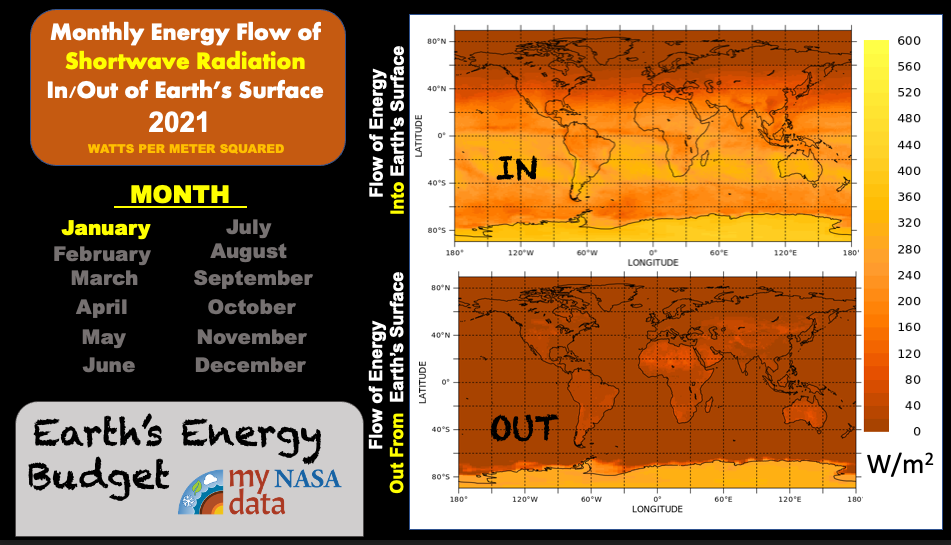
Students construct explanations about Earth’s energy budget by connecting a model with observations from side-by-side animations of the monthly mapped data showing incoming and outgoing shortwave radiation from Earth’s surface.
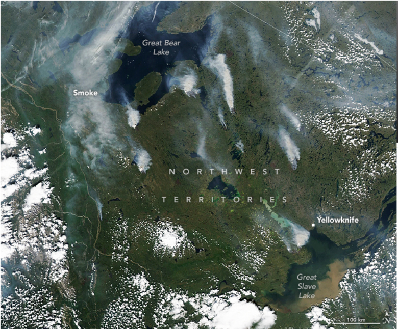
Students will analyze images and data from a variety of NASA sensors and satellites depicting the wildfires of northern Canada to understand the state of the atmosphere at the time. Then they will answer a series of questions.
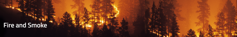
Students watch a 28-minute video on NASA's involvement in fighting wildfires.
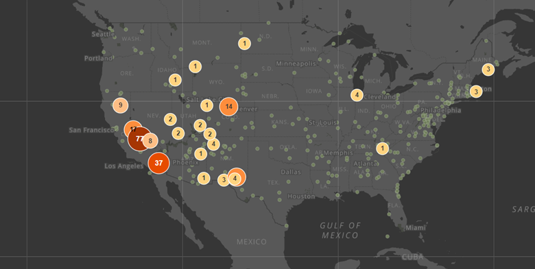
This lesson uses the National Park Service StoryMap which displays national parks around the contiguous United States and their standard exceedance ozone concentrations from 2016-2021. Students will explore ozone levels and answer questions.

Several heat domes have occurred over the last few summers and around the world. This lesson provides one example from 2021 in Portland, Oregon, with temperature and ozone data.
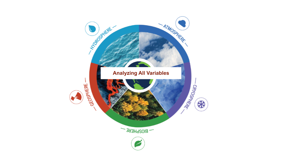
The Earth System Satellite Images, help the learner visualize how different Earth system variables change over time, establish cause and effect relationships for a specific variable, identify patterns, and determine relationships among variables over one year.

The Earth System Satellite Images, along with the Data Literacy Cubes, helps the learner identify patterns in a specific image.

The Earth System Satellite Images, along with the Data Literacy Cubes, help the learner visualize how different Earth system variables change over time, establish cause and effect relationships, identify patterns, and determine relationships among variables.
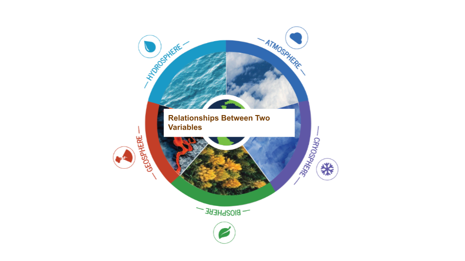
The Earth System Satellite Images, along with the Data Literacy Cubes, help the learner visualize how different Earth system variables change over time, identify patterns, and determine relationships among two variables in three months.
These NASA lessons support Next Generation Science Standards (NGSS) and three dimensional learning of the Earth System. These include activities where students interact with NASA maps, graphs, and datasets from the atmosphere, biosphere, cryosphere, geosphere, hydrosphere and the earth system.

