Air Temperatures

What is Happening with Air Temperature?
The world's surface air temperature is getting warmer. Whether the cause is human activity or natural changes in the Earth System—and the enormous body of evidence says it’s humans—thermometer readings all around the world have risen steadily since the beginning of the Industrial Revolution.
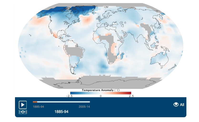
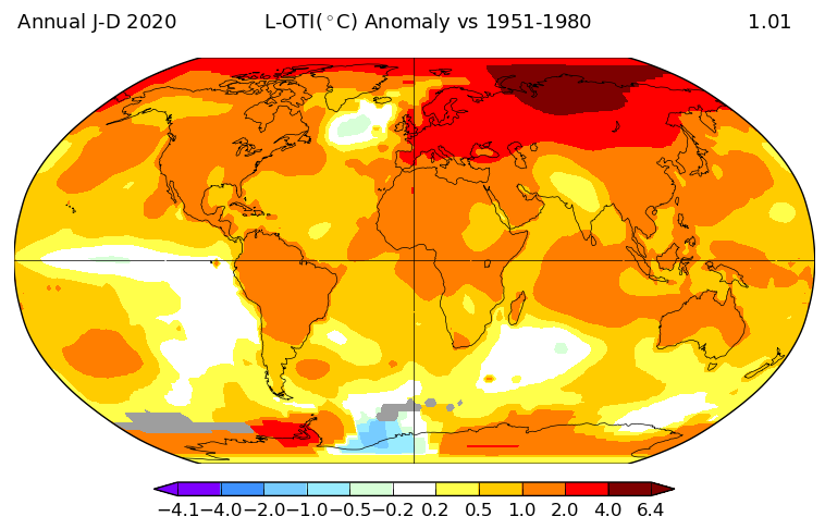
The maps above show temperature anomalies, or changes, not absolute temperature. They depict how much various regions of the world have warmed or cooled when compared with a base period of 1951-1980. (The global mean surface air temperature for that period was estimated to be 14°C (57°F), with an uncertainty of several tenths of a degree.) In other words, the maps show how much warmer or colder a region is compared to the norm for that region from 1951-1980.
As the maps show, global warming doesn’t mean temperatures rose everywhere at every time by one degree. Temperatures in a given year or decade might rise 5 degrees in one region and drop 2 degrees in another. Exceptionally cold winters in one region might be followed by exceptionally warm summers. Or a cold winter in one area might be balanced by an extremely warm winter in another part of the globe.
Two terms that are often incorrectly used interchangeably are “global warming” and “climate change.” Global warming is the observed upward global temperature trend since the early 20th century, mainly due to the increase in emissions from burning fossil fuels. Climate change is a broader term that describes all changes in different Earth spheres, not just temperature changes, connected to the increase in emissions.
Weather and climate are two other terms that are frequently confused in the discussion of climate change. Both refer to events with broadly different spatial and time scales. Weather refers to atmospheric conditions that occur locally over short periods of time – from minutes to hours or days. Familiar examples include rain, snow, clouds, winds, floods or thunderstorms. Remember, weather is local and short-term. Climate, on the other hand, refers to the long-term regional or global average of temperature, humidity and rainfall patterns over seasons, years or decades. Climate is regional or global and long-term. Erratic weather in your neighborhood – whether rain or drought – may or may not be a symptom of global climate change. To know, we must monitor weather patterns over many years.
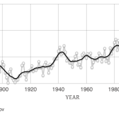
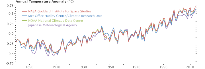
According to an ongoing temperature analysis conducted by scientists at NASA’s Goddard Institute for Space Studies (GISS), the average global temperature on Earth has increased by about 0.8° Celsius (1.4° Fahrenheit) since 1880. Two-thirds of the warming has occurred since 1975, at a rate of roughly 0.15-0.20°C per decade.
Global temperature records start around 1880 because observations did not sufficiently cover enough of the planet prior to that time. The period of 1951-1980 was chosen largely because the U.S. National Weather Service uses a three-decade period to define “normal” or average temperature. The GISS temperature analysis effort began around 1980, so the most recent 30 years was 1951-1980. It is also a period when many of today’s adults grew up, so it is a common reference that many people can remember.
The line plot below shows yearly temperature anomalies from 1880 to 2014 as recorded by NASA, NOAA, the Japan Meteorological Agency, and the Met Office Hadley Centre (United Kingdom). Though there are minor variations from year to year, all four records show peaks and valleys in sync with each other. All show rapid warming in the past few decades, and all show the last decade as the warmest.
To conduct its analysis, GISS uses publicly available data from 6,300 meteorological stations around the world; ship- and buoy-based observations of sea surface temperature; and Antarctic research station measurements. These three data sets are loaded into a computer analysis program—available for public download from the GISS web site—that calculates trends in temperature anomalies relative to the average temperature for the same month during 1951-1980.
Why Should We Care if Temperatures Change?
Who should care about one degree of warming, right? After all, the temperature fluctuates by many degrees every day where we live.
The global temperature record represents an average over the entire surface of the planet. The temperatures we experience locally and in short periods can fluctuate significantly due to predictable cyclical events (night and day, summer and winter) and hard-to-predict wind and precipitation patterns. But the global temperature mainly depends on how much energy the planet receives from the Sun and how much it radiates back into space—quantities that change very little. The amount of energy radiated by the Earth depends significantly on the chemical composition of the atmosphere, particularly the amount of heat-trapping greenhouse gases.
A one-degree global change is significant because it takes a vast amount of heat to warm all the oceans, atmosphere, and land by that much. In the past, a one- to two-degree drop was all it took to plunge the Earth into the Little Ice Age. A five-degree drop was enough to bury a large part of North America under a towering mass of ice 20,000 years ago. The objective, according to GISS scientists, is to provide an estimate of temperature change that could be compared with predictions of global climate change in response to atmospheric carbon dioxide, aerosols, and changes in solar activity.
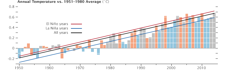
Generally, warming is greater over land than over the oceans because water is slower to absorb and release heat (thermal inertia). Warming may also differ substantially within specific land masses and ocean basins. The graph below shows the long-term temperature trends in relation to El Niño or La Niña events, which can skew temperatures warmer or colder in any one year. Orange bars represent global temperature anomalies in El Niño years, with the red line showing the longer trend. Blue bars depict La Niña years, with a blue line showing the trend. Neutral years are shown in gray, and the black line shows the overall temperature trend since 1950.
Since the year 2000, land temperature changes are 50 percent greater in the United States than ocean temperature changes; two to three times greater in Eurasia; and three to four times greater in the Arctic and the Antarctic Peninsula. Warming of the ocean surface has been largest over the Arctic Ocean, second largest over the Indian and Western Pacific Oceans, and third largest over most of the Atlantic Ocean.
In the global maps at the top of this page, the years from 1885 to 1945 tend to appear cooler (more blues than reds), growing less cool as we move toward the 1950s. Decades within the base period do not appear particularly warm or cold because they are the standard against which all decades are measured. The leveling off between the 1940s and 1970s may be explained by natural variability and possibly by cooling effects of aerosols generated by the rapid economic growth after World War II.
Credit: NASA Climate & NASA Earth Observatory
Disciplinary Core Ideas:
Crosscutting Concepts:
- Patterns
- Cause and Effect
- Scale, Proportion, and Quantity