Mini Lesson/Activity
Creating an El Niño Poster Model
Overview
Students will use coloring sheets to create a color coded model of El Niño and analyze it. If the Data Literacy Map Cube is used with this, students will color their models first.
Student Directions
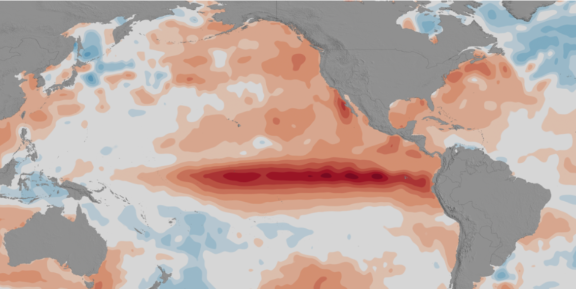
El Niño is a condition that sometimes occurs in the Pacific Ocean, but it is so big that it affects weather all over the world. Weather depends a lot on ocean temperatures. Where the ocean is warm, more clouds form, and more rain falls in that part of the world. In the Pacific Ocean, near the equator, the Sun makes the water especially warm on the surface. Normally, strong winds along the equator push the warm surface water near South America westward toward Indonesia. When this happens, the cooler water underneath rises up toward the surface of the ocean near South America.
Using the 2 sheets provided, fill in the colors depicting the El Niño models from 1997 to 1998 and answer the following questions.
Use crayons in the following colors:
- Purple
- Blue
- Light Blue
- Green
- Yellow
- Orange
- Red


Steps:
- Check with your instructor on how to submit your answers.
- Each color represents the difference between the normal sea level in centimeters. What is the approximate range of the difference between normal sea level for each color?
- What do negative numbers represent?
- What does zero represent?
- Compare the images from the different months.
- What differences do you see between March 1997 and May 1997?
- What differences do you see between May 1997 and November 1997?
- What differences do you see between November 1997 and January 1998?
- What differences do you see between January 1998 and February 1998?
- What differences do you see between February 1998 and May 1998?
- Explain what happened over the year.
Sources:
- “Ocean Surface Topography From Space.” The El Nino Poster, NASA Jet Propulsion Laboratory, https://sealevel.jpl.nasa.gov/resources/1005/el-nino-poster/. Accessed 23 April 2019.
- A Still-Growing El Niño Set to Bear Down on U.S. (2015, December 29). NASA. Retrieved October 19, 2022, from https://sealevel.nasa.gov/news/29/a-still-growing-el-nino-set-to-bear-down-on-us/.
Teacher Note
Students will use coloring sheets to create a color coded model of El Niño. If the Data Literacy Map Cube is used with this, students should color their models first.
Teachers, these mini lessons/student activities are perfect "warm up" tasks that can be used as a hook, bell ringer, exit slip, etc. They take less than a class period to complete. Learn more on the "My NASA Data What are Mini Lessons?" page.
Teachers who are interested in receiving the answer key, please complete the Teacher Key Request and Verification Form. We verify that requestors are teachers prior to sending access to the answer keys as we’ve had many students try to pass as teachers to gain access.
Disciplinary Core Ideas:
- ESS2D: Weather and Climate
Crosscutting Concepts:
- Cause and Effect
Science and Engineering Practices:
- Analyzing and Interpreting Data
Complementary Mini Lessons
Complementary Lesson Plans

Grade Band
- 6-8
- 9-12
Time
- 30 minutes
Visualization Tool
NGSS Three Dimensional Learning
- See drop-down menu at the bottom of the page