Lesson Plans
When Precipitation Patterns Change: Visualizing Drought Indicators (SERC)
Overview
In this activity, students explore three indicators of drought are: soil moisture, lack of precipitation, and decreased streamflows. Students investigate each of these parameters develop a sense for the effects of drought on land.
Materials Required
- Acquire two matching clear containers (use 400 ml beakers or the bottom half of 1-liter soda bottles)
- Permanent marker for labeling
- dry potting soil: enough for about 250 ml into each container
- Water
- Clear, colorless plastic wrap
- Access to direct sunlight or a bright lamp
- Google Earth downloaded on computers
- computer or tablet
Procedure
Part 1: Reduced soil moisture: a hands-on activity
- Acquire two matching clear containers (use 400 ml beakers or the bottom half of 1-liter soda bottles).
- Label one container as "wet" and the other as "dry."
- Place equal amounts of dry potting soil (about 250 ml) into each container.
- Add 50 ml of water to the "wet" container and cover both containers with clear, colorless plastic wrap.
- Place the containers in direct sunlight or under a bright lamp.
- After 5 minutes and again at 15 minutes, observe the plastic wrap covering.
Optional extension: If you have access to a soil moisture probe, measure the soil moisture in each container before you place them in the sun. You could also perform this part of the activity using a balance to measure the mass of each container.
- Carefully remove the plastic wrap from both containers: try to keep moisture that has collected on the plastic wrap from dripping into the soil and measure the soil moisture again.
- Remove the containers from the sunlight or lamp and leave them uncovered overnight. Re-wrap the containers and repeat the experiment the following day.
- Graph the change in soil moisture you observe over time. Try to predict when the soil moisture of the originally wet sample will decrease to the same level of moisture as the originally dry sample.
Stop and Think
- Compare your model to the real world: describe the situation represented by each container.
- On average, the Western U.S. experiences fewer cloudy days per year than the Eastern U.S. Based on this fact, which area is more likely to have drier soil and therefore, be more prone to drought?
Part 2: Decreased precipitation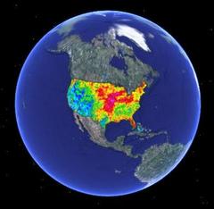
The National Weather Service keeps records of the amount of precipitation across the contiguous United States. You'll explore some of these images in Google Earth, such as the one pictured right, and interpret them to predict which areas might be developing or experiencing drought.
- Launch Google Earth.
- Instructions for downloading and installing Google Earth are provided in the originating lesson Lab 2B.
- If you cannot install and use the program, you can view web-based versions of the images that are used in this lab from the Advanced Hydrologic Prediction Service: Precipitation.
- Download and open the NWS Monthly Precipitation Data.kmz (KMZ File 212kB Jul21 08) file in Google Earth.
- In the Layers list in Google Earth, click the arrow next to the NWS layer to reveal the list of sub-layers. Start by un-checking the boxes to turn off all the sub-layers except for January 2008 Precipitation.
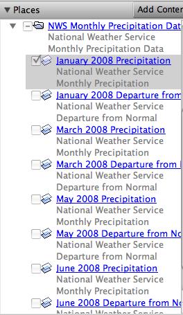
4. Use the information in the two sections below to walk you through interpreting the two different types of images in the file. NOTE: The file you downloaded shows data images for the Spring of 2008. To view web-based images of current data, go to the Advanced Hydrologic Prediction Service: Precipitation.

Interpreting Precipitation Images
Turn on the January 2008 Precipitation layer. Use the color scale on the right to interpret the map colors.
- On the map, look at the area where you live to see what color it is. Check where that color is on the scale.
- Find an area on the map that is a different color. Check that color on the scale to see if the second location received more or less rain than your area.
- Check carefully to find areas on the map that had the most and least precipitation.
-
After you've worked on understanding the patterns, check your interpretation with the example interpretation below.
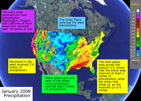
Example interpretation of the January 2008 Precipitation image - Un-check the box to the left of the name of the January Precipitation layer.

Interpreting Departure from Normal Precipitation Images
Departure from Normal
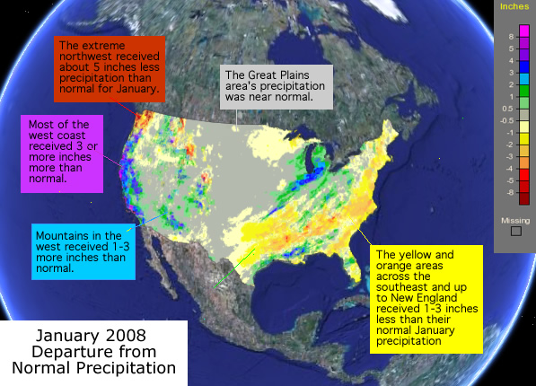
The National Weather Service also produces Departure from Normal Precipitation images. These show if areas had more or less precipitation than normal for the month.
Turn on the January 2008 Departure from Normal Precipitation layer. Use the color scale on the right to interpret the map colors.
- Check carefully to find areas on the map that had more and less than normal precipitation.
- After you've worked on understanding the patterns, check your interpretation with the image below.
Stop and Think
- Which areas in the contiguous U.S. consistently received less precipitation than normal during January 2008?
- Based on your explorations, describe the locations that you think were developing or experiencing drought by June of 2008.
- Once you're confident that you can make meaning of the colorful images, analyze one of the image sublayers at a time. Check the precipitation amount and departure from normal for your own location and look for areas that received less precipitation than normal.
- Return to the Advanced Hydrologic Prediction Service: Precipitation page. Turn on the Rivers and RFC (River Forecast Center) boundaries.
- Explore the data across the contiguous United States, and within a region of interest. Choose, for example, an area near your home, or in an area of known drought.
- Look at the 7-day, 30-day, and year-to-date maps. Switch between the Observed, Normal, and Departure from Normal maps. Look for areas that may be currently experiencing meteorological drought conditions.
Part 3: Reduced streamflow 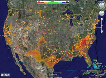
The United States Geologic Survey (USGS) provides streamflow data from gauging stations across the country. At each station, instruments estimate the downstream flow of water and use wireless communication devices to submit the information to central locations. Flow rates are classified according to historical records so you can tell at a glance of a stream is above, at, or below normal levels.
- Go to USGS Waterwatch Google Earth Streamflow
- One the page that opens, choose Streamgages, colored by streamflow condition (390K). It is the first link in the list.
- Choose the KMZ file, real_us.kmz, that is refreshed every hour.
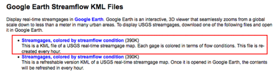
- If necessary, open the real_us.kmz file in Google Earth. Turn the layer on by clicking in the checkbox to the left of its name. Click the arrow to the left of the checkbox to reveal the various layers of the streamflow data.
-
Checking In:
From the legend, which colors indicate gauging stations that are reporting low streamflows? Red, dark red, and orange indicate lowest streamflow (dry conditions).
Which regions of the United States show below normal (or dry) streamflows? Answers will vary. Areas that show many red, dark red, and orange dots have low streamflow.
-
- Use the check boxes in the legend to turn off the streams that are normal or higher or not ranked. You will have 3 sets of gauges remaining on your map. They represent rivers and streams where the flow is below the 25th percentile of normal flow for that day of the year.
Stop and Think
- If an area shows just one stream gauge location with lower than normal streamflow, can you assume that the area is in a drought? Why or why not? Describe one or more conditions besides drought that could account for low streamflow.
- Based on patterns in the streamflow data, predict which areas of the country are experiencing drought.
Part 4: Compare your predictions to the Drought Monitor
The U.S. Drought Monitor is produced through a partnership between the National Drought Mitigation Center at the University of Nebraska-Lincoln, the United States Department of Agriculture, and the National Oceanic and Atmospheric Administration.
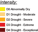
Use this legend to interpret the Drought Monitor map.
- Go to the Drought Monitor Data Download page to retrieve the KMZ data layer that shows current drought conditions.
- In Google Earth, choose File > Open, and browse to the location where you stored the file. Turn the layer on and click the toggle (arrow) to reveal the sub-layers of data.
- You can find detailed information about the drought categories in the map from the National Drought Monitor Center where the maps are produced.
- To focus in on the areas where drought is severe, extreme, or exceptional, turn off the drought index layers that are less than D2.
- Compare the areas of drought with the predictions you made based on precipitation and streamflow.
Stop and Think
- How well did your predictions match the drought monitor map? Describe areas where your predictions were correct and areas where they did not match.
- Of the two main types of data you examined—precipitation and the streamflow—which of the two seems to be a better predictor of drought conditions identified by the Drought Monitor layer?
Disciplinary Core Ideas:
- ESS2A: Earth Materials and Systems
- ESS2C: The Role of Water in Earth’s Surface Processes
- ESS2D: Weather and Climate
- ESS3A: Natural Resources
- ESS3B: Natural Hazards
Crosscutting Concepts:
- Patterns
- Cause and Effect
- Scale, Proportion, and Quantity
- Systems and System Models
- Stability and Change
Science and Engineering Practices:
- Asking Questions and Defining Problems
- Developing and Using Models
- Planning and Carrying out Investigations
- Analyzing and Interpreting Data
- Constructing Explanations and Designing Solutions
- Engaging in Argument from Evidence
- Obtaining, Evaluating and Communicating Information
- analyze physical models of soil moisture and the effects of evaporation on this soil property
- interpret patterns by investigating differences in precipitation data over time and space using Google Earth
- review streamflow data to identify areas undergoing varying streamflow conditions
- compare drought data to precipitation and streamflow data
- How is soil moisture connected to other spheres in the Earth System?
- How do changes in other parts of the Earth system affect Soil Moisture?
- What effect does drought have on soil moisture? What effect does soil moisture have on drought?
- Why is it important for scientists to monitor changes in the soil?
NASA actively monitors soil moisture and these measurements have practical applications that range from food availability to flood safety and weather forecasting. Water, energy and carbon exchanges between the land and the air are linked together through soil moisture. Detailed monitoring of soil moisture provides a view of how our whole Earth system works. The health of Earth’s biosphere is dependent on the flow and storage of water, energy, and carbon. Our global climate and its future changes are dependent on how these major Earth cycles link and vary together. Global change is the major environmental challenge of our century, and its impacts can cause major shifts in how our societies will function in the future.
Through soil moisture data collection, NASA sensors provide critical information for drought early warning. In fact, a deficit in the amount of moisture in the soil defines agricultural drought. The measurements from Soil Moisture Active Passive mission, SMAP, are tools for mitigating drought in the future. Researchers forecast a threefold increase in drought frequency in many regions of the world by the end of the 21st Century. History shows that a sustained drought can result in crop failure, deaths of livestock, and ultimately deaths of people. There is an economic impact as well. It is estimated that the 2012 drought in the Midwest led to harvest failures costing an estimated $30 billion.
Soil monitoring is a critical factor for evaluating healthy plant growth and will help improve crop yield forecasts and irrigation planning around the world. By indirectly monitoring global food production, NASA will improve the targeting of humanitarian food assistance. Studies estimate that climate change will increase the number of undernourished people worldwide in 2080 by 5-26%.
Having a better understanding of soil moisture will also improve our ability to predict and warn residents about impending floods by assessing how wet the soil is before a rainstorm. Floods are the #1 natural disaster in the United States and they account for 40% of all natural disasters worldwide. Flooding is the leading cause of weather-related deaths in the United States. Flash flood guidance is updated at least every 24 hours based on surface soil moisture. Losses due to floods here average billions of dollars per year.
The amount of water available to evaporate from the land surfaces can be used by meteorologists to improve their forecasts of local and regional weather over spans of days to weeks. Forecasting the weather requires continuously observing the state of the atmosphere and including the level of moisture of the soil and water sources on the ground. Nearly 90% of the emergencies declared by the Federal Emergency Management Agency and approximately 70% of air traffic delays are caused by weather, at a cost of many billions of dollars per year.
Modified from NASA SMAP.
National Geography Standards:
- Standard 1: How to use maps and other geographic representations, tools, and technologies to acquire, process, and report information from a spatial perspective.
- Standard 7: The physical processes that shape the patterns of Earth's surface.
Scientists worldwide warn of increasing temperatures in the future. There is a relationship between soil moisture and surface air temperature and this plays an important role in climate change that involves not only weather and climate but also the entire Earth System. NASA scientists strive to better understand how water availability changes around the globe, as well as better predict floods and drought in weather models. As Earth's temperature rises, our soils dry out and affect crop production, drought extent, and forest fires to name a few. NASA also researches additional phenomenon connected to soil moisture properties including landslide risks and vector-borne diseases (i.e., include but are not limited to cholera, malaria, dengue fever, Zika, schistosomiasis, and West Nile fever).
- Geoscientists - Research physical properties of the earth, such as rocks, soils, and other materials
- Soil and Plant Scientists - Explore the breeding, production, and management of crops, trees, and plants
- Conservation Scientists - Research, manage and protect natural resources like soil, forests, and water
- Atmospheric and Space Scientists - Investigate weather and climate-related phenomena to prepare weather reports and forecasts for the public
- Earth Drillers, Except Oil and Gas - Explore minerals and soil properties through a variety of drilling and testing measures.
- Agricultural Engineers - Solve problems that are related to the way farms work
- Computer and Information Scientists - Conduct research in the field of computer and information science
- Remote Sensing Scientists and Technologists - Research a variety of topics using techniques that allow the study of an object or phenomena without making contact directly with the object such as analyzing geological and geographical data (They typically work with aerial or satellite pictures.)
- Internet Required
- One-to-a-Group
- Visualization Tool Required


Grade Band
- 6-8
- 9-12
Time
- > 90 minutes
Visualization Tool
NGSS Three Dimensional Learning
- See drop-down menu at the bottom of the page
Related Resources
- When Precipitation Patterns Change Part B. Visualizing Drought Indicators
- NWS Monthly Precipitation Data.kmz
- National Weather Service: Advanced Hydrologic Prediction Service
- Advanced Hydrologic Prediction Service: Precipitation
- USGS Waterwatch Google Earth Streamflow
- Drought Monitor Data Download page
- Data Literacy Cube Guide
- Instructional Strategies for the Earth Science Classroom