Lesson Plans
Blossoms Blooming: Analyzing Plant Growth Patterns
Overview
Students analyze historic plant growth data (i.e., Peak Bloom dates) of Washington, D.C.’s famous cherry blossom trees, as well as atmospheric near surface temperatures as evidence for explaining the phenomena of earlier Peak Blooms in our nation’s capital.
Materials Required
Per Student:
- Behavior Over Time: Analyzing Plant Growth Patterns Student Data Sheet
Per Group
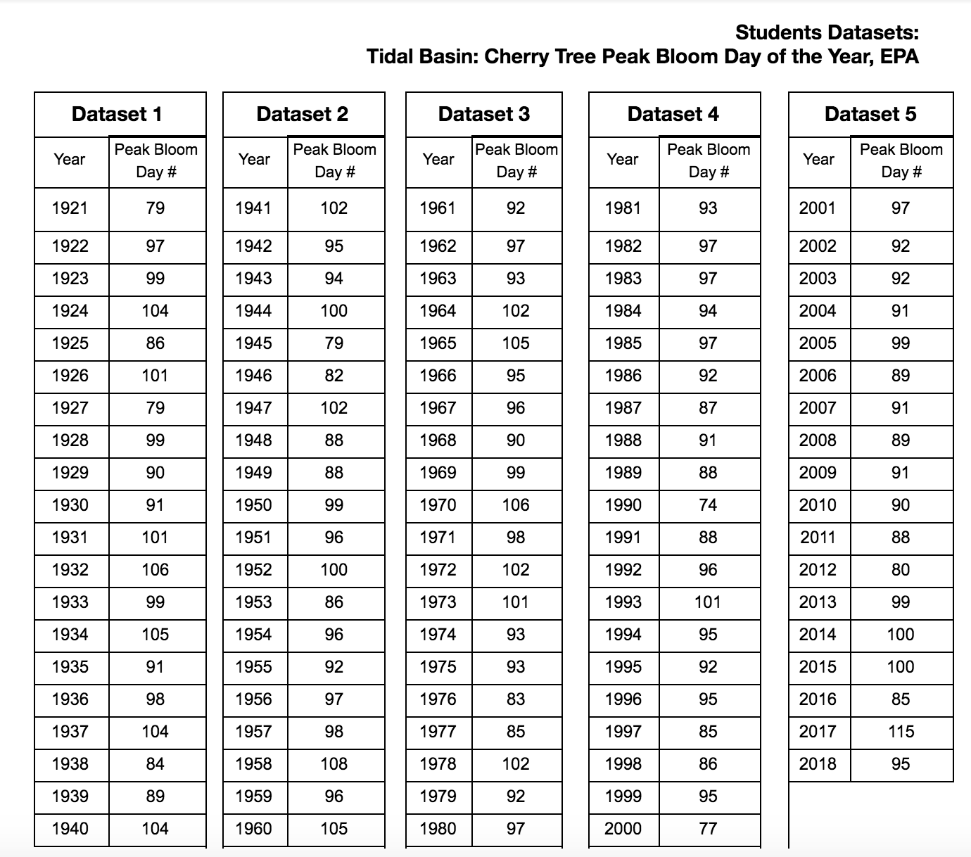
- Students Datasets: Tidal Basin: Cherry Tree Peak Bloom Day of the Year, EPA (#1 to all, and divide the remaining ones among the groups)
- Student Graphs: Peak Bloom Day # Over Time
- Student Graph: Average Yearly Near-Surface Temperature (℉)
- Station: Reagan National Airport (Alexandria, VA - Near Washington, D.C.) NOAA
- Optional: Data Literacy Cube to Facilitate Deeper Understanding
Procedure
Part A: Engaging Prior Knowledge of Washington D.C.’s Cherry Blossoms
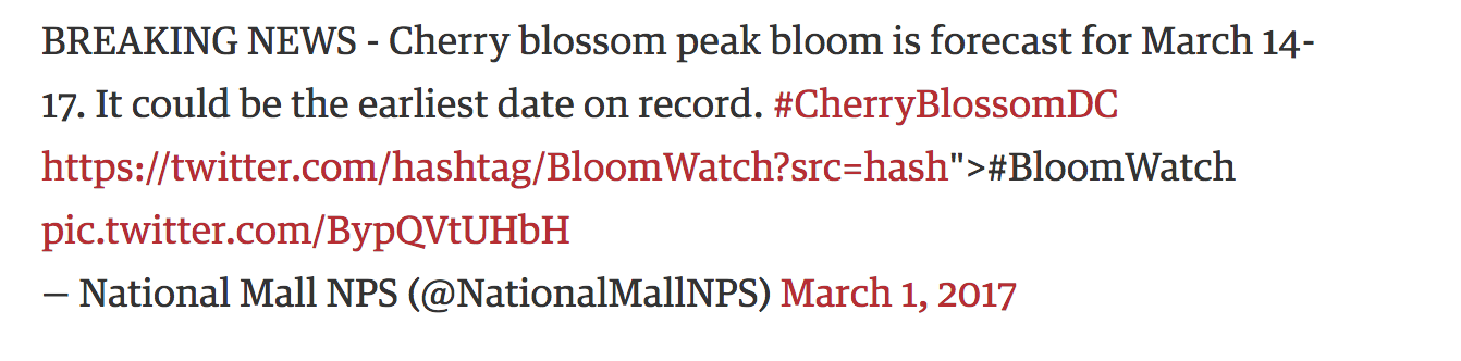
- To engage prior knowledge, project the following Twitter post and elicit student discussion with the following questions:
- Who sent the tweet?
- When?
- Where is the setting?
- What is the nature of the post?
- Why may this information be important?
- Who would likely care about this?
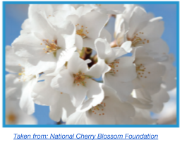
- Introduce Cherry Blossoms and brief phenology of plants. Explain to students that they will be analyzing the Peak Bloom of Washington, D.C. cherry blossoms for change in Day of the Year. (See Day of the Year Charts to help students understand how time is measured.)
- Review and discuss the following with students:
- Define plant phenology. Explain two factors that affect a plant’s life cycle.
- When do the Yoshino cherry trees normally bloom or hit Peak Bloom in Washington, D.C.?
- What affects the scientists' prediction of Peak Bloom?
-
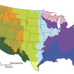
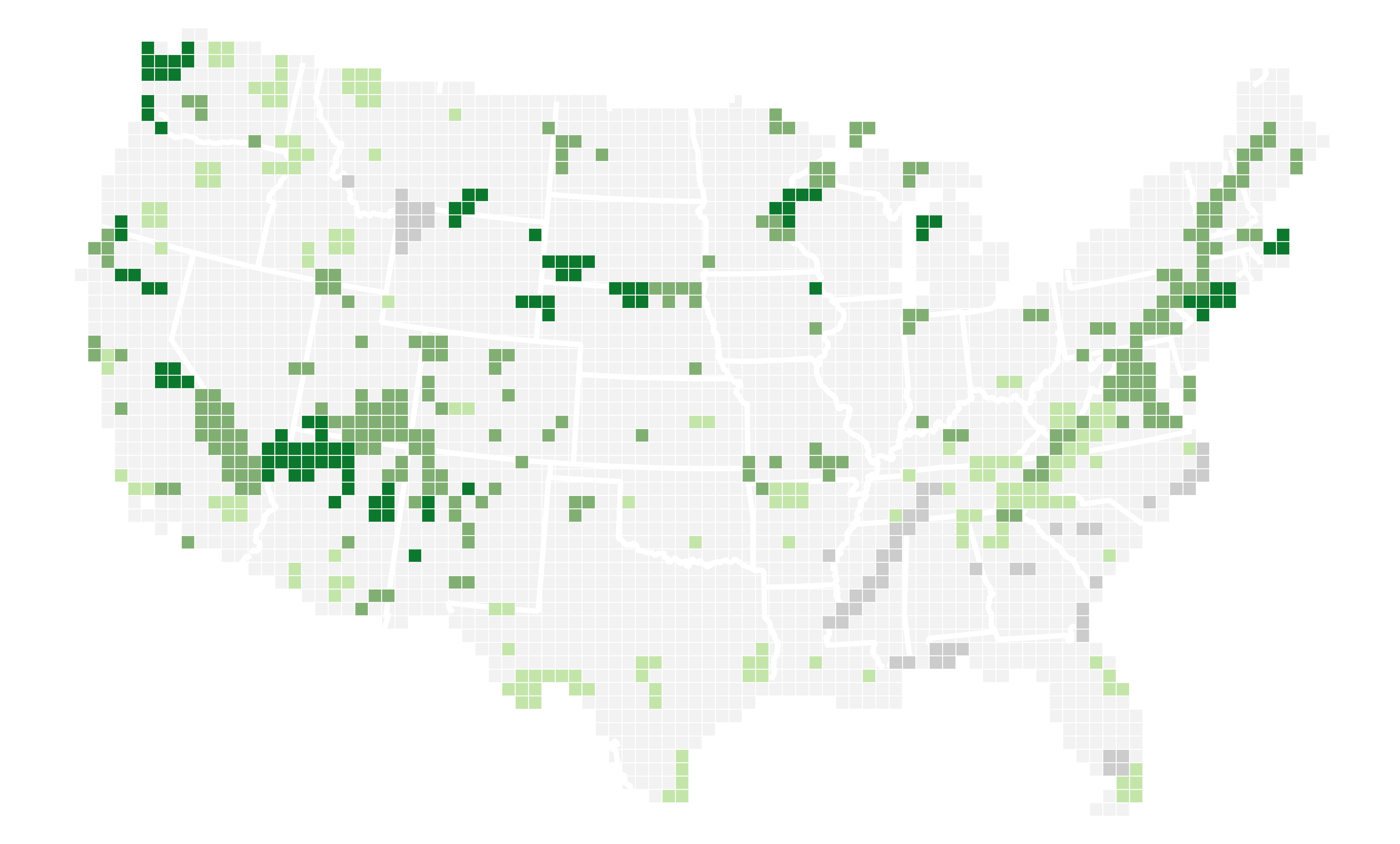
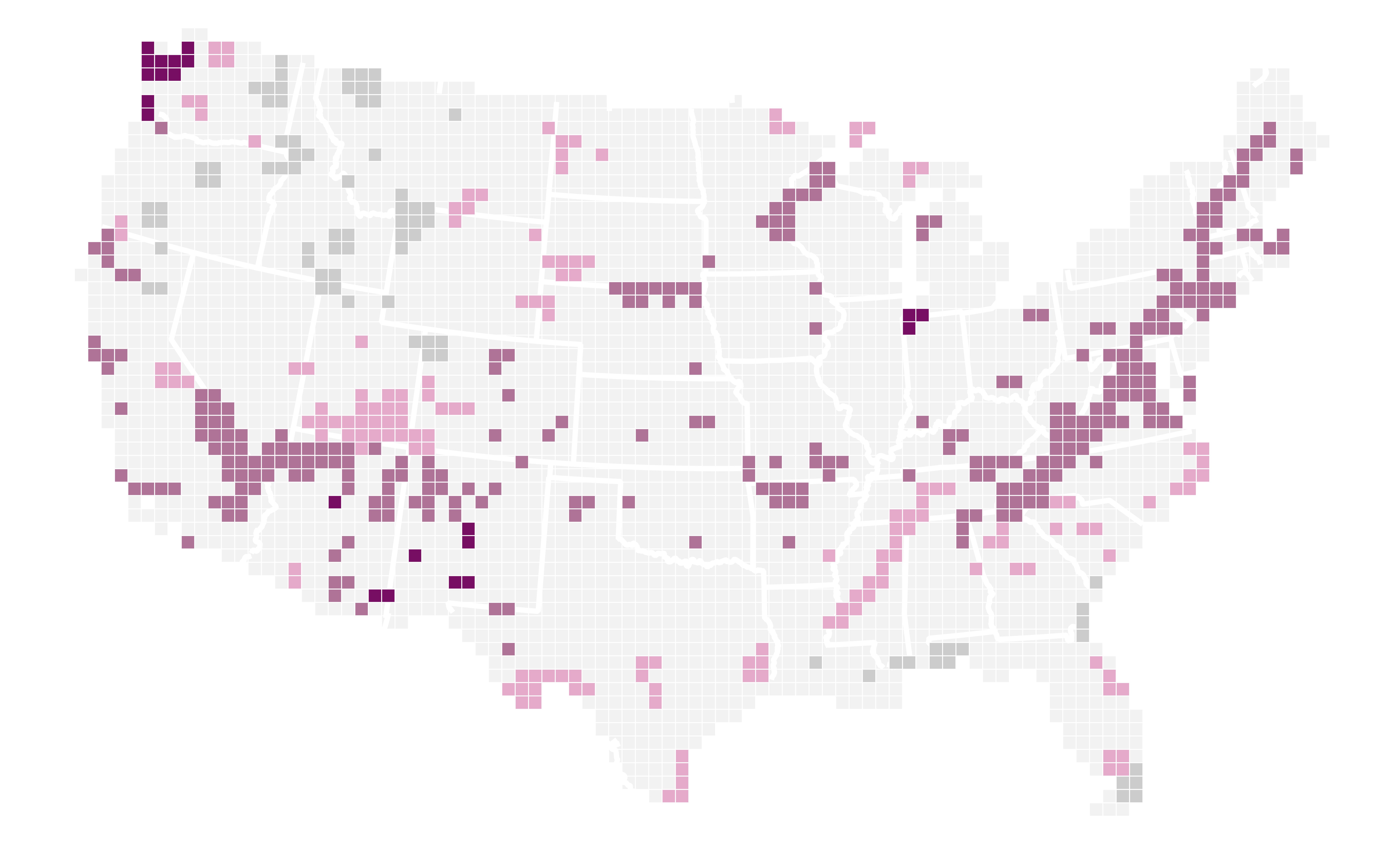
Observe and compare the two maps of the contiguous United States for First Leaf and First Bloom in National Parks across the country. What is each image showing and how does it relate to phenology? What do the colors represent? When was the data acquired?
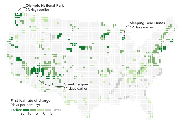
Credit: NASA Earth Observatory, acquired 2016 download large image (374 KB, PNG, 7800x4700) 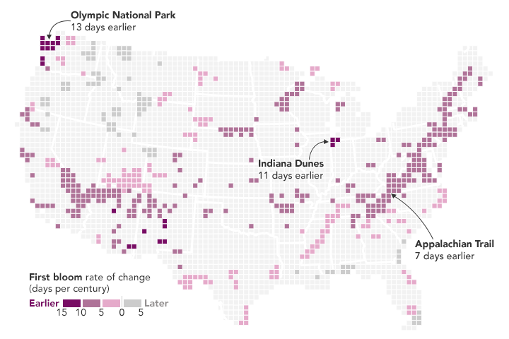
Credit: NASA Earth Observatory, acquired 2016 download large image (372 KB, PNG, 7800x4700) -
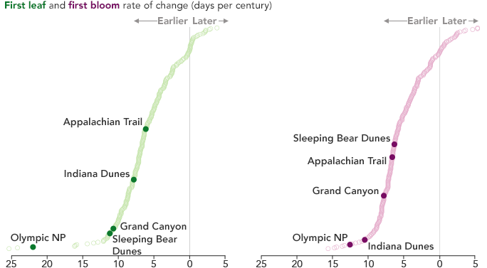
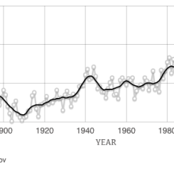
Look at the two graphs that refer to climate change bringing earlier springs in U.S National Parks. What do the graphs show us about most parks? Is First Leaf and First Bloom the same in all National Parks. Google the listed National Parks. Are they the same latitude? How are the same or different? Who should care about the differences? How might the fluctuation affect food sources or migration? The charts below show First Leaf (left) and First Bloom (right) in U.S. National Parks.
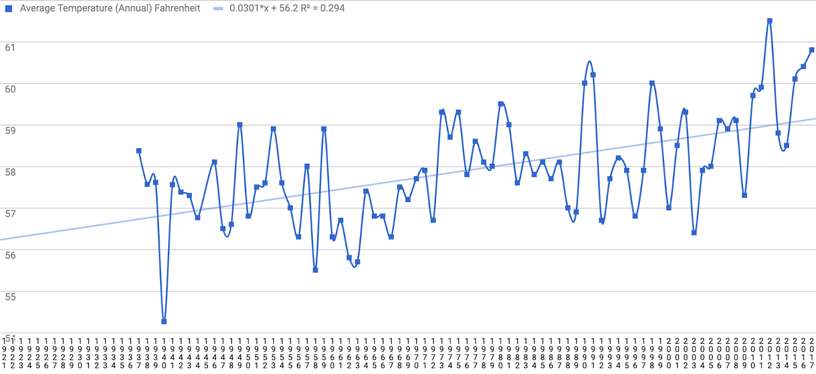
Credit: NASA Earth Observatory - Introduce the variable of Average Near-Surface Temperature. Explain to students that meteorological data was collected since the 1940’s by the government near the tidal basin and these data may give us clues about the changes in cherry blossoms. Ask students the following questions:
- How does the temperature change from month to month?
- What effect does this have on the life cycle of plants?
- How have temperatures changed in the Earth System over the last couple of decades?
- What role might this play on the phenology of plants?
- Distribute the Student Data Sheet and datasets and graphs to each student and review.
- Have students write a claim statement about the relationship of Peak Bloom Dates and Near Surface Air Temperatures and how they have changed over decades. e.g., My claim is that _____…; I believe _____ ; I think _____ will happen.
-
As a whole class, students will record and analyze your observations for Dataset 1 (Peak Bloom- Day of Year for Washington D.C.'s cherry trees. Discuss students' observations, and any patterns/trends.
Credit: NASA/My NASA Data -
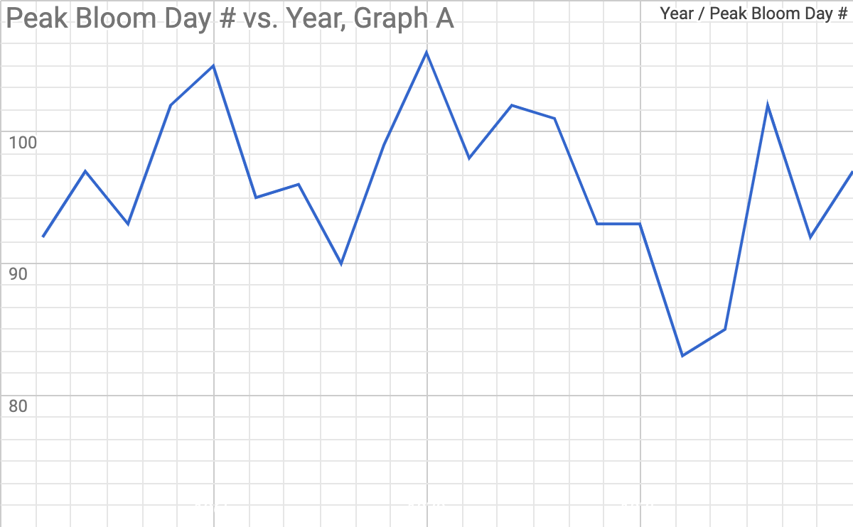
Next, draw students’ attention to the fact that the X Axes on each graph are unlabeled. It is the students’ job to analyze their dataset and select the graph that matches the set.
Credit: NASA/My NASA Data 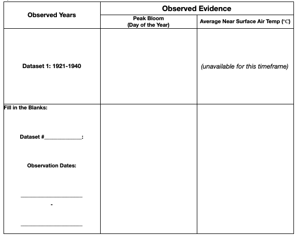
Credit: NASA/My NASA Data Then, divide students into small groups and assign the remaining datasets to be analyzed, one per group (i.e., Dataset 2: 1941-1960, Dataset 3: 1961-1980, Dataset 4: 1981-2000, Dataset 5: 2001-2018). Students will document their dataset number and observation dates in the data sheet and repeat Step 7.
- Students will analyze their graphs and write their observations in the Student Data sheet. Observed Evidence in the Left-hand column, Peak Bloom (Day of the Year).
- Review the correct order of the graphs with the students using the Teacher Graphs: Peak Bloom Day # Over Time (Labels added and in order).
- As a class, compare the groups’ datasets and graphs. Direct students observations by asking:
- What do you observe? Is there a trend? Is the trend positive, negative, cyclical, etc.
- What additional evidence did the other groups’ data/graphs provide? What contributions does your data and graph provide to the other groups?
- If you were presenting to scientists, what evidence would you use to defend your statement about this trend?
-
Display the summary graph that consists of the individual graphs. Describe the trend over time showing that the Peak Bloom dates occur earlier in the calendar year. One can infer that if this trend continues that spring will appear earlier than in years past.
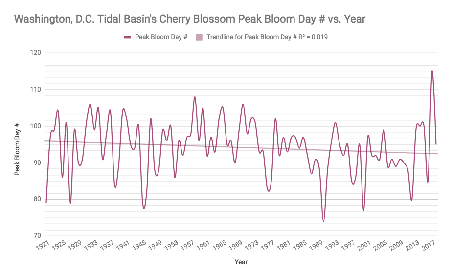
Credit: NASA/My NASA Data
Part B: Climate Change and Cherry Blossoms in Washington, D.C.
- Before showing the video, present the following questions found in #3 on the Student Data Sheet for students to find answers to during the video: (NOTE: Students should document their findings and report out to the class.)
- How has the life cycle of cherry blossoms changed? What changes have been observed?
- What explanations can you suggest for these patterns? What variable/s contribute to the change?
- Analyze and explain the relationship between key variables: air temperature and cherry blossom Peak Bloom dates in the spring:
- Are the relationships directly proportional (as one value increases, another value increases at the same rate)?
- Are the relationships inversely proportional (when one amount decreases at the same rate that the other increases)?
- Show students the National Park Service Video (4min)
- After the video, ask students to compare any new evidence revealed in the video to their predictions in Column A. Prediction on their Data sheet.
- Students should share their findings with the class.
Part C. Observing More Data -- Comparing Temperature & Peak Bloom
-
Now, distribute the Student Graph: Near Surface Temperature to each group.
Credit: NASA/My NASA Data -
Students will analyze the part of their graph that represents the span of time

Credit: NASA/My NASA Data they previously reviewed for Peak Bloom.
- Students write their observations in Observed Evidence on the Student Data sheet in the right-hand column.
- Students should report their findings to the class. Note: Students should collect information from peers’ reports to include in their data tables. All cells in the table should be completed by the end of the lesson.
- Teacher Tip: See the Data Literacy Cubes - Graph Cube to engage students in making deeper meaning of graphed data through hands-on activity.
Part D: Interpreting the Data
- Students revisit their claim and predictions as compared to their evidence by completing Step 5 on their data sheet.
- Students describe any ideas that the evidence has sparked and any scientific principles that affect their findings: Connection of seasonal effects on temperature, phenology of plants and animals, climate change, etc.
Part E: Thinking Big Picture
Encourage students to think beyond the obvious as they begin to connect the Biosphere to the other parts of the Earth System. Students complete questions 6-8.
Disciplinary Core Ideas:
- LS1B: Growth and Development of Organisms
- LS2A: Interdependent Relationships in Ecosystems
- LS2B: Cycles of Matter and Energy Transfer in Ecosystems
- ESS2A: Earth Materials and Systems
- ESS2D: Weather and Climate
- ESS3D: Global Climate Change
Crosscutting Concepts:
- Patterns
- Cause and Effect
- Systems and System Models
Science and Engineering Practices:
- Developing and Using Models
- Planning and Carrying out Investigations
- Analyzing and Interpreting Data
- Constructing Explanations and Designing Solutions
- Use evidence to create an explanation.
- Analyze Behavior Over Time graphs of plant phenology data for Washington, D.C.’s Cherry Trees from 1921- 2018.
- Compare Peak Bloom graphs to near-surface temperature data collected in the same region and time.
- Infer relationships between plant phenology and climate change supported by evidence and reasoning.
- How does the Biosphere respond to changing atmospheric temperatures?
- How has the Biosphere changed since the early 1900’s through today?
- What does plant phenology in the Washington D.C. area tell us about changing climates?
- What effects do earlier phenology cycles in the calendar year have on other spheres in the Earth System?
- How does NASA work with other organizations to help us better understand and interpret phenology data?
 In the spring of 2018, the cherry trees around the Tidal Basin, southwest of the National Mall in Washington, D.C., reached Peak Bloom in early April 2018—timing that is in line with the 96-year average. After a warm February, cool March temperatures confounded models that had predicted the bloom to occur earlier than usual. That is not surprising, as temperature plays a crucial role in bloom timing. But over the longer term, climate change is causing spring to begin earlier and earlier across the United States.
Maps reveal just how much earlier spring is arriving in National Parks across the country. The data were published in 2016 by ecologists from the National Park Service, working in collaboration with colleagues at other agencies and institutions. The first map shows the rate of change (days per century since 1901) of “First Leaf”—the date at which leaves first appear from buds. The second map shows the same rate of change for “First Bloom,” the average date when blooms appear. Combined, the two indices provide a way for ecologists to identify how vegetation is responding to warming temperatures.
Credit: NASA Earth Observatory, acquired 2016 download large image (374 KB, PNG, 7800x4700)
Credit: NASA Earth Observatory, acquired 2016 download large image (372 KB, PNG, 7800x4700)
“Climate changes are affecting resources across the entire range of National Parks,” said John Gross a climate change ecologist with the National Park Service. “Earlier springs, as indicated by leaf and flowering dates, is one of the most obvious and easily understood effects of climate change.” Of the 276 parks in the study (including Alaska, not pictured), about three-quarters of them are experiencing earlier springs. More than half are experiencing “extreme” early springs; that is, recent springs are among the earliest ever observed—and in many cases are wholly unprecedented—compared to the past 112 years. The charts below show that indeed, the vast majority of parks are experiencing First Leaf and First Bloom earlier than usual. This means that most parks are already experiencing and responding to climate-driven changes.
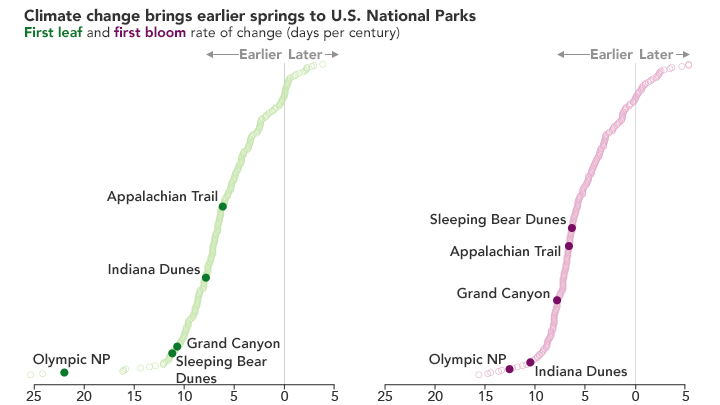
But as the maps also show, the magnitude of the change varies with location. Early blooming is evident in the swath of purple stretching from the south to the northeastern U.S. along the Appalachian Trail. Early leafing is quite evident in the southwestern part of the country, such as Grand Canyon National Park. Here, the long-term changes mean that spring is now arriving nearly two weeks earlier than it did in 1901. Still, other parks, such as Olympic National Park, are both blooming and leafing out earlier than normal. Conversely, some areas of the southeastern United States are not seeing much change at all; that region experienced less warming in the second half of the 20th Century.
Earlier springs have implications for how national parks are managed. The Cherry Blossom Festival in Washington, D.C., for example, has been lengthened to a multi-week event, making it more likely that the timing of the festival and Peak Bloom overlap. As the timing of spring has advanced, parks also have had to adjust the timing of management actions, which include hiring seasonal staff, opening park facilities, and initiating control of pests and invasive plants. According to Gross, park visitors are highly attuned to the beauty of the spring—from the emergence of buds to colorful flowers that emerge—and can observe for themselves how warming is changing the seasonality of parks. An earlier spring can affect the relationships between plants and pollinators, the wildlife that migrate in response to the greening of the plants they eat, and the return of birds that rely on the emergence of insects to feed their young.
“Changes in leaf and flowering dates have broad ramifications for nature,” Gross said. “Pollinators, migratory birds, hibernating species, elk, and caribou all rely on food sources that need to be available at the right time. Warming climates have disrupted these patterns, causing hardships for the animals and people that rely on them.”
NASA Earth Observatory images by Joshua Stevens, using data courtesy of
Monahan, William B., et al. (2016).
Story by Kathryn Hansen.
References and Related Reading
- EPA Climate Change Indicators (2016, April) Community Connection: Cherry Blossom Bloom Dates in Washington, D.C. Accessed April 5, 2018.
- Monahan, W.B. et al. (2016) Climate change is advancing spring onset across the U.S. national park system.Ecosphere, 7 (10).
- NASA Earth Observatory (2016, May 12) Natural Beauty at Risk: Preparing for Climate Change in National Parks.
- National Cherry Blossom Festival (2018, April) Bloom Watch 2018. Accessed April 5, 2018.
- The Washington Post (2018, March 20) Spring is springing earlier and earlier. Accessed April 5, 2018.
- Chung U, Mack L, Yun JI, Kim S-H (2011) Predicting the Timing of Cherry Blossoms in Washington, D.C. and Mid-Atlantic States in Response to Climate Change PLoS ONE 6(11): e27439.
Perhaps you are not interested in integrating the First Bloom of cherry blossoms into your instruction? Do not worry. Explore the phenology of native plants endemic to your area by using Budburst.
Budburst offers citizen science opportunities for students and teachers to better understand plant phenology in relation to environmental change for a wide variety of plants and locations. Budburst contains many resources to integrate phenology observations including the ability to create student accounts and build a research site listing specific plants. Or, if you prefer to download and use phenological data today, you can query the database by plant, location, or date.

- Line Graphs
- Life cycle of plants
- Simple plant/environment interdependencies
- Scientists have already studied all the Earth’s systems so there will not be any new discoveries.
- Earth events taking place within the global environment are not interconnected,
- such as El Nino is not important to people living in the Midwest.
- The atmosphere, hydrosphere, lithosphere, and biosphere do not cause changes in
- one another; these systems operate independently on Earth.
- Increases in global temperatures in the atmosphere and the consequent warming of the oceans will only create a problem for people living along the coast.
- Earth has always been pretty much the way it is now.
- Life on Earth can not modify or cause changes in the Earth’s systems.
- Earth is too big for us to change, thus the impact of our activities is inconsequential.
~ Credit: Center for School Reform at TERC’s MSPnet
In eastern North America, the spring “green up” phenomena is one of the most dramatic changes Earth-observing satellites record, indicating the time when leaves appear and begin growing. For more than three decades, NASA satellites have collected seasonal vegetation data and scientists are discovering interesting and consequential findings; the Northern Hemisphere growing season has lengthened over the past 30 years or so as the climate has warmed. The spring green-up arrives a week earlier in many Northern Hemisphere locations; however, not all important seasonal events can be observed with satellites. The most important event in the life cycle of flowering plants—flowering itself—is too small-scale and variable for satellites to observe directly. Therefore, NASA scientists couple satellite data with the work from the broader research community featuring the Environmental Protection Agency and the National Park Service for validation purposes.
In this lesson, Blossoms Blooming: Analyzing Plant Growth Patterns, learners collect evidence from air temperatures and Peak Bloom data, to examine yearly variations in plant growth patterns from 1921 to 2018. Students connect Behavior Over Time (BOT) graphs with data sets and review other resources to evaluate this changing phenomenon.
- Soil and Plant Scientists - Explore the breeding, production, and management of crops, trees, and plants
- Atmospheric and Space Scientists - Investigate weather and climate-related phenomena to prepare weather reports and forecasts for the public
- Computer and Information Scientists - Conduct research in the field of computer and information science
- Remote Sensing Scientists and Technologists - Research a variety of topics using techniques that allow the study of an object or phenomena without making contact directly with the object such as analyzing geological and geographical data (They typically work with aerial or satellite pictures.)
To further your classroom’s inquiry with the phenological studies of cherry blossoms beyond Washington D.C., visit the Project Budburst’s Cherry Blossom Blitz courtesy of Chicago Botanic Gardens. Here, you can observe a local cherry tree with your students from February 15th through April 30th and report and report how the tree is changing. The Cherry Blossom Blitz is a continental-scale campaign targeted to the collection of cherry blossom data by the public for research.
- Standalone Lesson (no technology required)
- Internet Required
- One-to-One (tablet, laptop, or CPU)
- One-to-a-Group
Complementary Lesson Plans


Grade Band
- 6-8
- 9-12
Time
- > 90 minutes
Visualization Tool
NGSS Three Dimensional Learning
- See drop-down menu at the bottom of the page