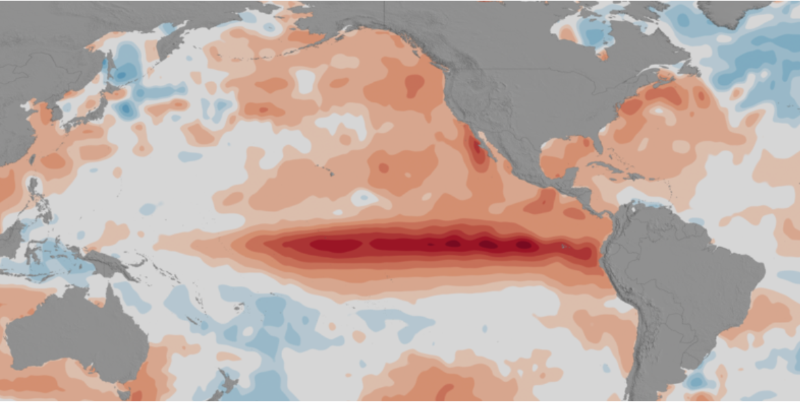
This mini lesson focuses on the 2015-2016 El Niño event and how its weather conditions triggered regional disease outbreaks throughout the world. Students will review a NASA article and watch the associated video to use as a tool to compare with maps related to 2
List of all Biosphere Mini Lessons
Examine the images to see the projected differences in land use between 1900 and 2100.
Students analyze Landsat images of Atlanta, Georgia to explore the relationship between surface temperature and vegetation.
Students will analyze the mapped plot of the historic Ocean Chlorophyll Concentrations at key locations around the world for the period of 1998-2018.
This mini lesson engages students by watching a NASA video related to seasonal chlorophyll concentration as it relates to net radiation using NASA's Aqua satellite. Students will examine the model and answer the questions.
In this mini lesson, students explore the relationship of chlorophyll and solar radiation by analyzing line graphs from the North Atlantic during 2016-2018.
Students learn how to estimate the "energy efficiency" of photosynthesis, or the amount of energy that plants absorb for any given location on Earth.
Help learners envision themselves as explorers, scientists, technologists, engineers, and mathematicians as they venture into the summer months. Download the PDF of the two sided document on cardstock and have students imagine and illustrate themselves!
Students will analyze a pie chart (circle graph) showing the distribution of different parts of the Earth system's absorption and reflection of energy.
Carbon dioxide concentration in the atmosphere is affected by many processes including fires, deforestation, and plant respiration. Students will evaluate a Landsat image to determine the rate of carbon dioxide sequestration in a particular area.